Exhibitions
|
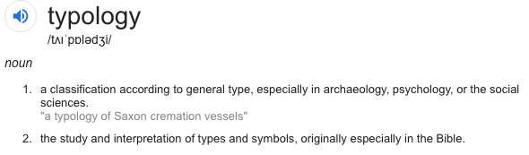
Variation and Similarity: Typology
The task was to create your own typology series documenting repeated forms . The camera has been used as a tool for witnessing and classifying types of subjects, people, buildings, objects etc. Gathering this evidence together in one place (often a book or exhibition) so that the viewer is able to see and assess it. Typology is much of recording and comparing interesting subjects and then combining them to produce an overall picture.
Boris Mikhailov
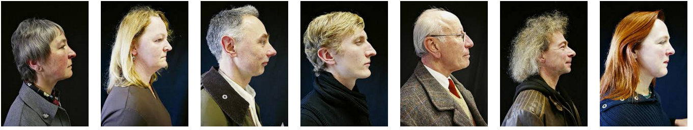
Ukrainian photographer Boris Mikhailov created a series of pictures of the amateur actors in a German theatre company in the town of Braunschweig. The photographer makes reference not only to Sander's typological study because of layout structure of the photos but also to Hitler's interest in eugenics which is a set of beliefs and practices that aim to improve the genetic quality of a human population by excluding. I find this particular work Interesting because of the dramatic backstory of how a war effected a population imagine if the war had been won for the nazi party how different would this series of pictures be.
My response
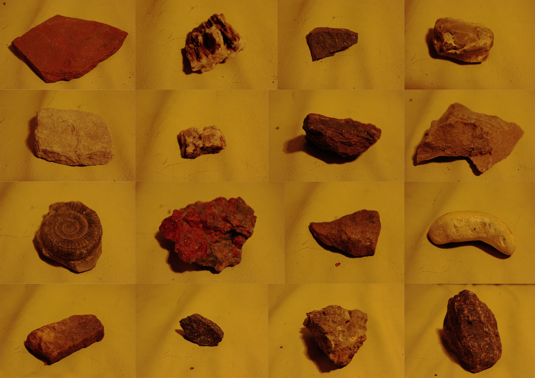
Taking the knowledge i have gained from researching into typology i have made my own response to the work for example the rocks i have used shows a deeper meaning because each is from the top of a mountain however this "secret" isn't visible to the first observation much like BORIS MIKHAILOV work that explores larger would issues without using dramatic imagery but instead a collective effort.
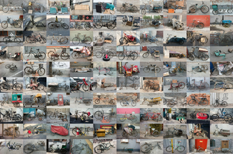
Zhao Xiaomengs
|
Zhao Xiaomengs series of typology is of bicycles around the city
these images are interesting because they show how a cities modern economy is like by the style and expenditure of the individual bikes and then averaging out this information across the numerous pictures. In cities like Beijing, bikes have become relics of a bygone age, no longer a symbol of a unifying culture of cycling but rather emblems of social marginalisation. |
|
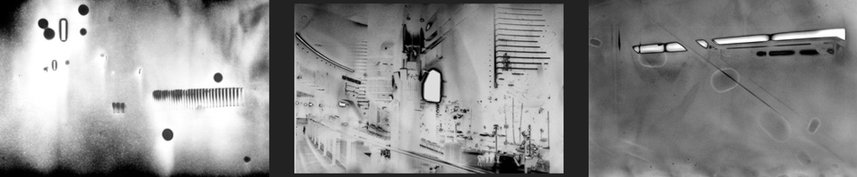
Antony Cairns
His photographic practice has remained rooted in chemical-based techniques, manipulating early photographic production methods to create his own unique style often with high contrast and inverted light. Shooting almost exclusively on black & white film, he prints all his own work, often experimenting with forgotten or discarded methods, and frequently becoming engrossed with the process, its imperfections and oddities. I like how his work has a main subject, buildings and city landscapes however some of his pictures are hard to recognise as this, this is what makes his pictures stand out because there of recognisable structures but he has converted them into unrecognisable or alien landscapes.
My Response
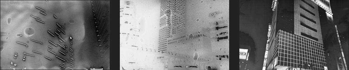
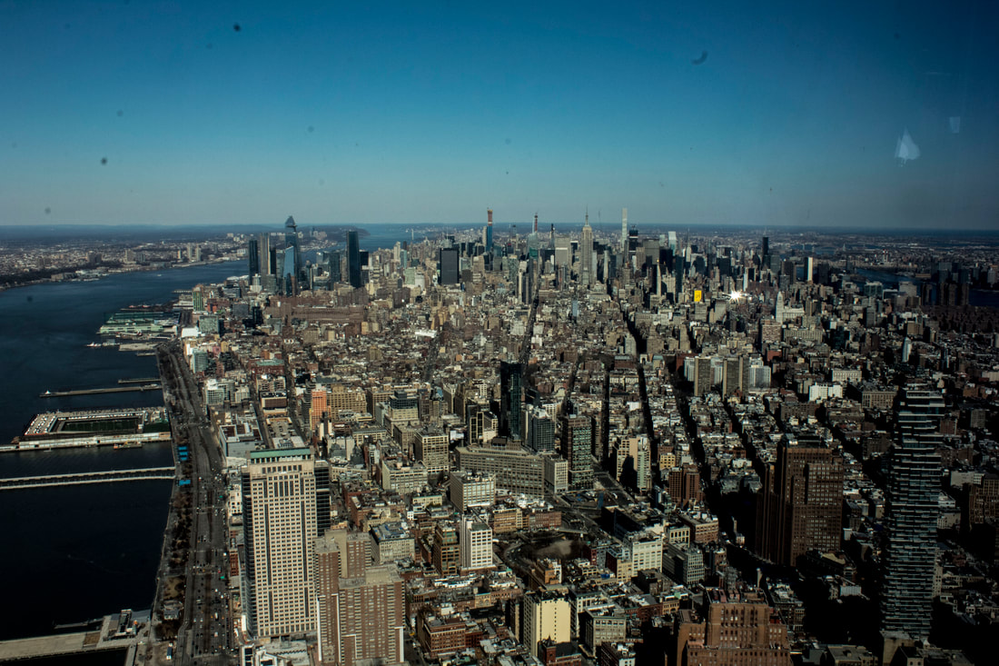
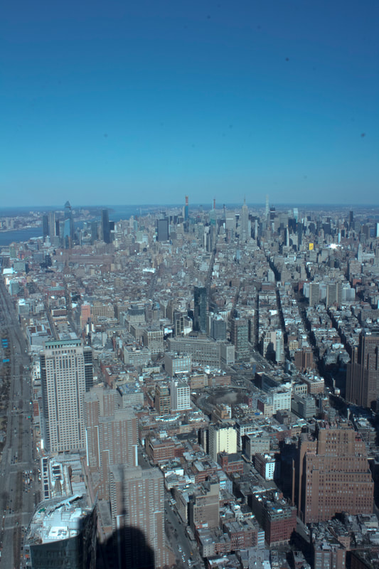
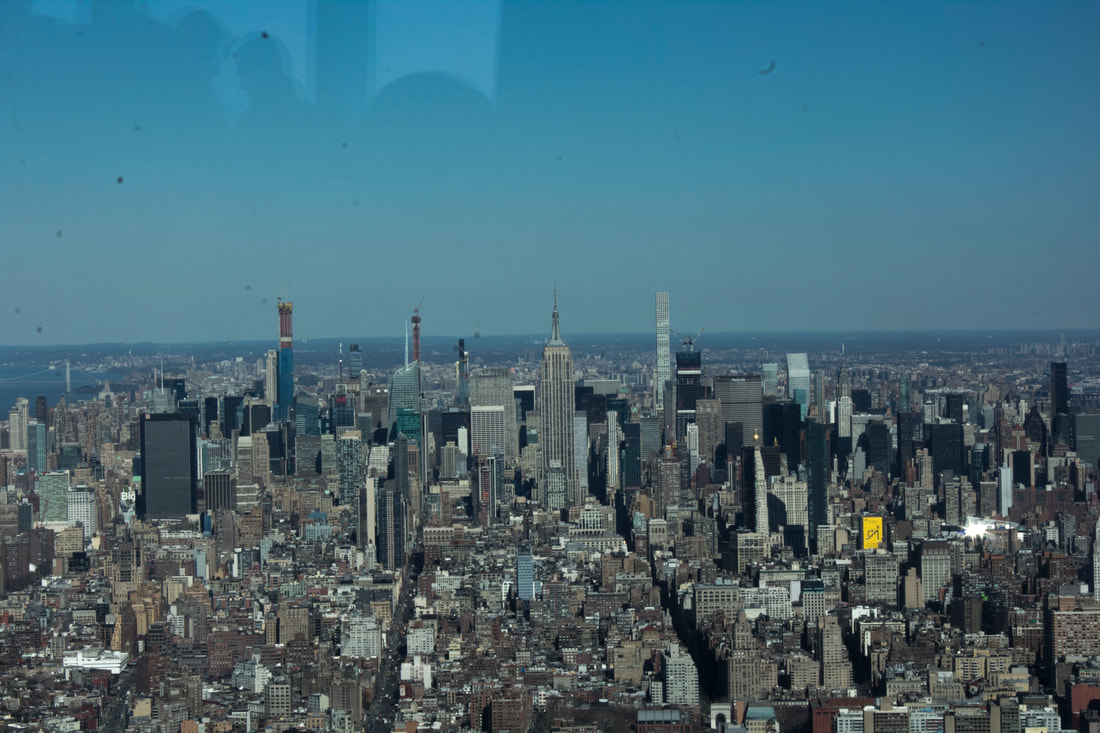
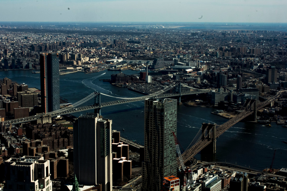
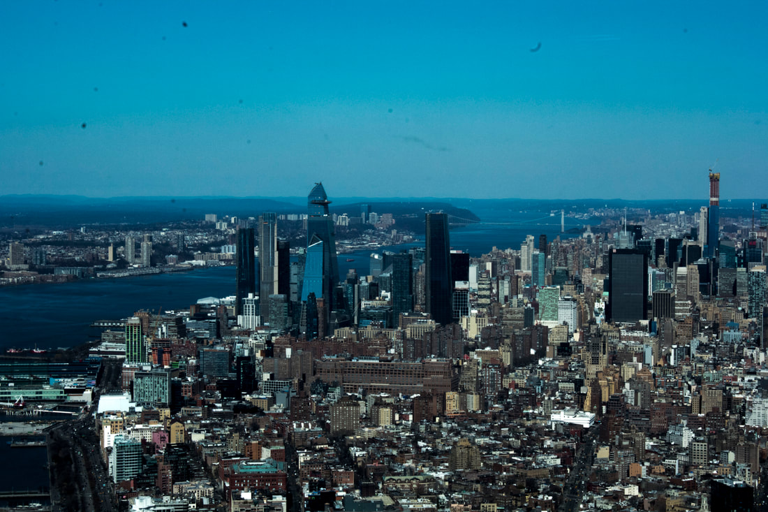
While away on holiday in New York i was tasked to take pictures of cities in different ways, to produce a variety of photographic processes. We were also tasked to find locations that are similar however in some ways are different this could be taking the pictures and then changing them afterwards using chemicals or using photographic post production.
|
|
|
|
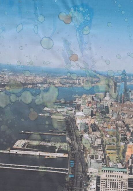
My response
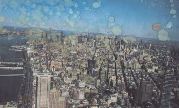
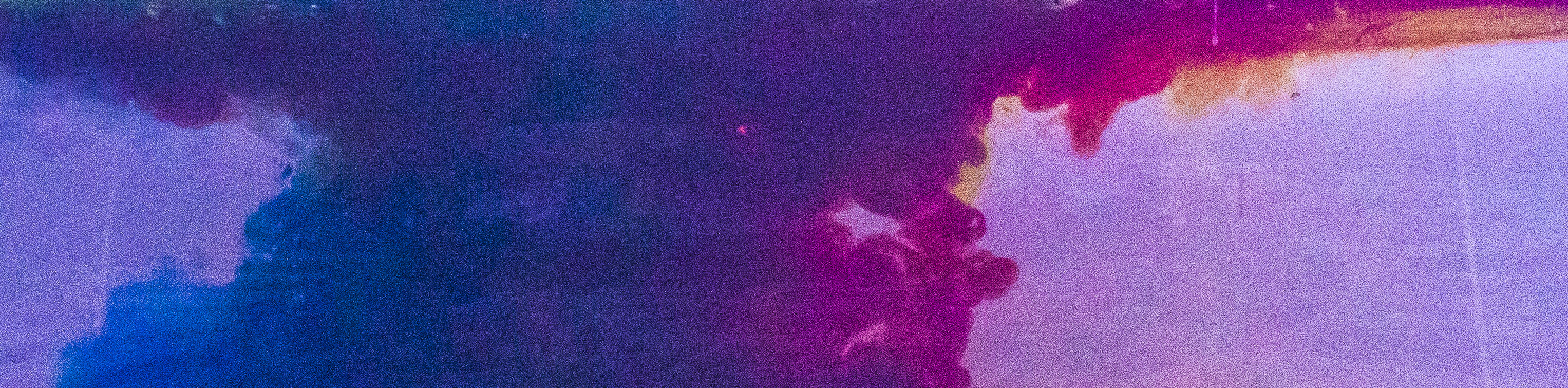
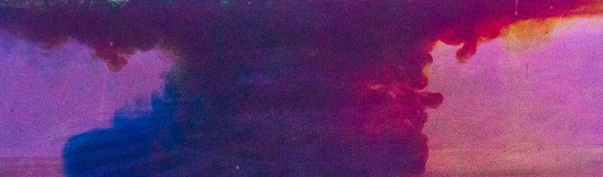
Using the work from Antony Cairns as inspiration I've made a these manipulated images using similar effects, a difference is the subject whereby the pictures are in the daytime and his are shot at night time. To make these i flicked using a paintbrush bleach and certain inks onto the paper and left it to dry which left me with a picture that had manipulation marks on it.
Ways to improve these pieces could be to after they had dried add more layers of complexity in the use of bleach and other chemicals however its important to try and keep the subject recognisable for the viewer. |
|
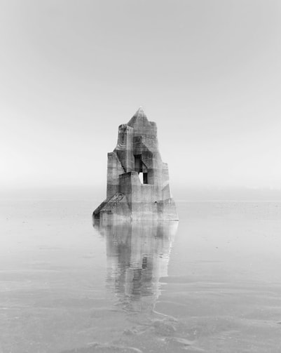
ralph eugene
Learning to See ‘No-Focus’ (2011)
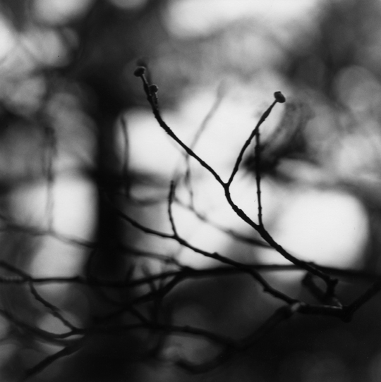
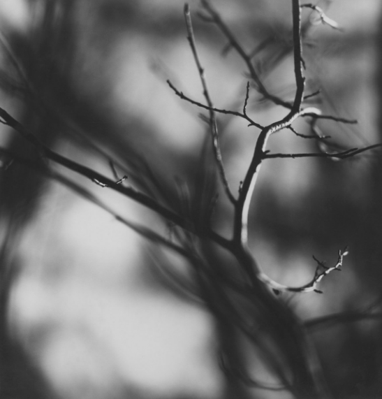
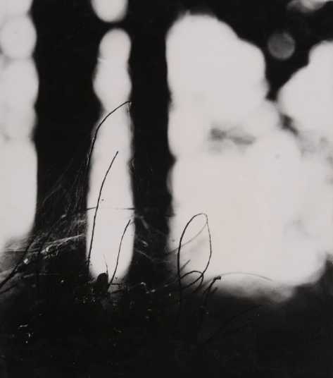
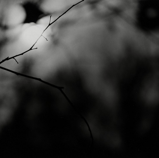
Meatyard eliminated the idea of having a solid colour background in front of the main subject and looked only for the background, which he would then throw out of focus. Eventually, feeling that the background was still too recognisable, he abandoned this practice and began to contemplate his surroundings through an unfocused lens. He would then wait two or three months before developing the negatives. After that interval, he was no longer able to identify the scenes or objects, this is successful at creating variations of reality while also solving the issue of a solid state background feature.
|
|
|
|
Variations and similarity in Focus
We expect images to be in focus. However, how do we respond to an image or a place when it is out of focus? Does it suggest something else other than the object/subject being photographed does the variation in focus take away the similarities of a location or add to it.
Variation and Similarity in Landscapes
Kevin McGloughlin
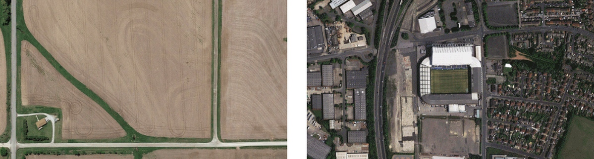
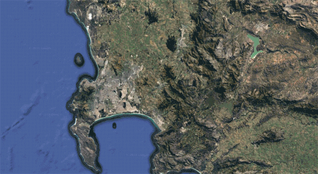
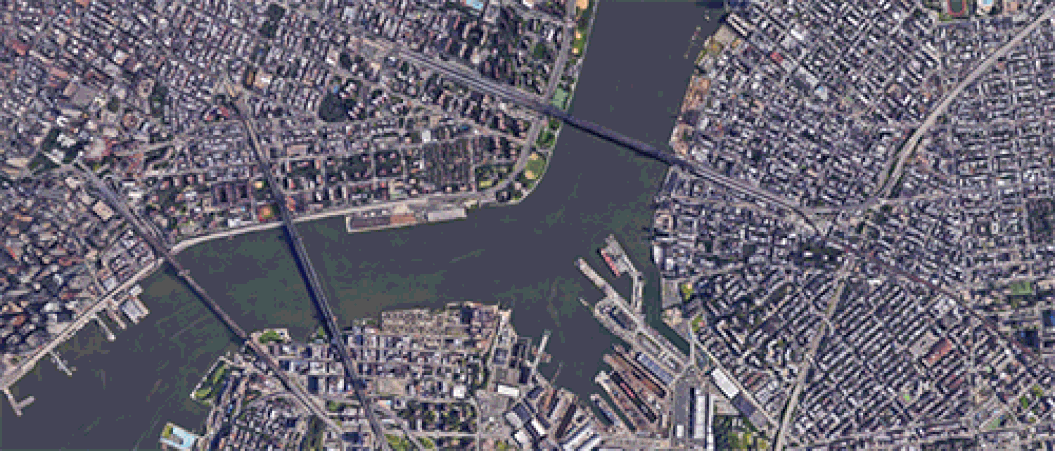
Heres a screenshot from one of his animations, his technique was to take screenshots from google maps and then compile them into gifs to create a motion for example the right one is a complication of loads of football stadiums from different places once lined up the subject the surroundings all change around the stadiums but the grass in the middle remains stationary i like this bird eye view that they've gone for it allows you to see all the similarities and variations in the city.
MY RESPONSE
Heres my response to his work, the left animation i made badly because it only repeats its self once, the animation to the right i wanted to change up there technique so using a 3 dimensional street plan i was able to create this animation by using screen shots. I like this approach because it shows a variation of the techniques that Kevin McGloughlin used.
|
|
|
Variations in layout and part
|
|
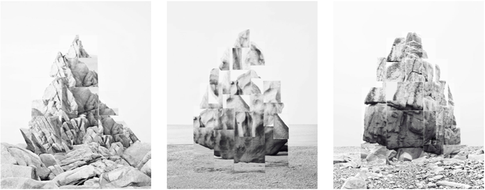
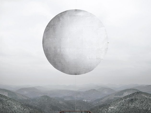
photographs and films as dialectical images, wherein close proximities of truth and fiction, real and imagined offer new perspectives into the photographic canvas. The artist questions the potential of the image as a whole, reconstructing its layers and possibilities of extension, through landscapes’ installations.
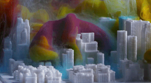
Her First step is to create the photo constructed rock-formation or planet and print it onto a foam or cardboard base then set up the scene where by the image looks photo realistic In the frame this required photographing the image at an angle or so that the image no longer looks like an image but instead a real object blending in with the scenery or showing reflection in the water helps seal the illusion that it is a real object to building. |
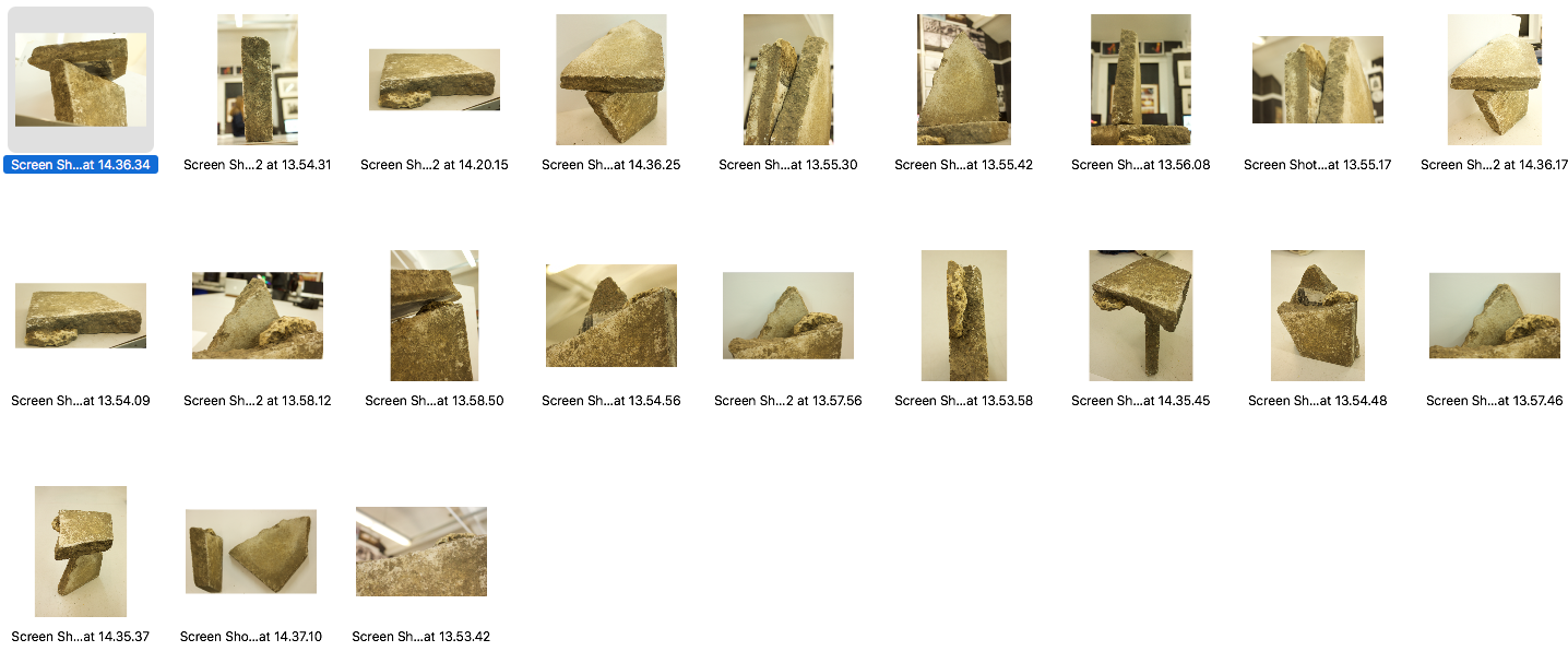
Step 1 was to take a collection of pictures that were of similar objects or building components and then in photoshop to ressembol the pictures to create a similar building and or structure to NOÉMIE GOUDAL’S work. While taking the pictures I wanted to be looking up at the rocks this would be so during the editing process the building would look a lot more realistic when photographing in the wild because the angles will represent as if your looking up at a building.
Don McCullin
|
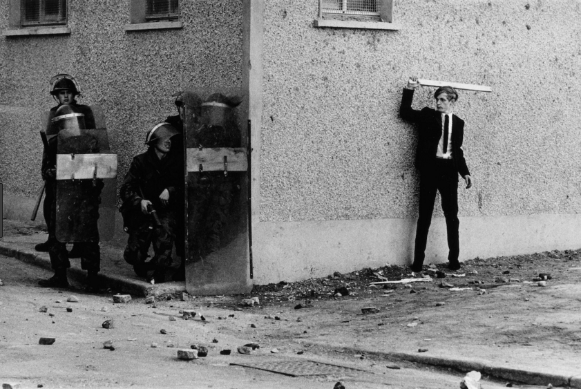
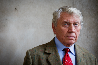
Don McCullin is known for his impressive skill of being able to compose his pictures really well he has a keen eye to what will look good and what will look bad before taking the picture, you can se an example of this from the picture to the left which was taken in Finsbury park this picture was one of the first that got published into newspapers inspiring him into a 60 year long career of photography. This picture is one of my favourite because of the composition and because of it backstory.
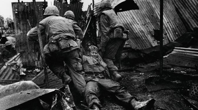
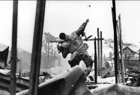
Don McCullin has been a photographer from all over the world hes travelled everywhere from the Belfast conflicts in Ireland to the conflict of Syria and Vietnam. However he doesn't like to describe himself as a war photographer, he says he just wants to take pictures of things that interest him while capturing an emotion or a dramatic feeling. For example the picture to the left which is of the Belfast riots the picture directly shows the conflict while showing both sides perspective around the corners, he develops all his prints and takes a lot of pride in using a tradition darkroom. |
|
|
These pictures above are from Vietnam the picture to the right is especially dramatic because he states that seconds after the picture was taken of him throwing a grenade in his own description his arm was turned into a cauliflower from an ermines bullet, this must of been very dramatic and horrifying however the picture that was taken shows a different perspective before the injury happened making most views clueless to what happened outside the frame of the picture this adds depth to his work and shows the Horrors of war though a lens of a camera.
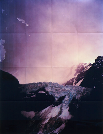
Adam Jeppesen
|
An important part of Jeppesen's work is his labour-intensive approach, his photos are the product of physical challenge and experimental printing techniques. He abandoned the idea of a perfect print in favour of cheap reproductive techniques and mass production.
Coincidence, damage and imperfection are essential elements in his work. At a time when the image has become infinitely perfectible and reproducible, Jeppesen experiments with the photograph as a unique object that is subject to the forces of change and decay. |
|
My response
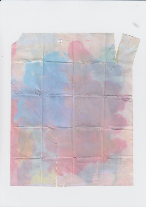
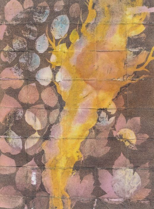
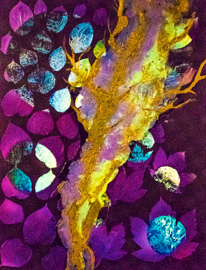
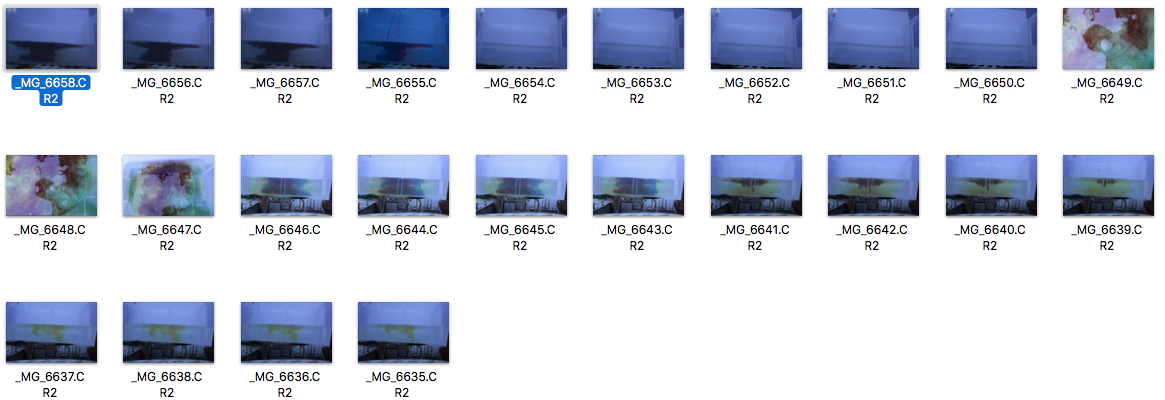
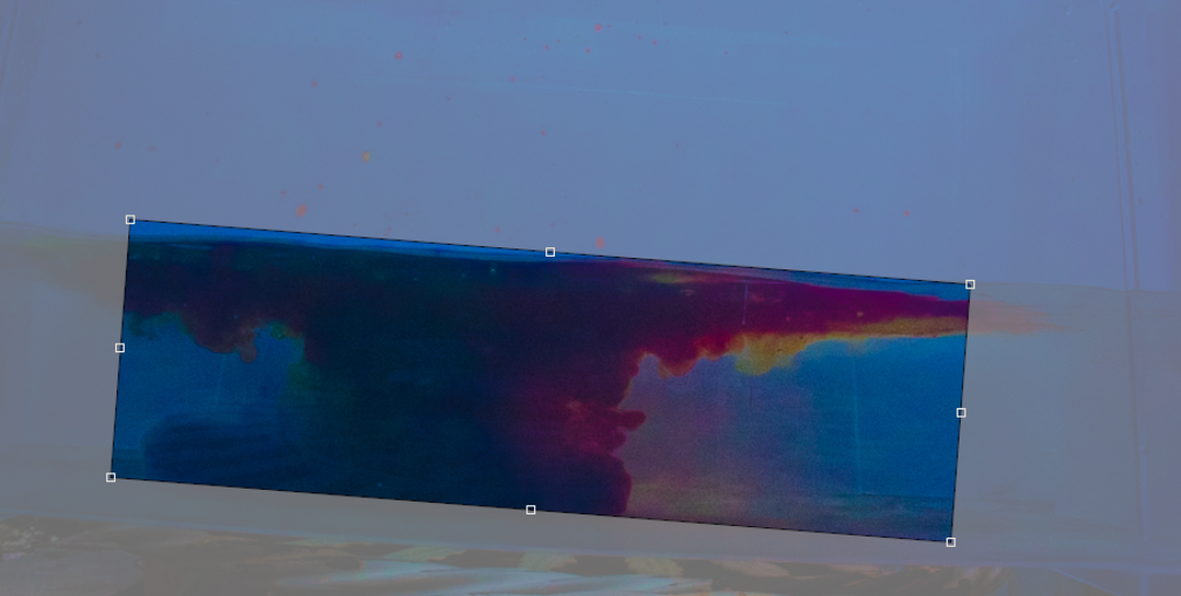
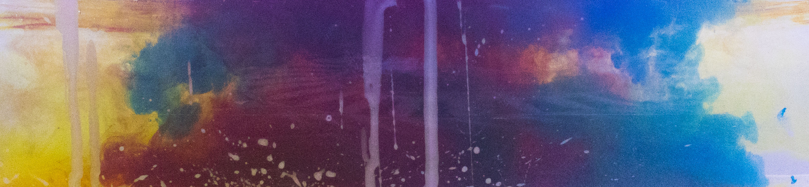
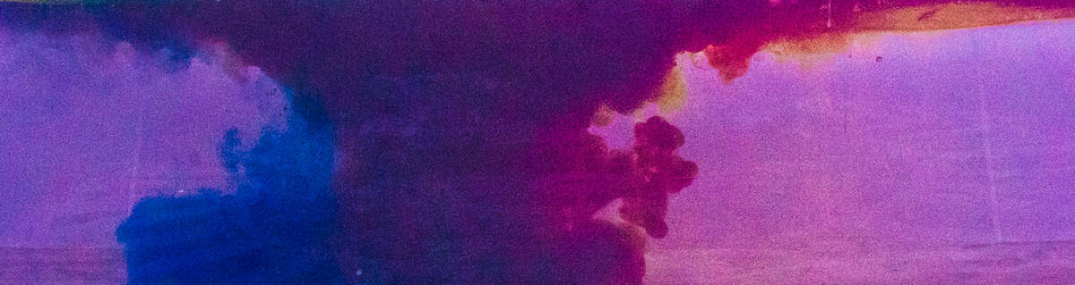
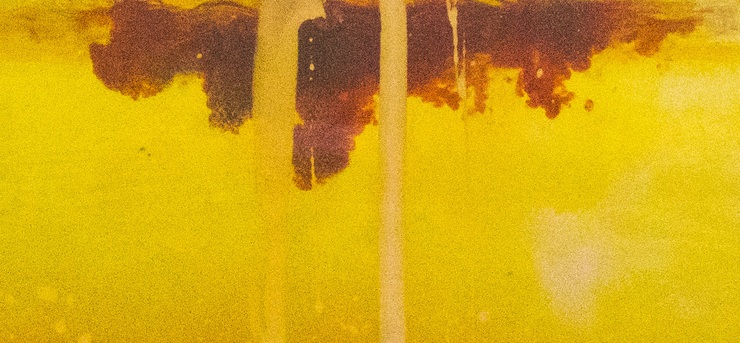
Ive taken the work from Adam Jeppesen as inspiration and then made a few images that include his folding technique and style however i replaced the images with those from later developments, this shows not a development from my main pictures but it shows how i am thinking of other ways to manipulate photos to produces different effects though printing techniques. Adam Jeppesen series includes more of a mountain ranges and landscapes with a lot of negative space around it, this i changed instead to be pictures of ink squirted into water. Then once i had printed them i put them into water so that the ink would leach out a little to achieve a more pastel look. I like these pictures because its about looking at the imperfections of the printing process and then keeping them in the final product.
|
|
|
|
To the left you can see how i have used the same style and printing techniques and you can see how i have folded to paper and porously made imperfections along the fold lines using a pencil. However the first step was to print the image below out onto paper and then let the paper sit in a bath of water to leach the inks a little so that the image would become less vibrant i also achieved this by the use of a small amount of bleach and a few different coloured inks, after looking back at the effect and comparing to Adam Jeppesen i think this work would look better when its more vibrant like the purples in his folded series.
|
Strand 1 : NIght Photography
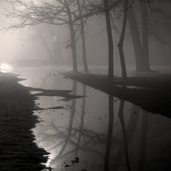
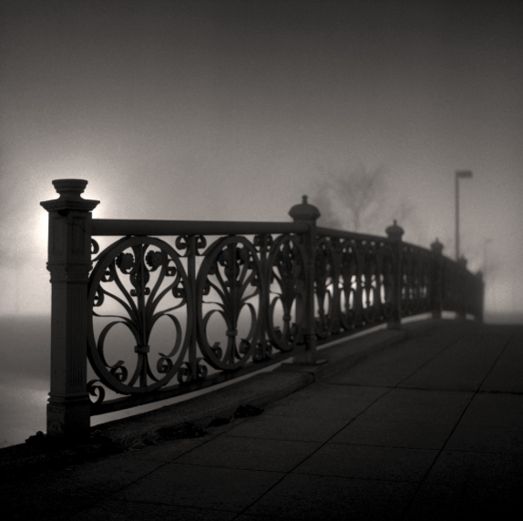
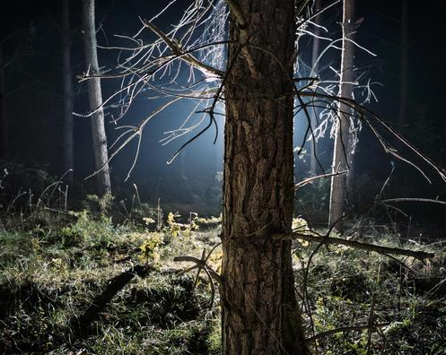
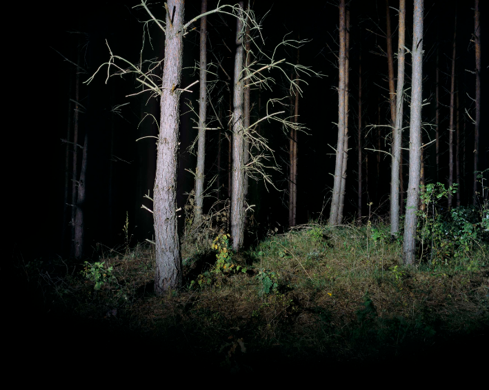
Bill Schwab
|
|
|
|
Bill Schwab is known for his emotionally charged yet peaceful urban and natural landscapes. His photos are well known for his foggy atmosphere he achieves an impressive immersive nature to his photos where by it feels like you're there in the shot, this is enhanced by the dramatic black and white that shows elements of straight photography. Where somethings are in perfect detail others fall into a distant fog this is where his photography differs from straight photography and instead falls into more of a dramatic photography style.
I like this effect because it shows a lot has been thought about when creating/taking these pictures from aperture, atmosphere and composition are just somethings Bill Schwab photos are famous for, therefore when I go to take my series/responce to his work I will ensure that these aspects of photography are achieved in a similar way to how its shown above.
I like this effect because it shows a lot has been thought about when creating/taking these pictures from aperture, atmosphere and composition are just somethings Bill Schwab photos are famous for, therefore when I go to take my series/responce to his work I will ensure that these aspects of photography are achieved in a similar way to how its shown above.
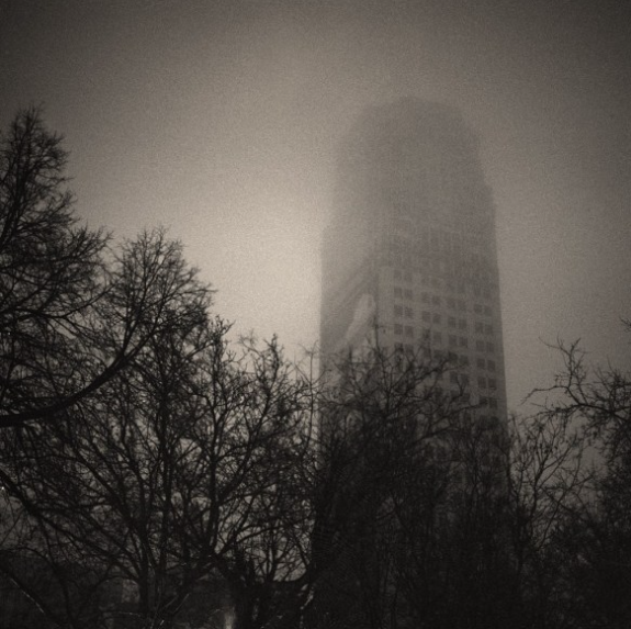
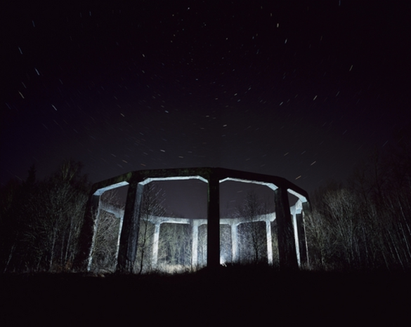
SZYMON ROGINSKI
|
|
|
Adam Mazur (writer for various art magazines) wrote: "In Rogiński’s photographs, the Poland of the transformation period is a dark, unsettling, sometimes grotesque country. Some shots are reminiscent of stills from horror movies and thrillers, but also tie into the hallucinatory aesthetic of computer games. Visionary night views show Poland from an amazing new angle." I agree with this observational quote because it directly describes the shots above i think this atmosphere is achieved by the use of very black contrasting the daylight bulb light which is reminiscent of the light from the mood rather than the warmer light of the sun this helps exaggerate the night photography theme and makes a more horror looking photo like Adam Mazur says about his work.
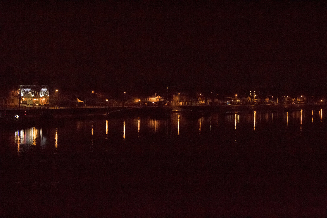
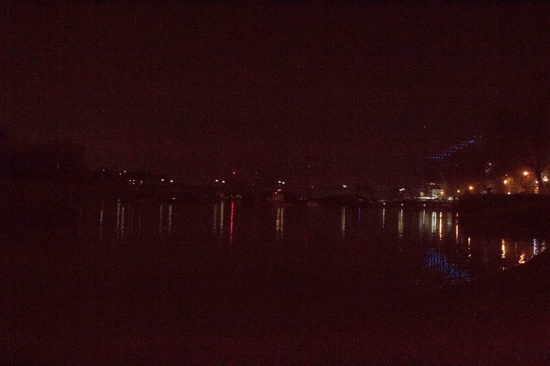
My responSe To night photography
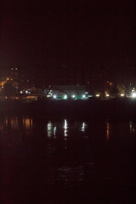
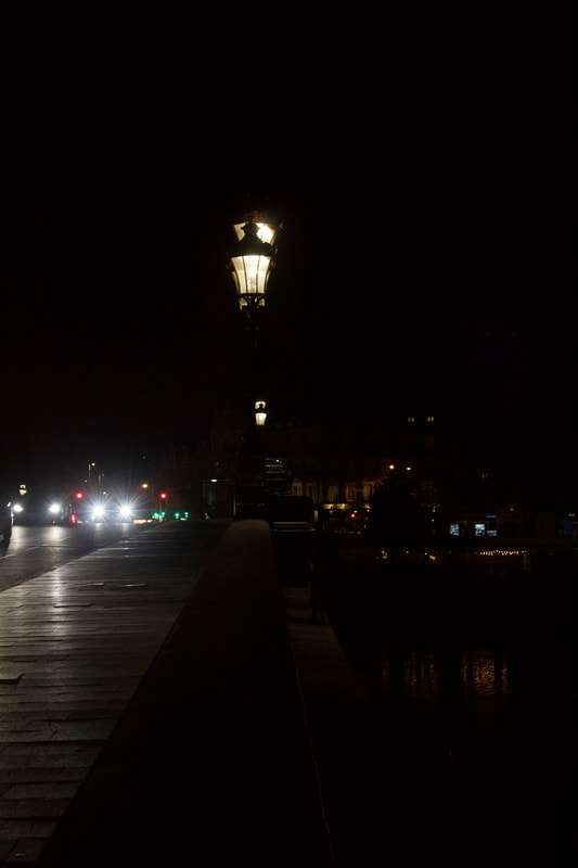
For my second strand i will focus on night photography, in particular reflection of light and contrast of light and darkness. SZYMON ROGINSKI's work shows a correlation between light and dark in a different style however the main theme of having light be a main focus of the picture is something i want to include in my future photos. When i go out to make a response to night photography i will take into mind that a good night photography photo includes a good contrast between light and dark this could be amplified by a reflection of some sort in water; this is similar to BILL SCHWAB's work as he also combines night photography with the reflection of scenery or light in the water.
|
|
|
|
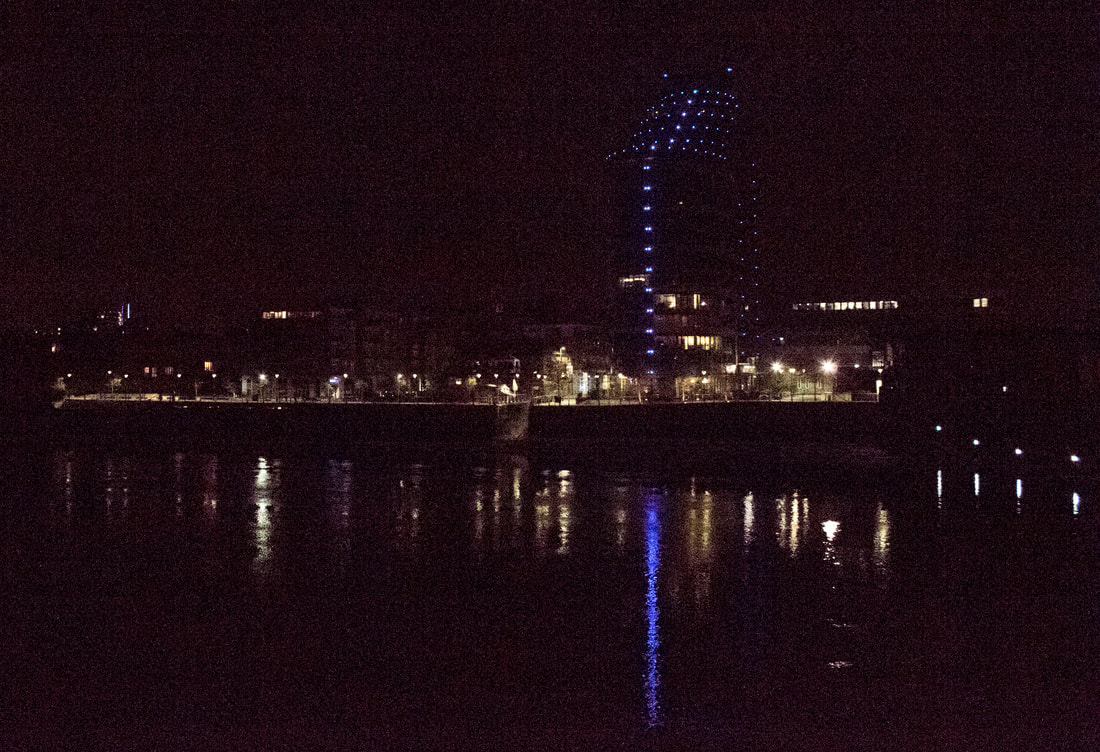
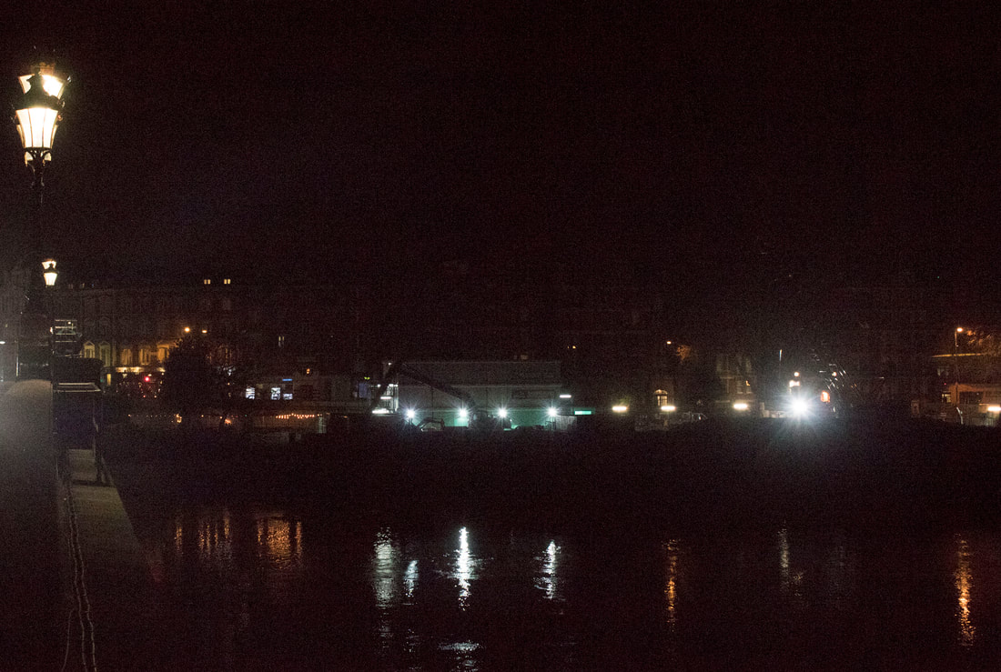
After taking these series of pictures and editing i found some easy ways i could improve such as using a long exposure and a tripod to capture a more accurate photo in the sense if a cleaner example of where the light source is coming from and capturing a lot more detail from what the pictures are actually off.
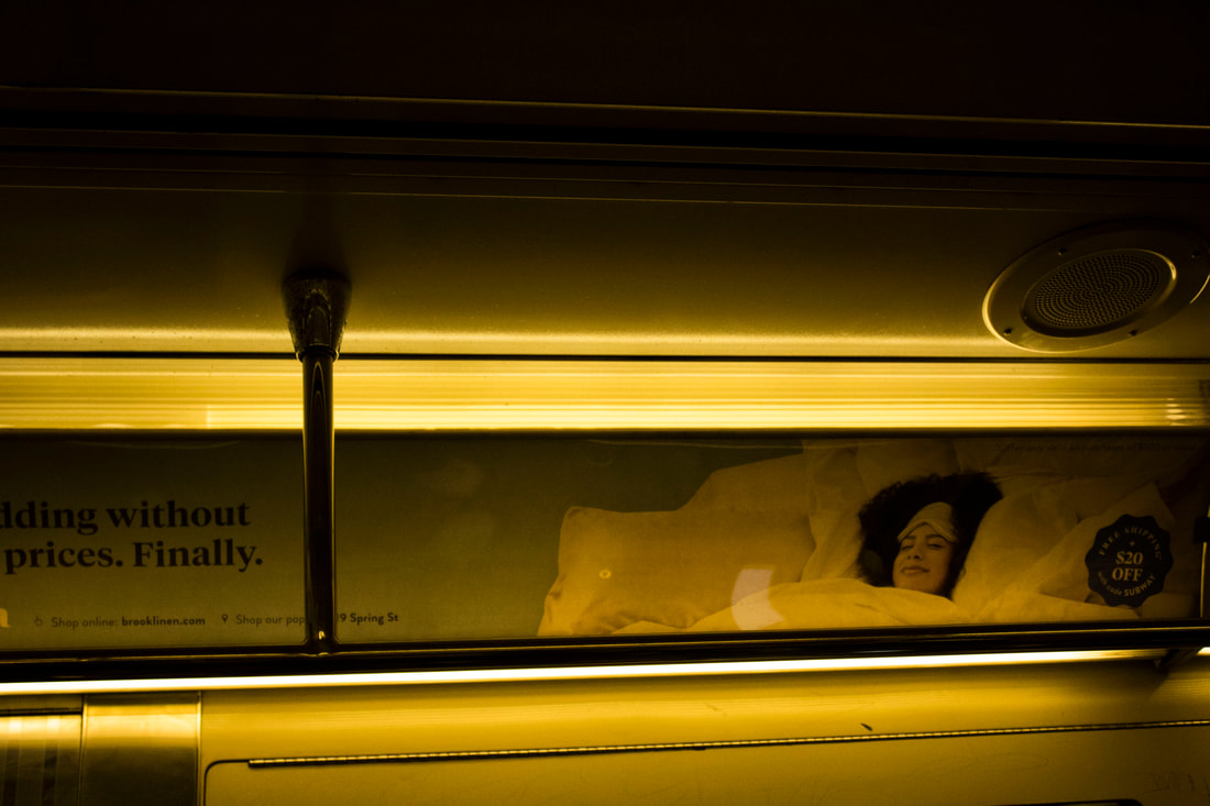
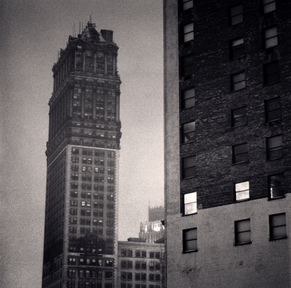
This picture is from New York in the subway i like this picture because it shows good contrast in lighting while remaining quite a simple subject off just the lights on the subway.
Strand 2 :
Strand 3 :
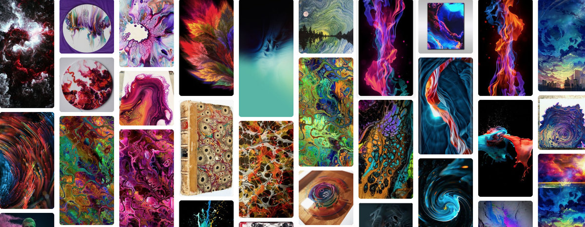
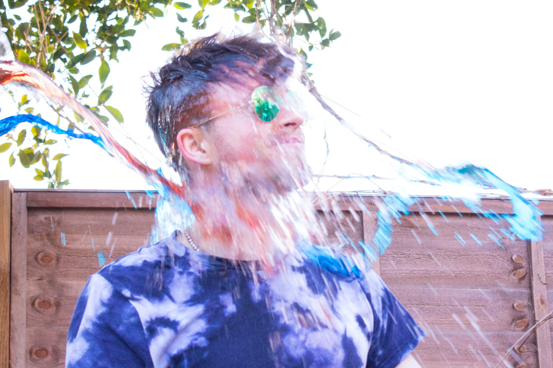
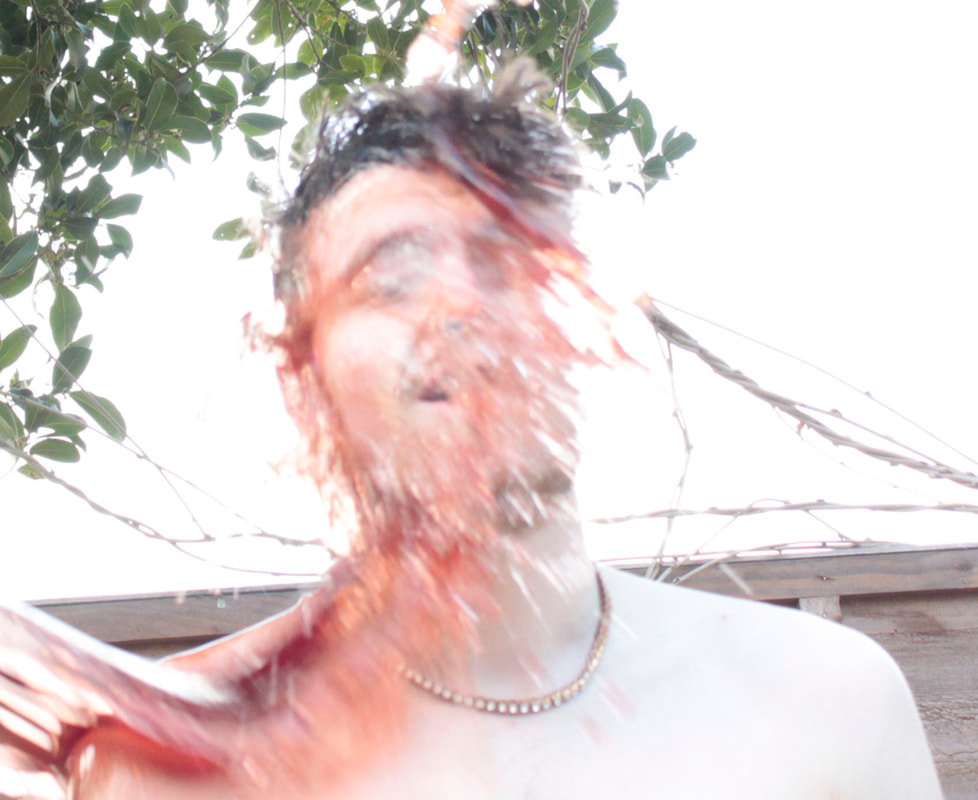
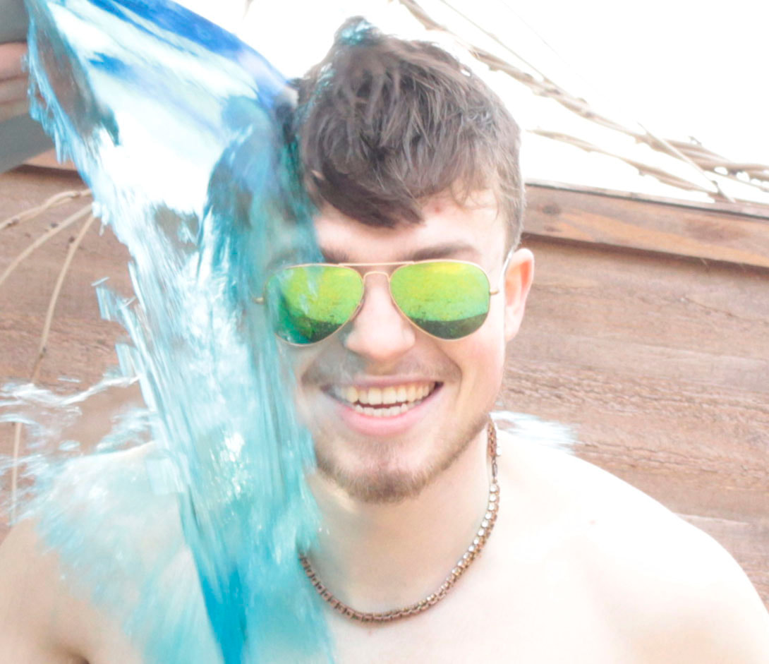
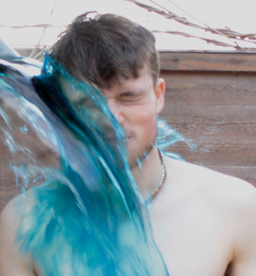
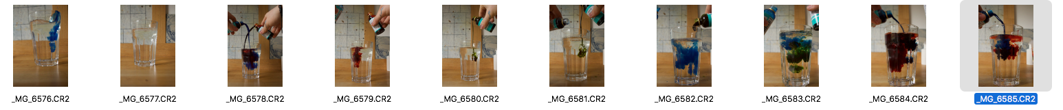
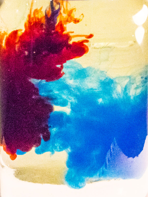
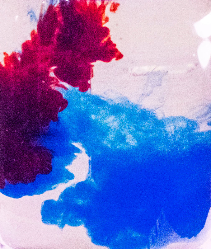
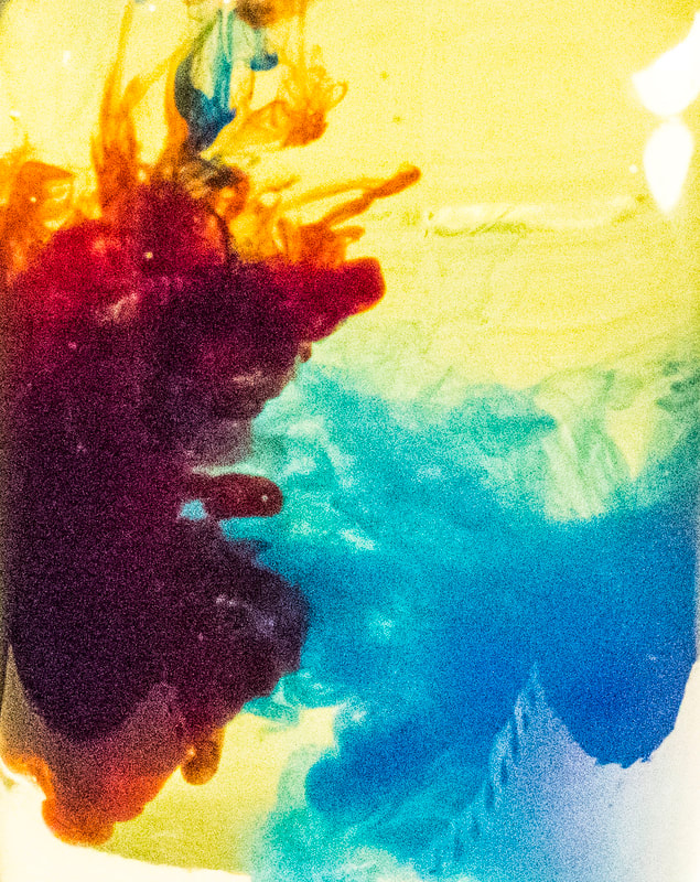
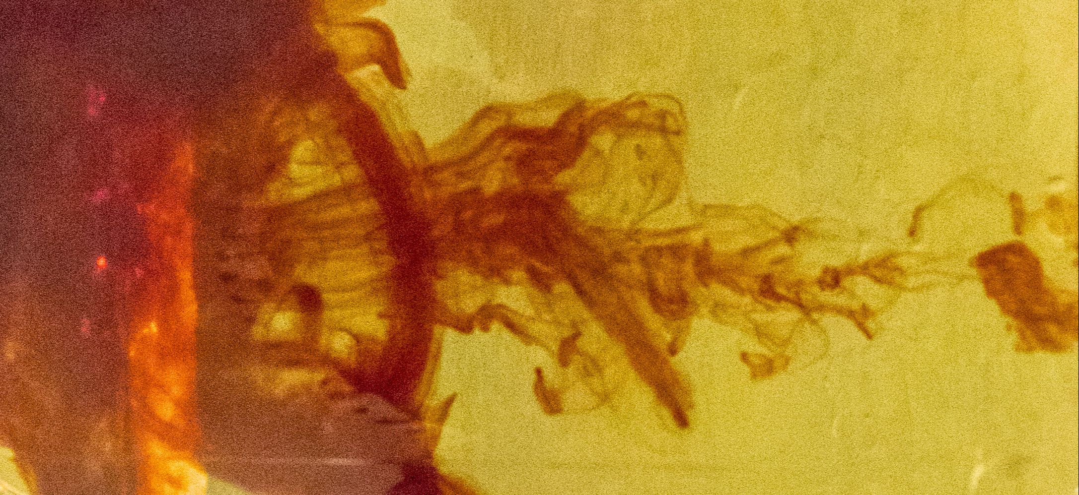
THROWING COLOURED LIQUIDS INTO EACHOTHER TO CREATE A SPLASH
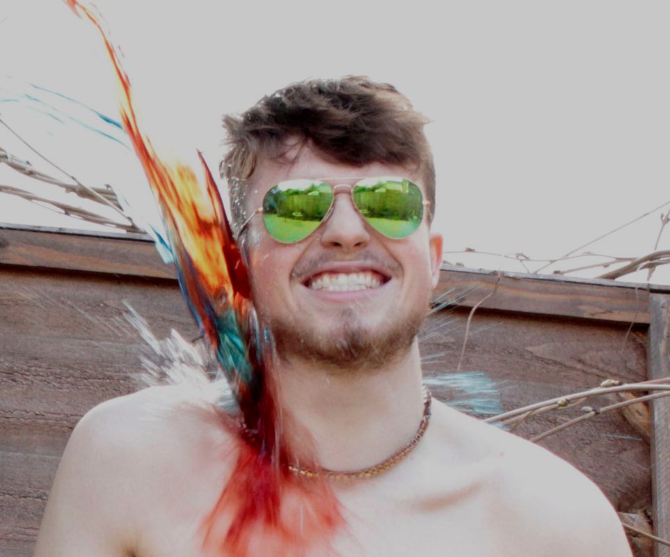
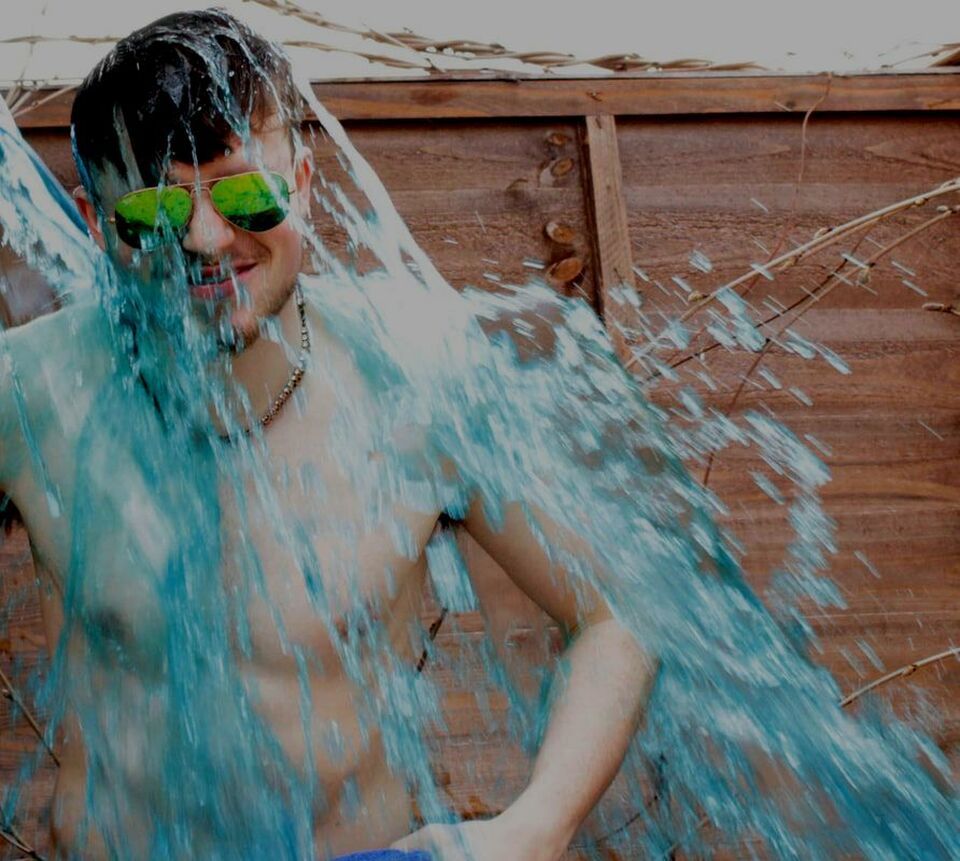
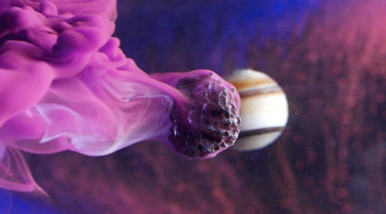
For this strand I decided to use variation of colour combined with motion of water and how two colours combine in motion to create a picture for this I will need a subject so I will get my friend to throw the water onto me, however the main subject of this strand is the water and how it looks for a picture in mid air or how the two colours interact with each other when they hit each other in the air. Ways I could develop this strand would be to remove the subject "me" and have a black or white solid background. While I was taking this set of pictures While colouring the water with dye I noticed it produced really interesting shapes in the water and pattens and water motions while the colour got dyed if I took pictures of this it would resemble variations of colour which is my aim.
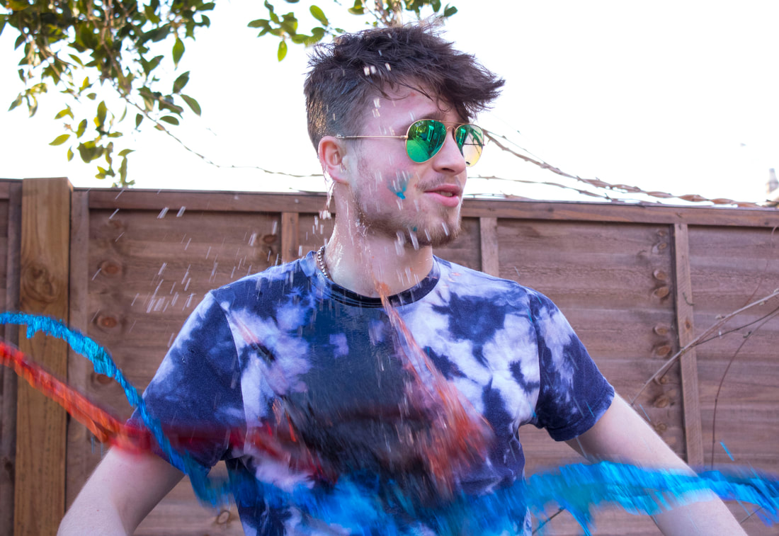
WWW. I like these top 3 pictures because they were some of the last pictures that I took out of the series so at this point we had developed the throwing technique this can be seen when you compare these photos with the photos below which show a lot more experimental techniques and a variety of ways the water was thrown.
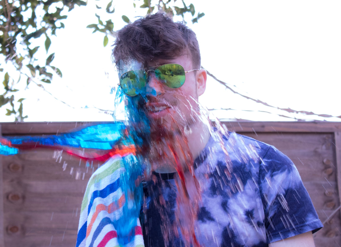
EBI. An improvement I could make would be to have the water be thrown at me from 2 different directions, this would require another person to throw however if you observe the bottom pictures it is obvious that they would look better if another colour was thrown in a different direction creating a centre point where the water collides.
EBI. An improvement I could make would be to have the water be thrown at me from 2 different directions, this would require another person to throw however if you observe the bottom pictures it is obvious that they would look better if another colour was thrown in a different direction creating a centre point where the water collides.
I have altered the contrast and brightness slightly on the top two images. You need to edit them more- they are over exposed. This shows you could have also got away with a much faster shutter speed which would have helped you to capture the water in focus. Exposure, shutter speed and a better background need to be considered if you continue with this strand.
|
|
|
|
|
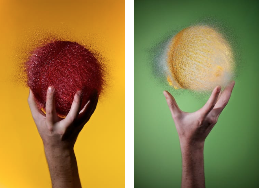
Edward Horsford

|
A series of experiments investigating how everyday objects look at high-speed. I really like these pictures because if how the water looks like its in solid state when its photographed another good idea that I want to replicate would be to hang the ballon from a string and the pop it and photograph it like these photos, in post production I would then flip the picture upside-down and it would look like an ordinary ballon but floating water in mid air frozen.
|
1st development
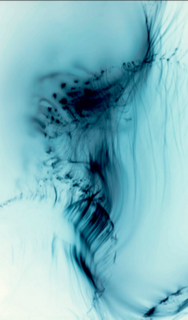
For my first development I wanted to experiment with the way coloured liquids (food Dye) react with water upon first impact. This would change the way I will look at future developments because after this development I will have an idea of how the colours react with each other, or what colours work best together working this out on a smaller scale like just a cup allows me to not waste much of the food dye. Things I need to take into mind before the development would be that its important to have my camera on burst mode and to make sure the camera is steady.
|
|
|
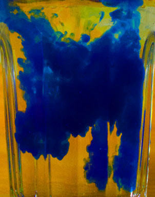
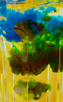
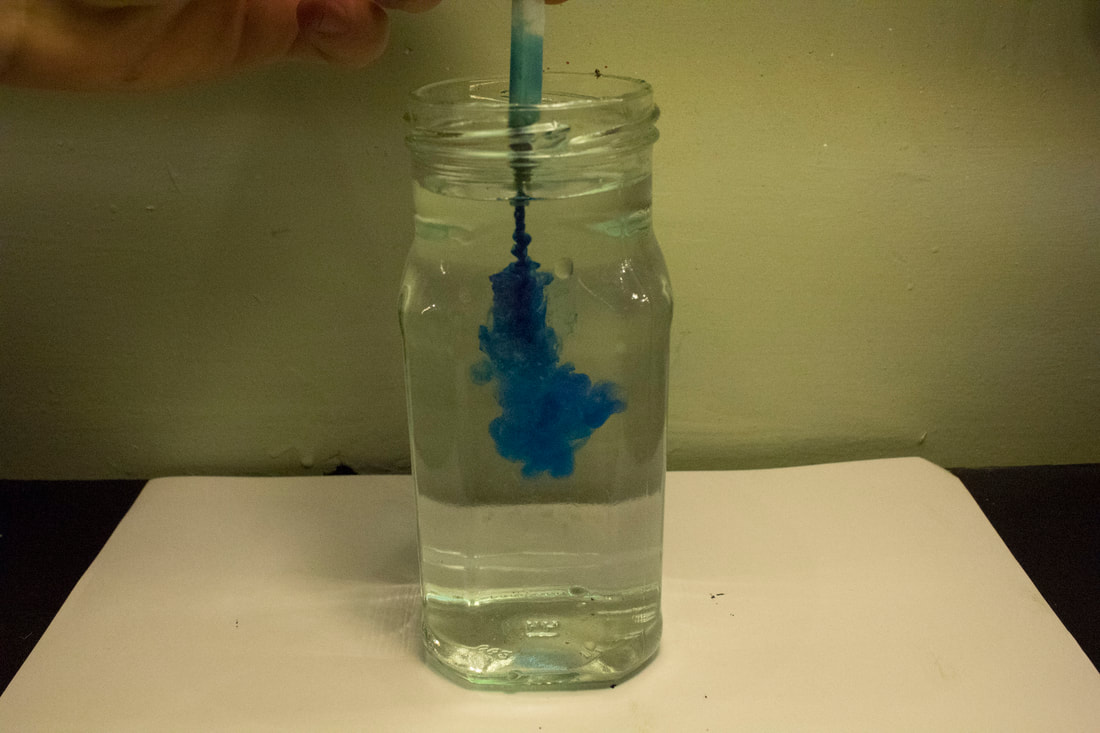
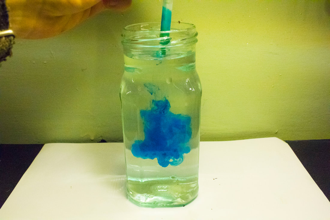
2nd development
For this development I want of replicate my first development however on a larger scale this will require a larger see though bucket to increase the size of the reaction area for the inks. I want to create variations by the mixture of different colours and though the abstract way water mixes. My first development taught me that i would be able to produce a better picture by using a solid background colour, and by using a faster shutter speed to capture the ink in its early stages of the mixing process.
Something i have noticed from this development are areas i can improve on for a later development such as: Deeper water will produce a better picture as i will get a larger/ deeper area rather than a slimmer picture, ensuring the water is clear before the next pour of ink is important because the contrast of the picture is a lot more interesting, the pouring method at the moment is hard to control i could make it easier by using a pipet to achieve a stronger effect on the waters surface and to control the amount of dye.
This image shows how i have cropped the image from the original picture, this shows the importance of using deeper water as it directly affects the dimensions of the final picture. This shows the importance of using a pipette or a tool to control the flow of the ink and the amount that hits the water at one time, sometimes less is more as once theres ink in the water i will have to refill the container again with fresh clear water so the background remains white for the final picture.
Another important note to take is to ensure the boxes surface is completely clean, a smudge line can easily break the illusion of the picture which takes away from the abstract nature, i also think its important to use a pipet because then there would be a more controlled direction of flow within the water. One more improvement would be to experiment with the lighting of the picture maybe a good experiment would be lighting from the bottom or from behind the camera or above the picture.

|
|
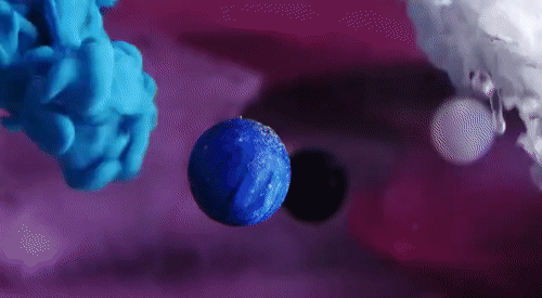
An idea for future developments would be to include a subject in the water such as a 3d printed components or something other than the water for the ink to react with such as a variation of a city, this would work well because a miniaturised city contains lots of different roads and contours for the water to flow around once the ink had been squirted to the bottom rather than just dropping it straight from the bottle.
|
|
|
|
I like this idea because its easy to change the subject this could be something natural like a flower or something man made like the Gifs above. Any experimenting is important such as dragging a stone though the water and into the ink could produce a wildly different effect, this is something i will experiment in later development as it will require me building a miniature fish tank. I could also suspend things in the "fish tank"using fishing line that wont show in the final picture.
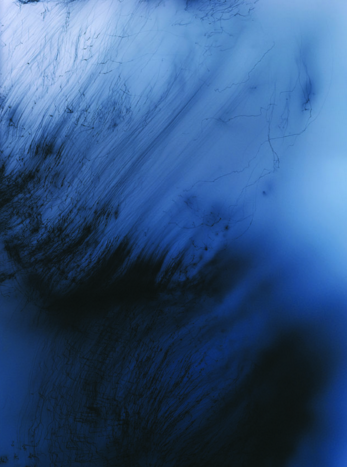
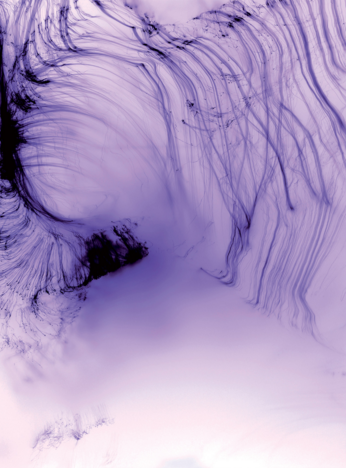
Wolfgang Tillman
|
|
|
Freischwimmer 186, which sold for £269,000 / $328,718, £36,000 higher than his previous record, is not a photograph, at least in the sense that it wasn’t made with a camera. Created in the dark room without negative and without camera, they’re made purely through the manipulation of light on paper. A quote i really like and and inspiration from is "After much trial and error to create a range of forms and colours, it is often strikingly simple.” This shows that its important to learn to control the media your working with to produce a developed idea, this is something i want to take note of to improve on my next development.
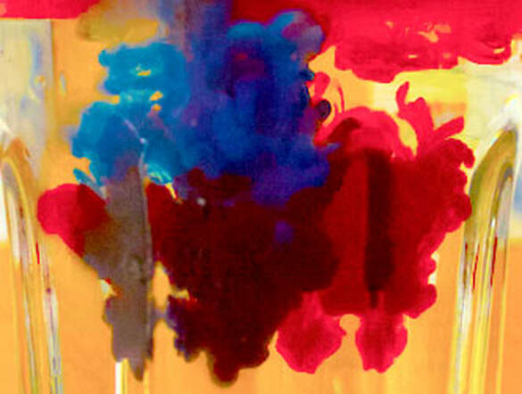
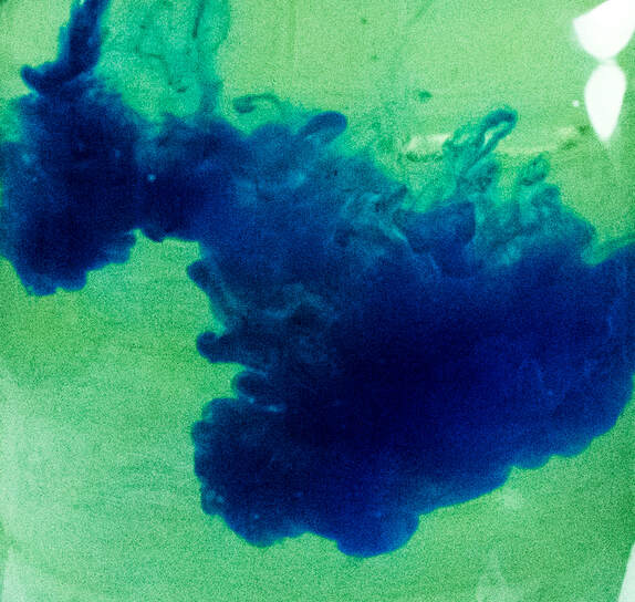
Development 3
For this development i will take what i have learnt from my second development and include the improvements:
- Deeper water
- Using a pipet
- using the correct lighting
- spend more time on control and use a faster burst on my camera to ensure i don't miss the ink in motion.
|
|
|
|
|
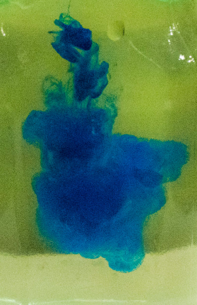
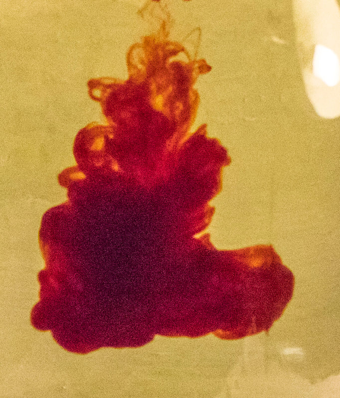
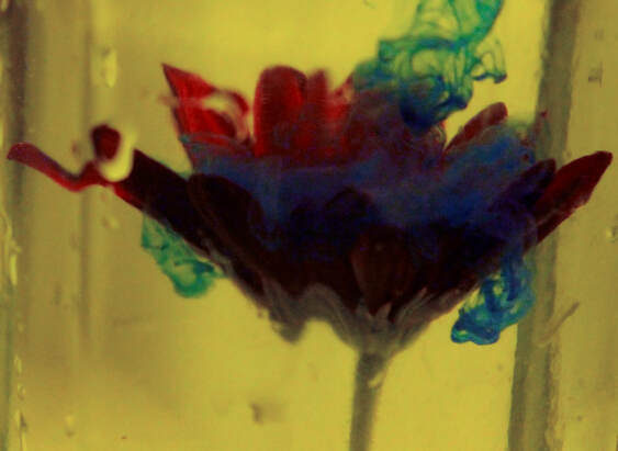
This effect i've produced with two contrasting inks is good because it shows how they react with each other in open water, the ink's represent variety because there is an unpredictability in the way they react with the water before completely mixing with the water. Something i do really like is the way the reds separate in the water to produce a yellow and red combination depending on where the ink is thinner or where there's a higher concentration.
|
|
Development 4
For this development i wanted to create a small version of what i plan to achieve on my final shoots to find the best flower structures and how the ink reacts with the subject as i already know what the ink looks like when it's suspended in the water however this could look different to what i expect so this development is vital.
|
|
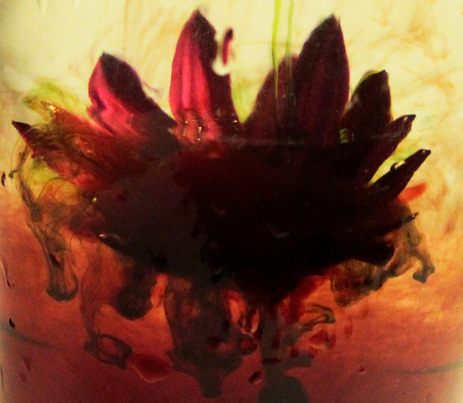
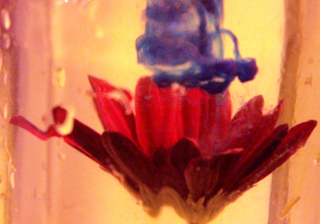
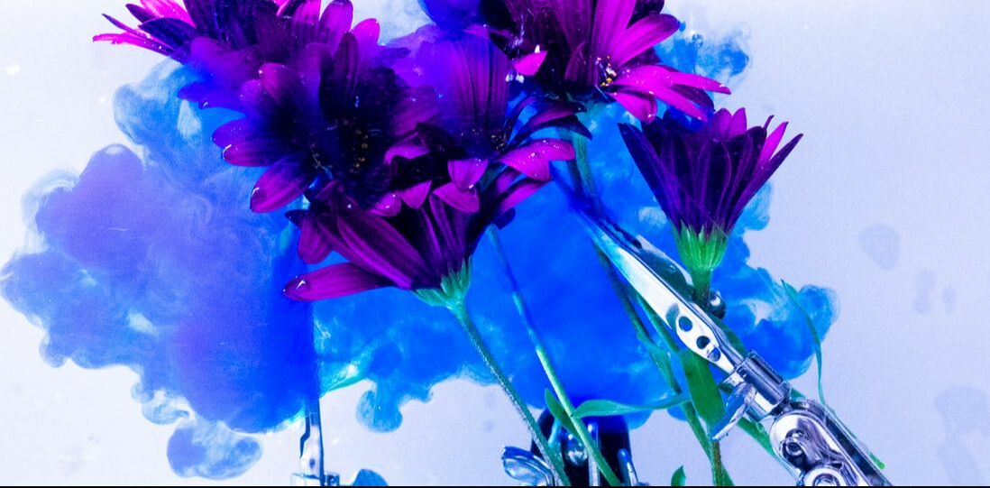
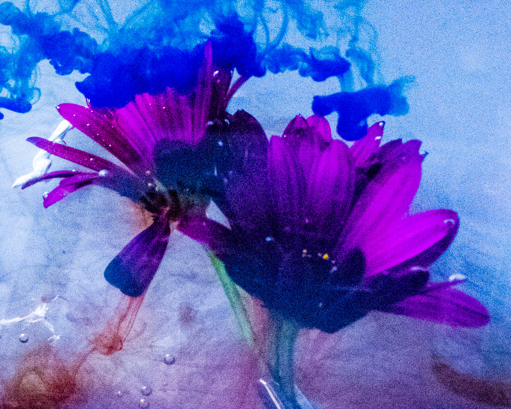
Choosing a subject, for my first subject i chose to use a small flower this looks good because when its in the water it is hard to notice that it is water that surounds the flower, this is an ideal prospect as it highlights the importance of the ink and makes the flowers seem like they are producing the ink rather than just in its way from the squirted ink.
|
Ways To improve
One way i could produce better pictures is by ensuring the device use to weigh down the subject (flowers) is hidden for the main picture frame. An idea is to use clips rather than tying and notting rope. Another Way i could improve is to have what i am shooting in front of be a flat surface like a see though box allowing me to photograph it from all angles as well as photograph from all angles as well. Another expanded idea is to have multiple see though boxes behind each other to create a double or triple exposed picture. |
|
|
Experimenting in post production
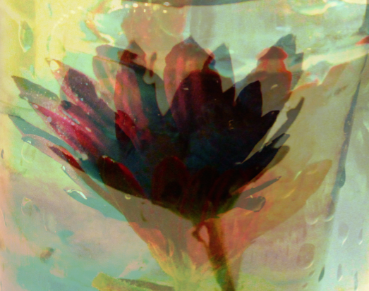
For this experimental picture I've layered 3 of the pictures over each other with a varying amount of opacity this produced an image that contains multiple angles of the flowers and multiple colours of ink squirted onto the flowers in the water. I like the theme of introducing more variety however I feel like I can achieve more by layering the jars behind each other rather than layering the final pictures over each other. This could be achieved by building see through boxes that stack next to each other allowing for more variation being introduced into the 2nd box that will sit behind the first, a challenge before doing this would be to ensure the ink gets squirted accurately and all at the same time. An advantage of a see-through box would be you can light it from any angle. |
|
|
|
|
|
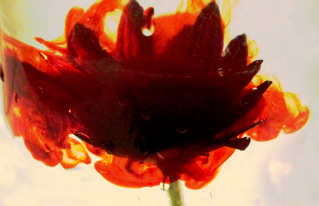
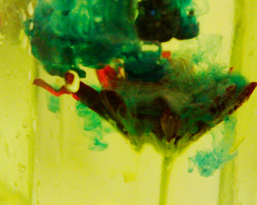
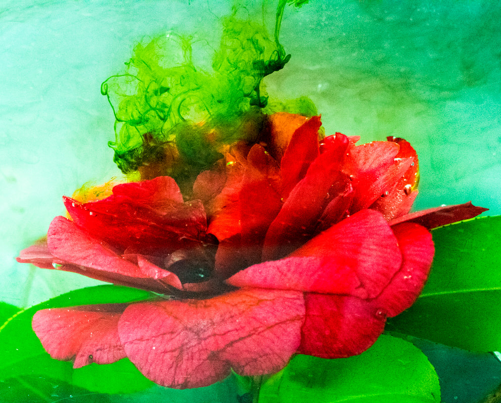
These cropped images show a close up of how the flower reacts in the water just after the ink is squirted onto the flower, i've adjusted multiple things in post production such as saturations and colour ranges. i really like the contrast element in the colours and the darkness of the shadowed areas such as certain areas of the ink in the water and how this conceals areas of the subject (flower's).
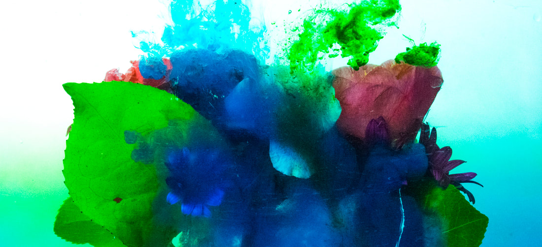
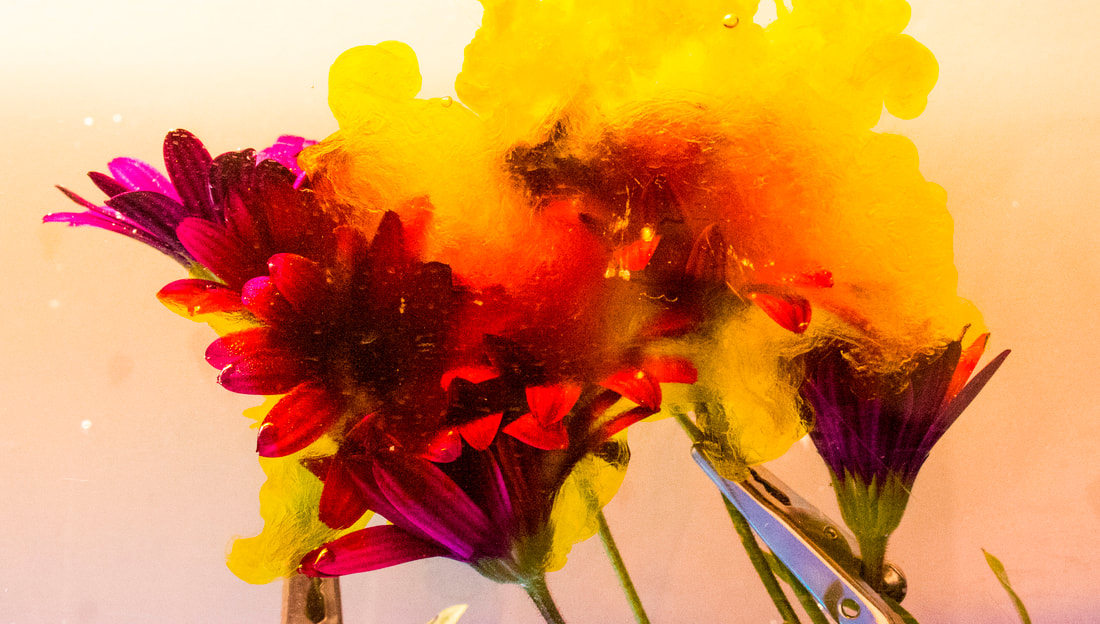
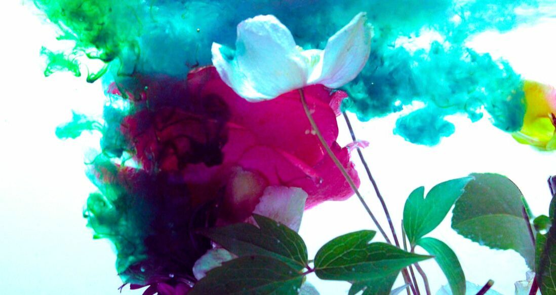
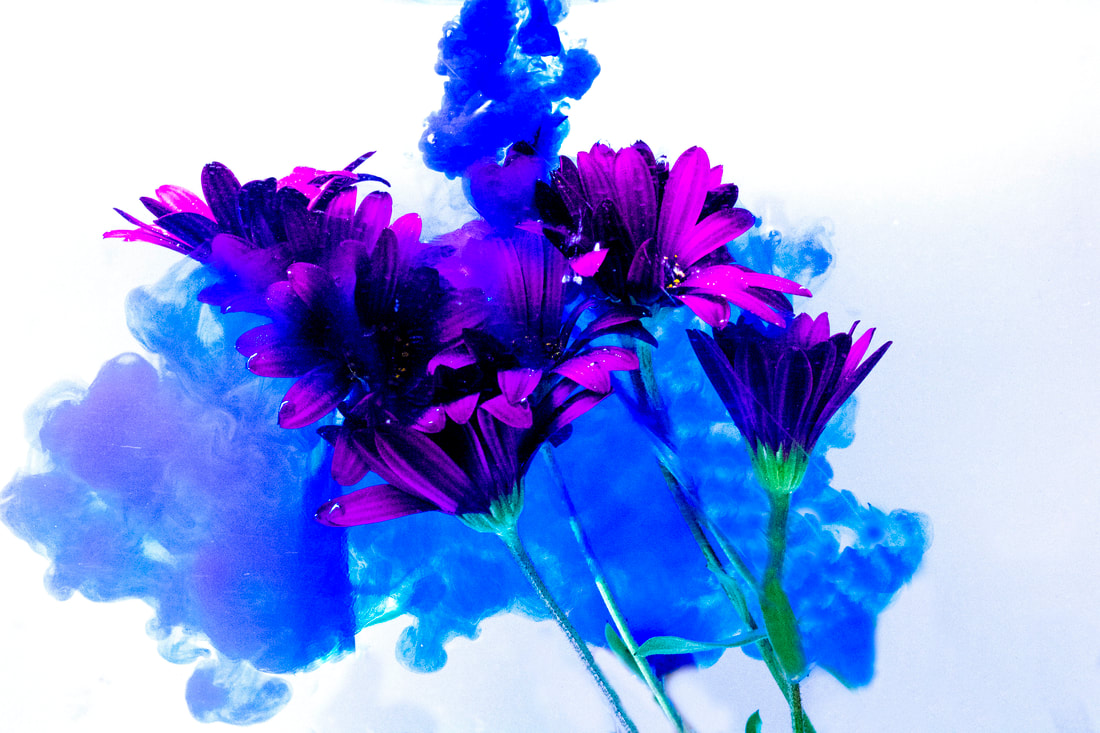
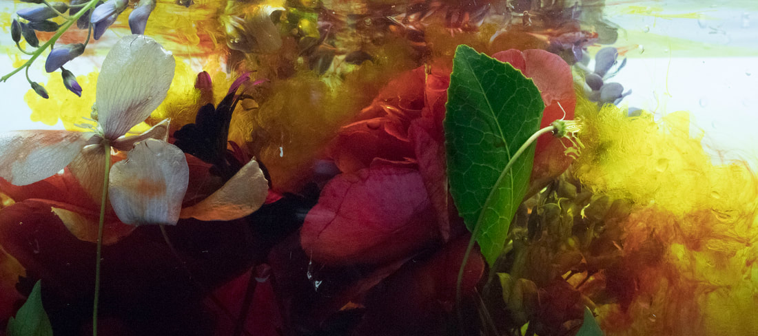
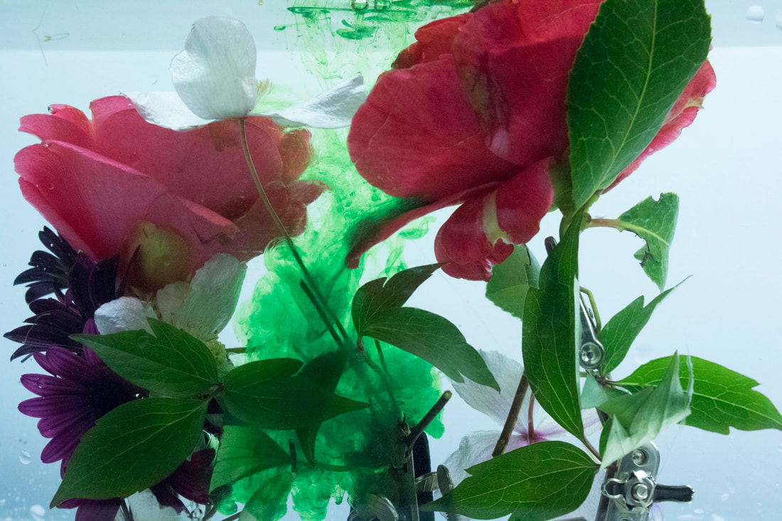
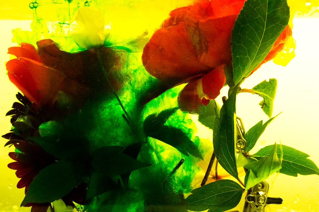
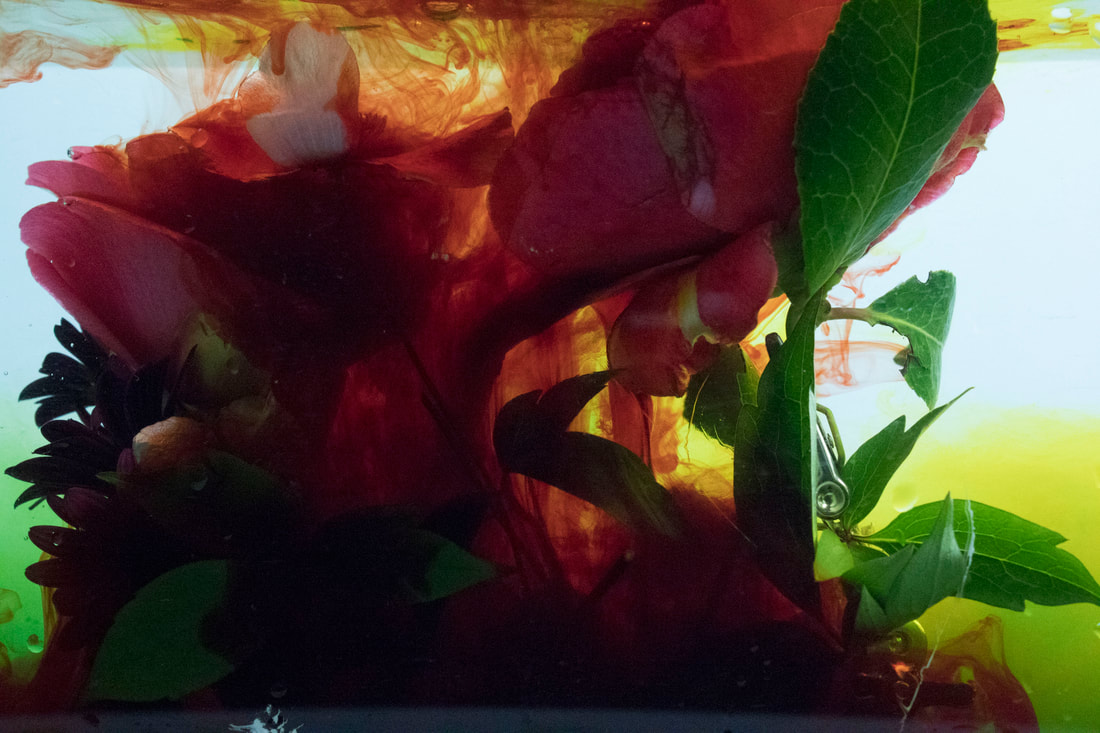
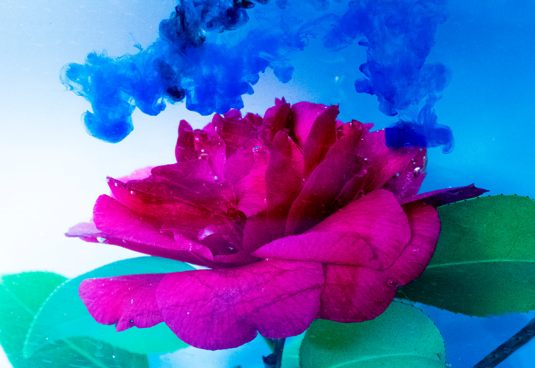
Final Shoot
|
|
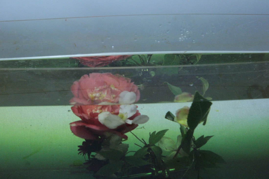
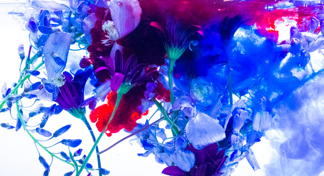
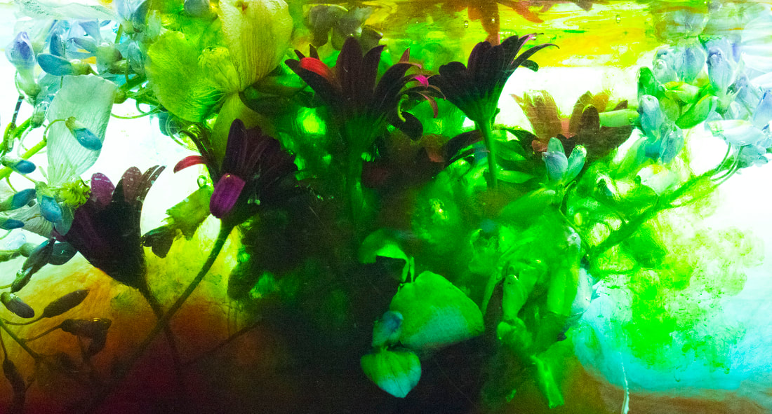
these two images the the left show how i suspended the flowers in the water before adding ink, these pictures are from after i used green ink so thats why theres a green tint in the water. This ink sinks as the water settles leaving a cool gradient i will use this information to create a better image.
|
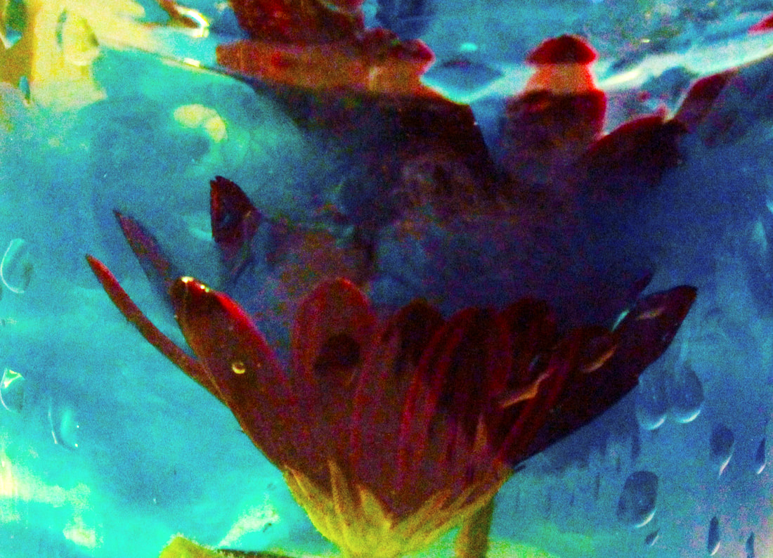
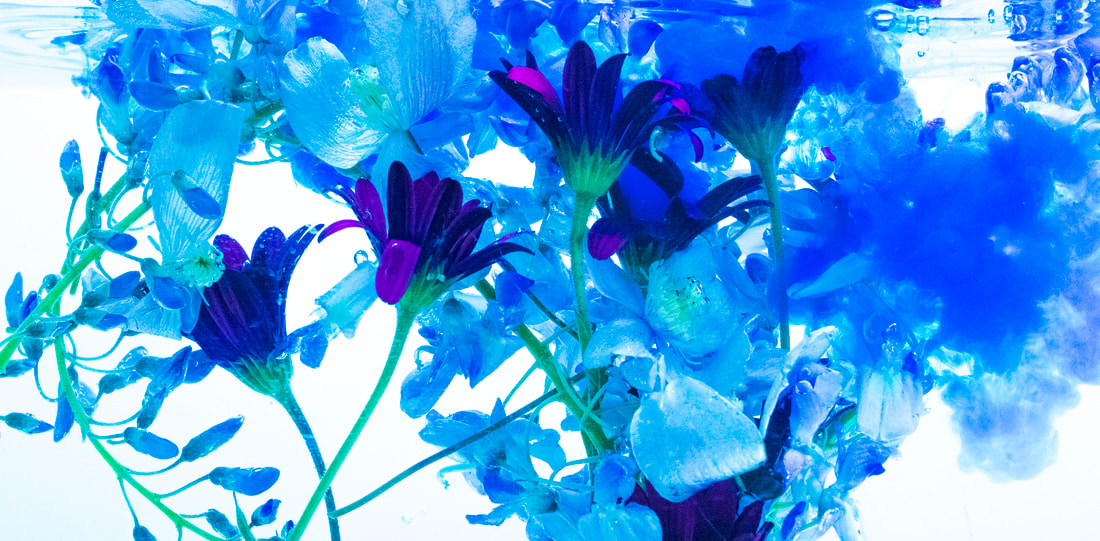
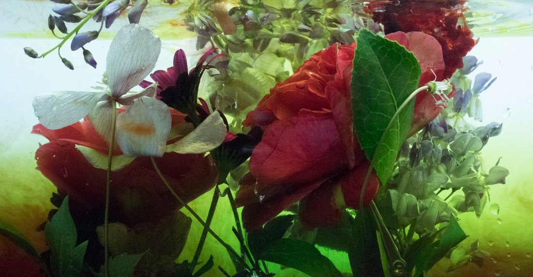
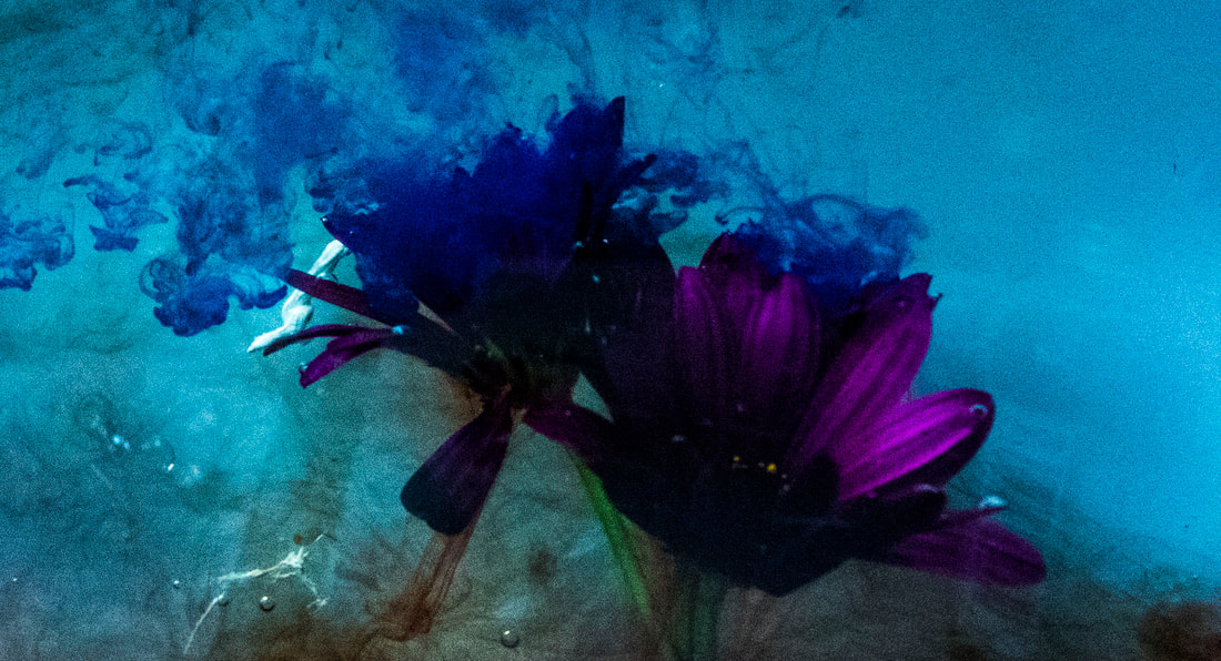
I like the image below because it is a successful attempt of what i was aiming for, it's one of the best ones because the background remained a solid state of white this required the water to be fresh which i replaced after each shoot. It also required good lighting which i had set up 2 studio strobe lights to flood the tank with light and the background, this looks great because there is a really high contrast between the white background and the coloured inks.
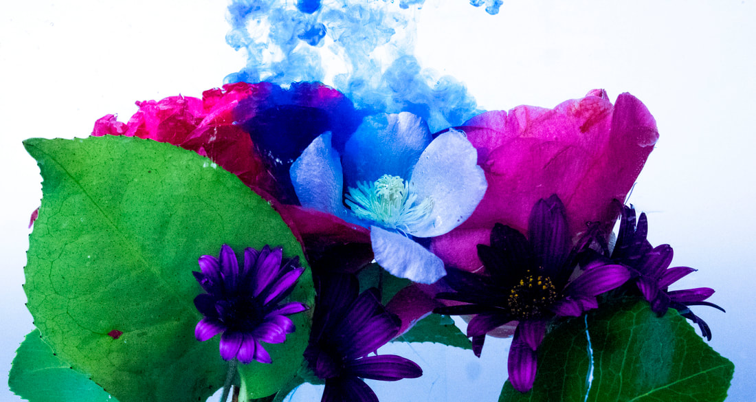
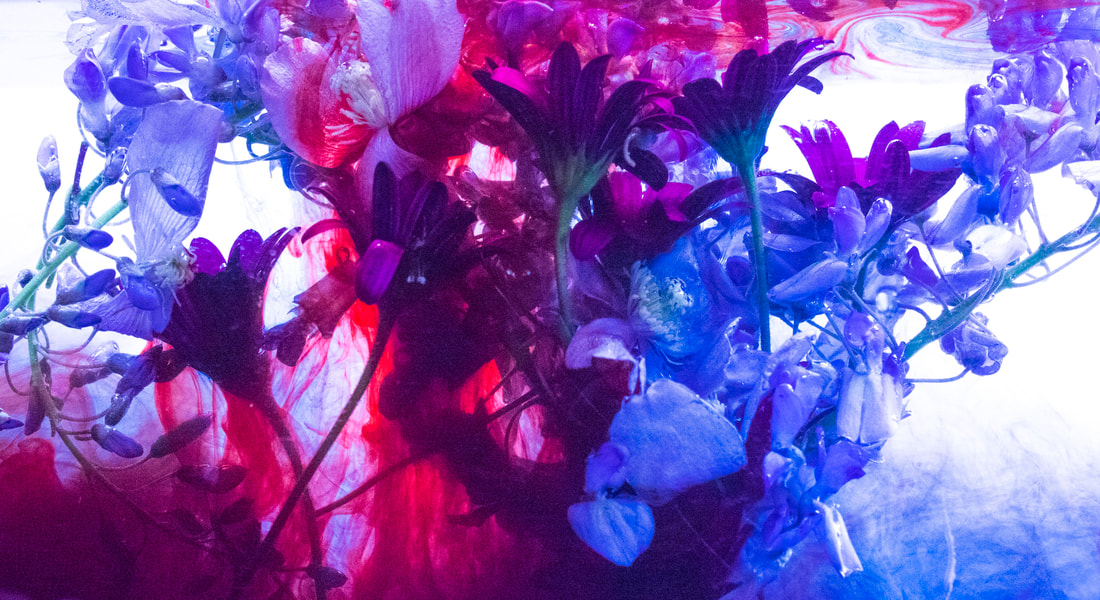
I really like the structure of the variety of leaves and different coloured flowers because it gives the ink different ways to mix around the leaves producing more variety in the image this shows the overall theme because there is a sense of variety in the different leaves and a sense of variety of the way the ink reacts with the water. Using crocodile clips i was able to secure the leaves and flowers a lot better than when i was tying them to objects that sink.
|
|
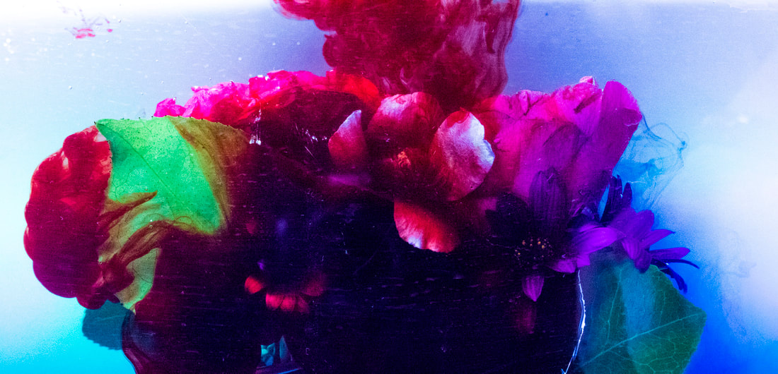
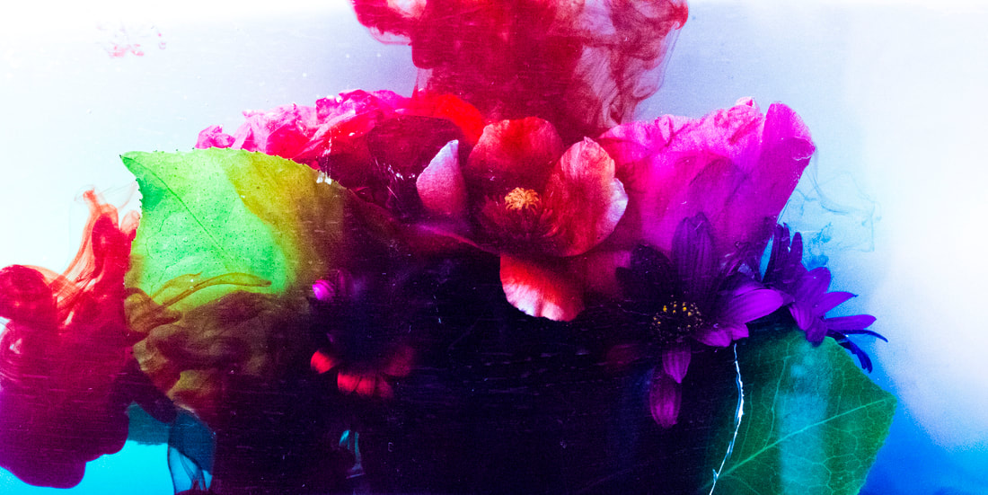
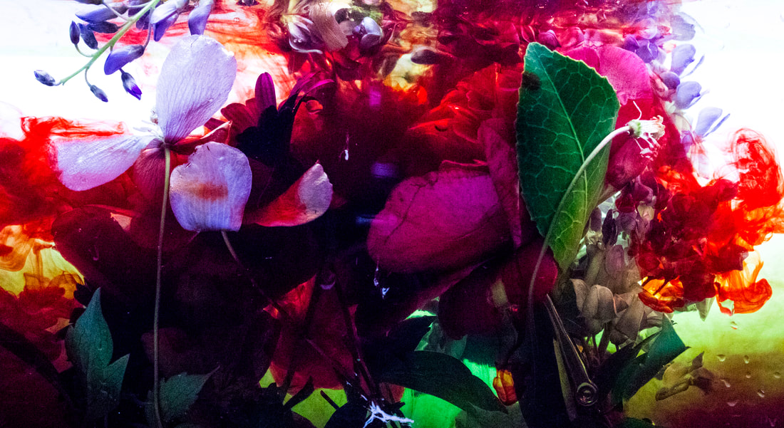
I think the best part of the pictures above is the contrast between the darkest areas and the white petals of the flowers this is really nice because the ink shows best against the white while the dark areas directly next to the flowers adds a sense of depth showing variety though layers and dark/light areas.
|
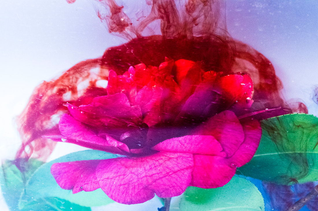
The image to the right shows an unedited version of the image above, the main difference was just to edit out the crocodile clips that were holding down the flowers to stop them floating off another thing i wanted to change was making the background a more solid white and increase the contrast so the ink looks a lot more popping on the page.
|
|
|
|
|
|
|
|
|
|
|
|
I don't like the picture above because they are too crowded with flowers and there isn't a main subject for the eye to focus onto, a part of the picture i do like is i took this while not using fresh clean water so there was already yellow and green settled at the bottom when i poured red into the tank. This effect looks aesthetic however it takes away from the subject and the white background isn't as prominent.
|
|
|
|
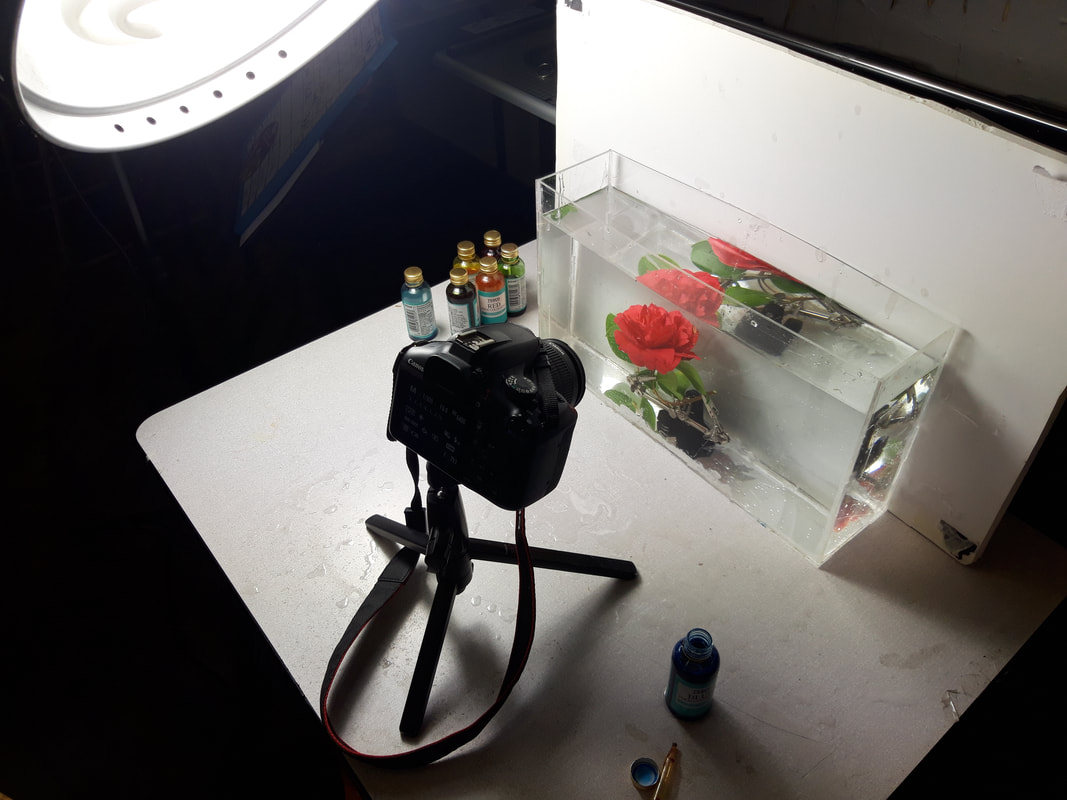
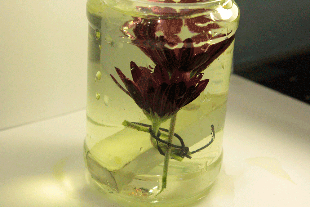
These pictures show how i set up the photo shoot above you can see how i have built a acrylic box and then filled it with water before composing the leaves then sinking them to the bottom of the tank once most of the bubbles has gone i then was able to use the inks in the water and set my camera to a clock timer for 10 seconds so i got my pictures while the ink was setting onto the flowers. The picture to the right shows how i printed them off on a fine art paper and then i mounted them on half a centimetre foam board.
|
|
|
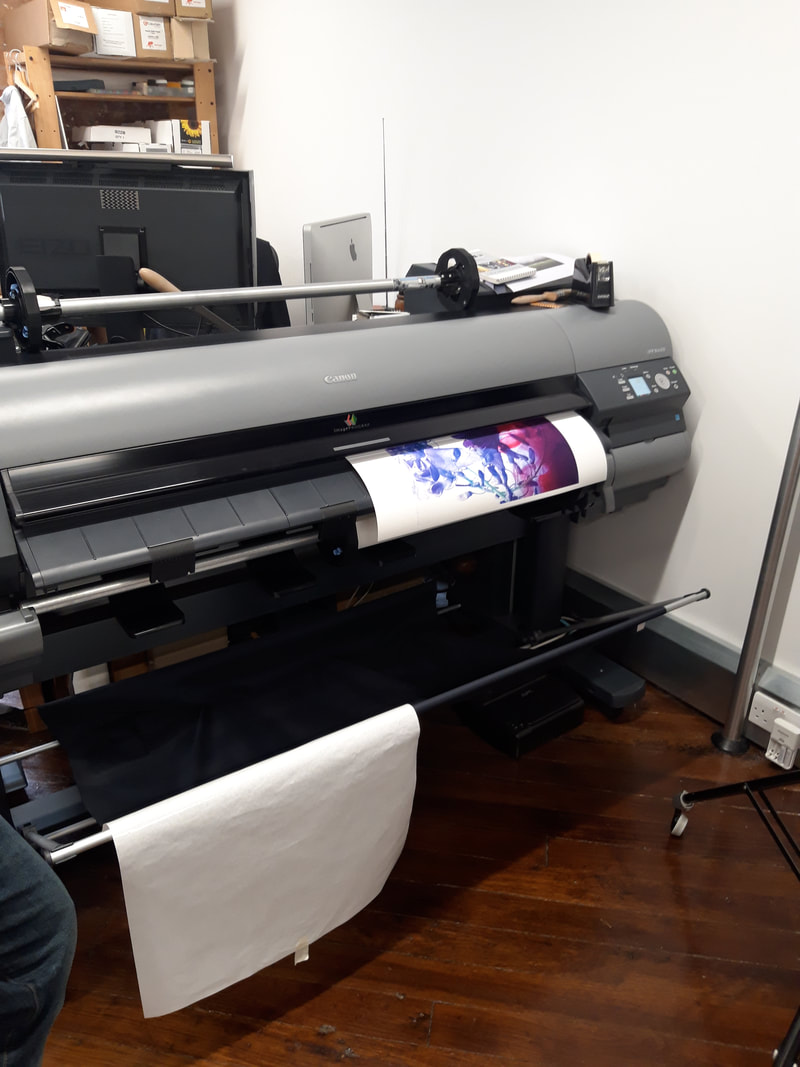
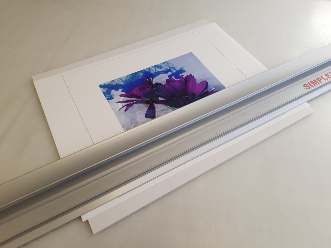
Heres a picture of how i cut out the pictures i had printed previously after they had been mounted onto foam board. i did this for all of my prints regardless of what paper i was using.
|
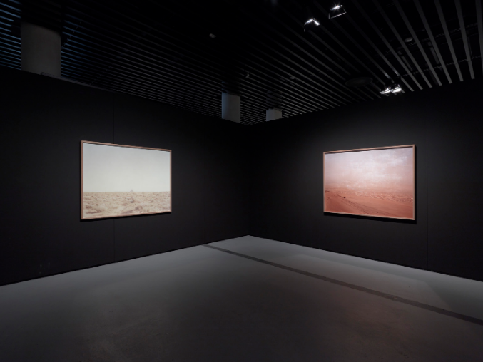
szymon roginski
SZYMON ROGINSKI – UFO 2006 – 2008
exhibition of Szymon Roginski and Milán Rácmolnár
Acrylic painting abstract - Collage, Teer, Pigmente
Hydroklinika, 2004, lambda print on wood
