Brief: To create abstract imagined landscapes
The shape of light
|
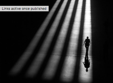
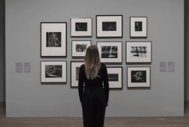
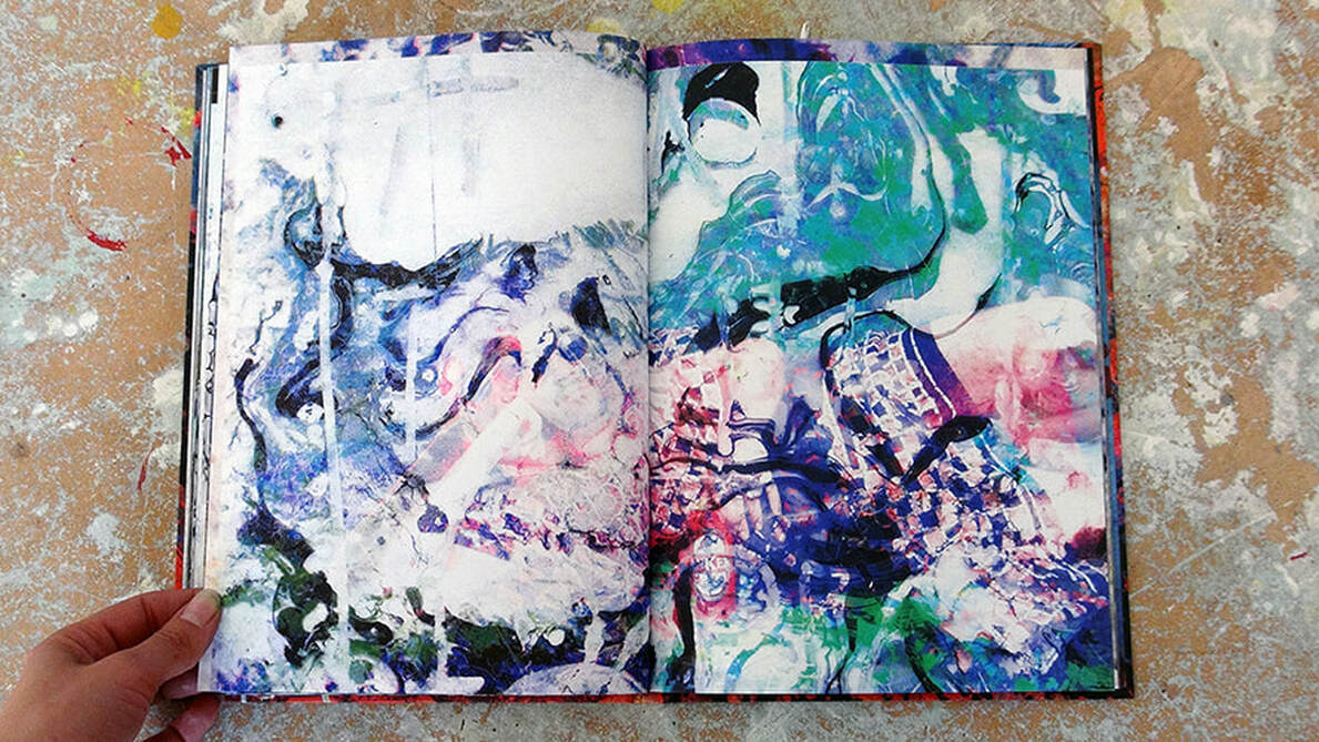
The shape of light exhibition included photography from the last 100 years presented in a sort of art timeline from room to room, this adds a new dimension to experiencing this exhibition because not only can you be consumed in the dramatic atmosphere of their photos but you can also see how the photographers used eachother for inspiration creating series of photos that work really well in the same location but are made by completely different artist.
|
|
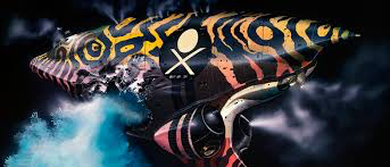
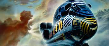
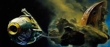
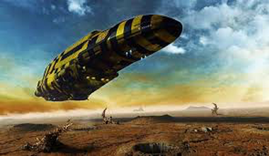
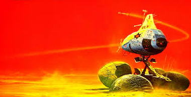
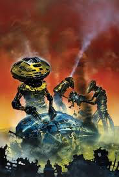
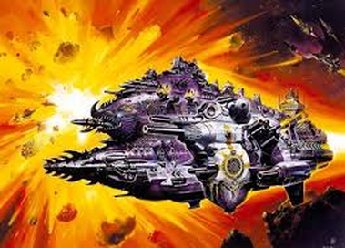
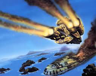
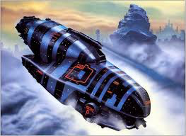
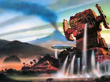
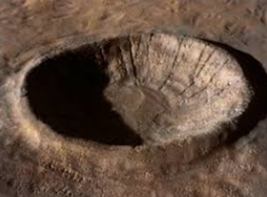
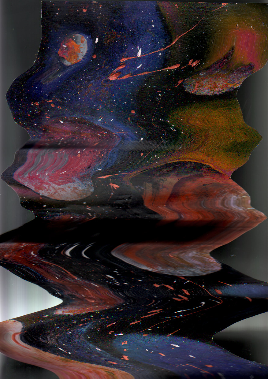
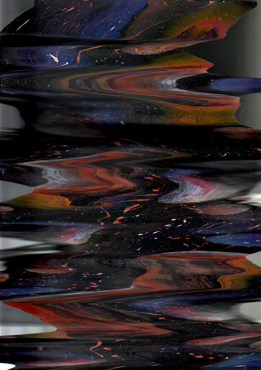
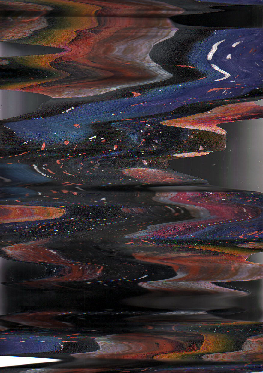
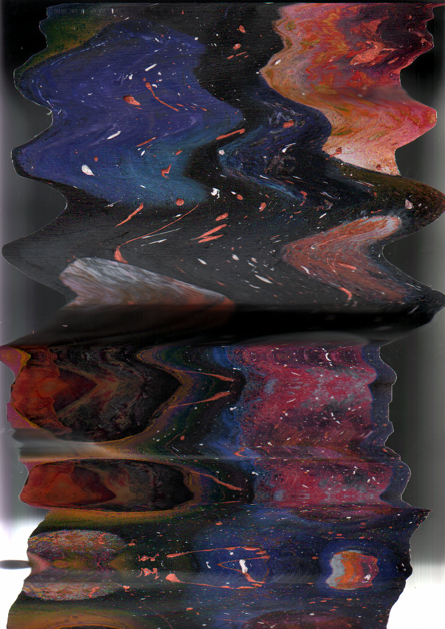
Chris Foss
|
For my first artist I wanted to show that I was thinking out of the box and what I'm generally interested in, Chris Foss creates these amazing imagined landscapes by the use of an airbrush and paintbrushes to produce unreal details. His artwork is so detailed intact it relates so close to real photography, to use this work as inspiration I wanted to pick out things such as the environment or the space and sky and how he creates an effect like this. Something that I think works well in his work is the subject of having a spaceship always taking central stage in the picture, this is something that works well in his work however I think that I would much rather focus my work on the scenery and environment he created so well with a spaying techniques.
|
|
|
|
|
|
|
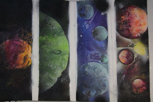
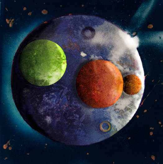
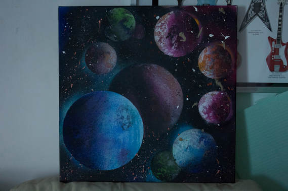
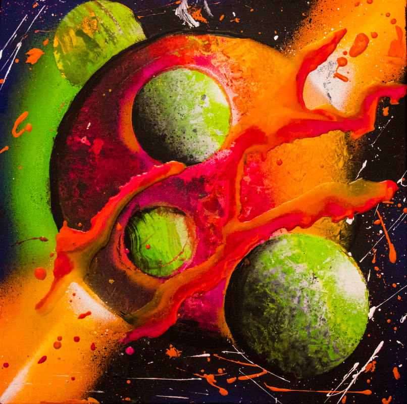
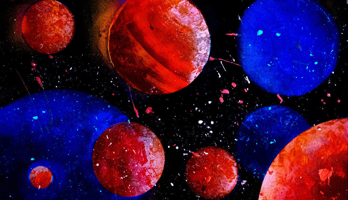
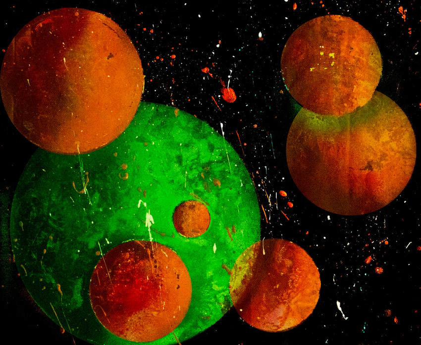
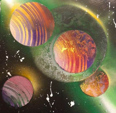
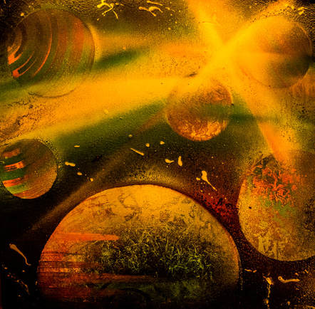
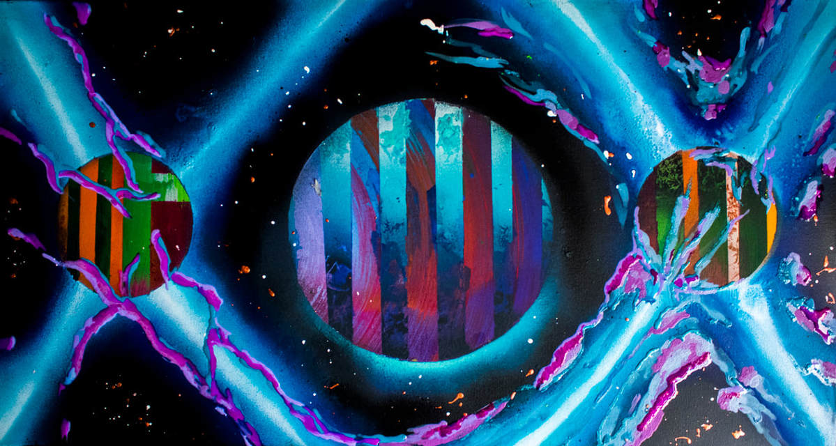
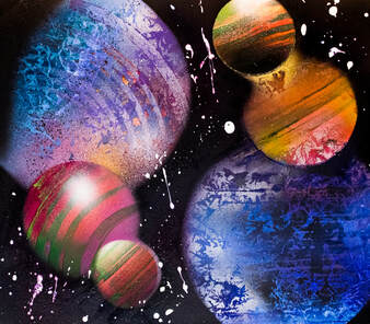
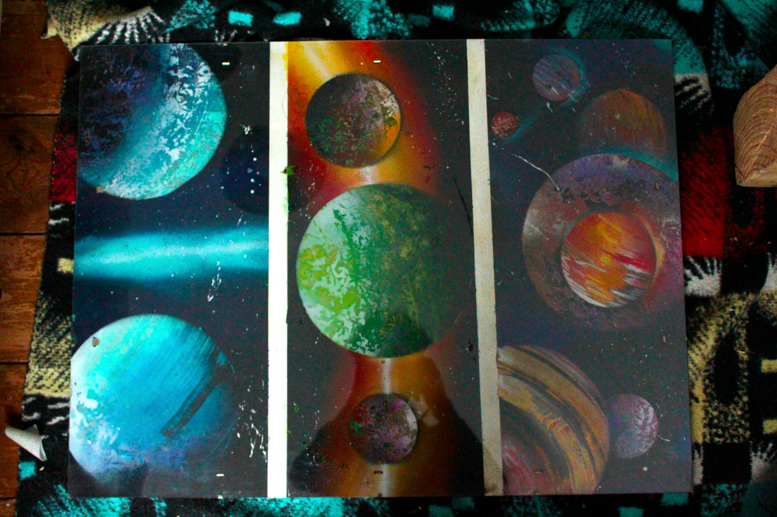
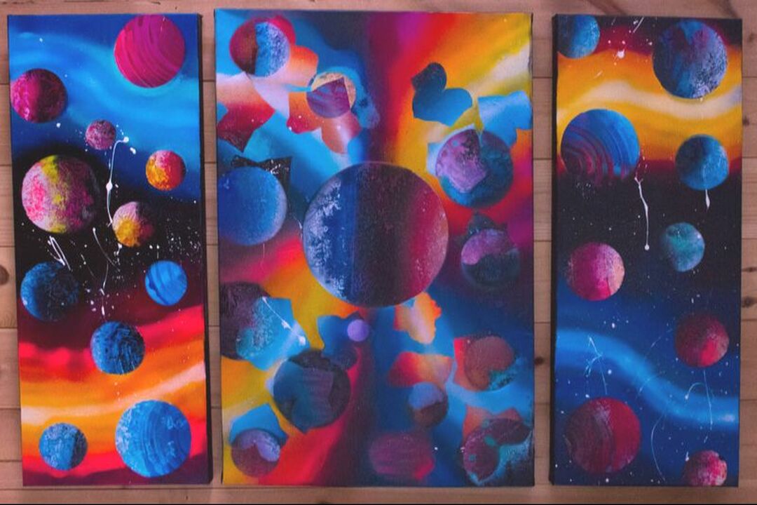
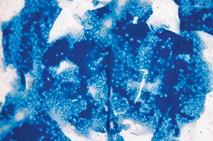
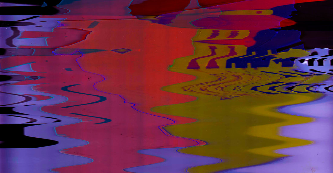
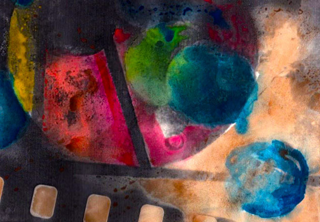
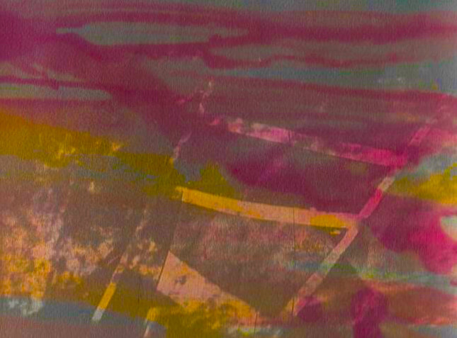
1st development
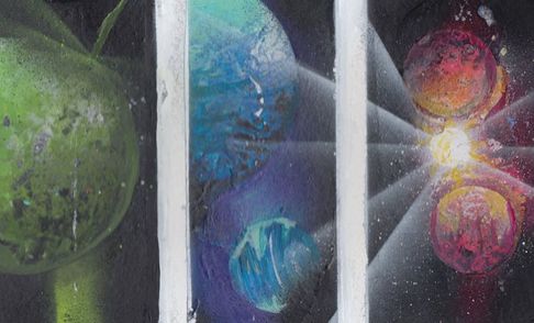
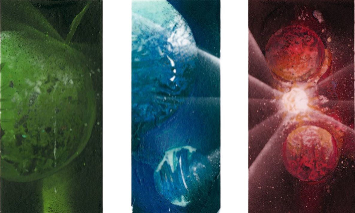
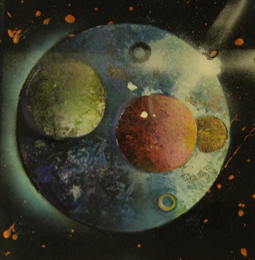
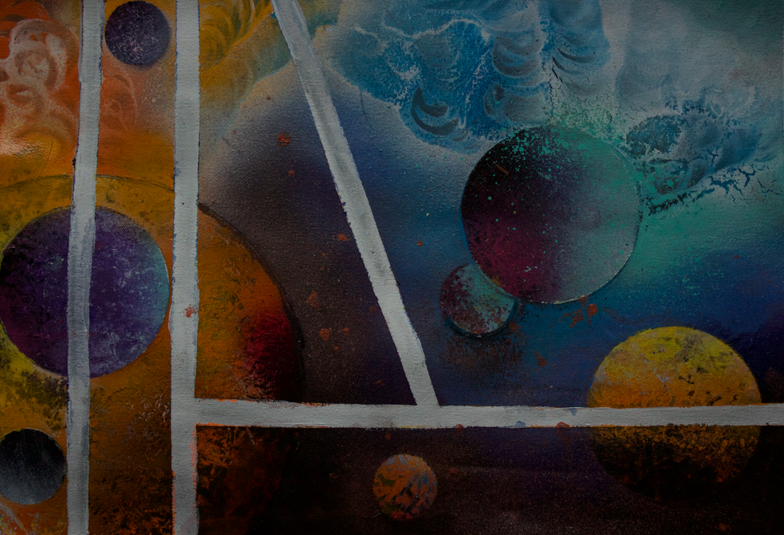
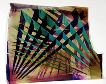
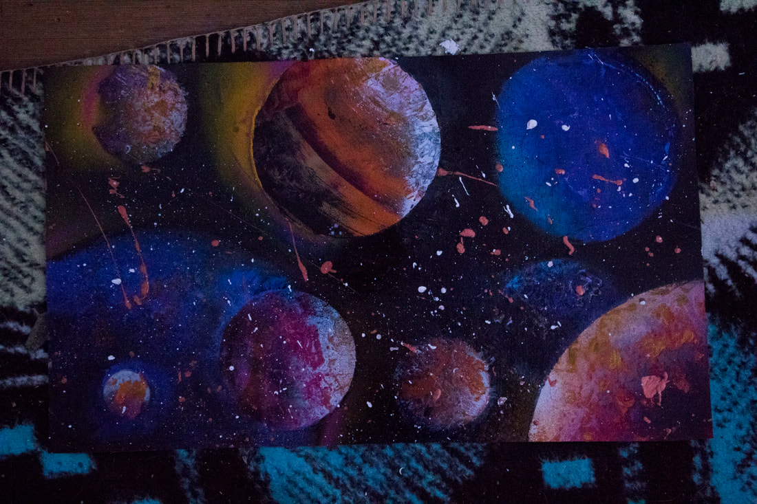
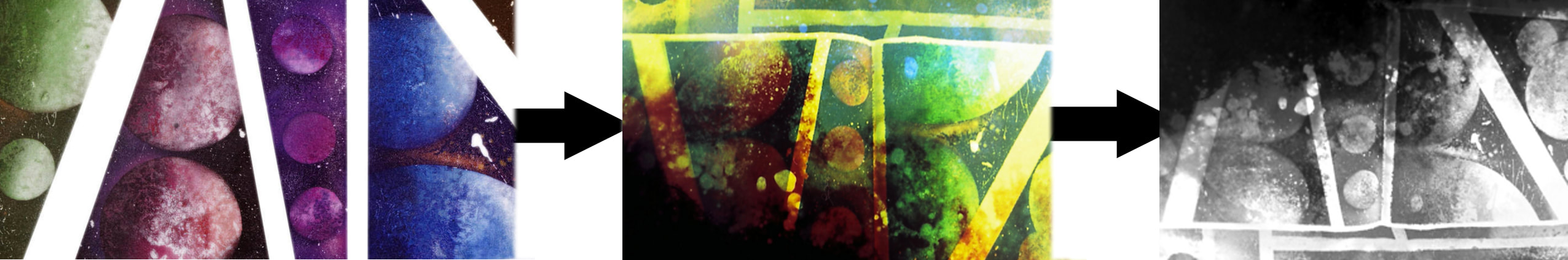
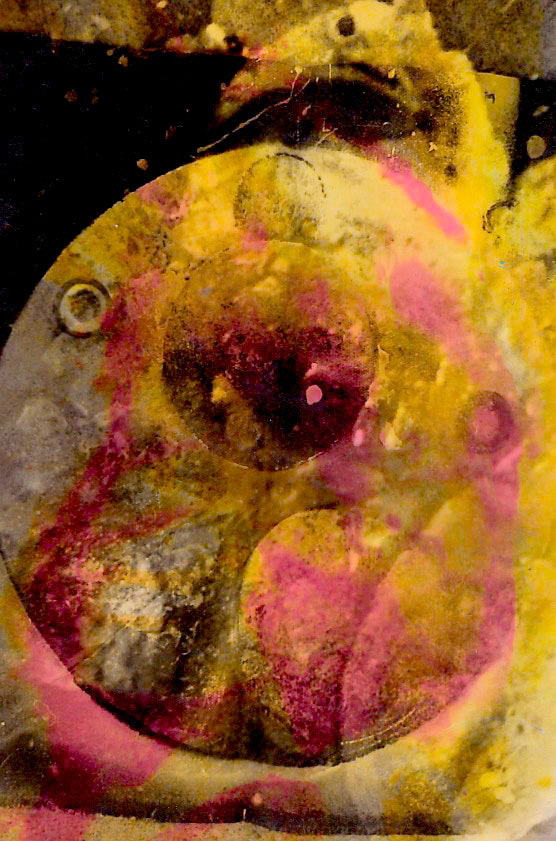
1st response, spaypainted planets, enhanced by post production
I've spray painted these planets using a developed technique, I chose these fluorescent colours because they represent criss fords? FOSS? work directly, he loves to make dramatic and exotic skylines and spacious views. Taking his work as experience I've created my own depiction of his work, I decided to leave the scenes of space ships out to start with because I think its important to achieve a good representation of his colours and background art.
|
I wanted to separate colours to achieve a variety of different contrasts and to see what different colours I could achieve with just spay-paint cans. While also experimenting with colours I also achieved a variety of different sizes of planets.
In the red section I created a white focus point, this could be a star however it tried to keep it more abstract, I carried the stars light beams into the next colour to show how light travels. |
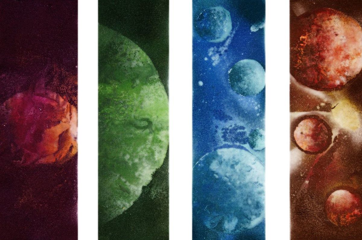
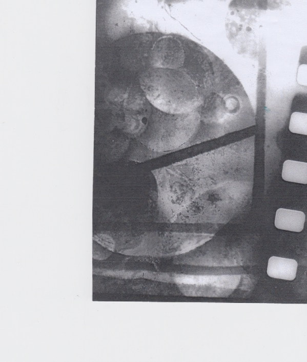
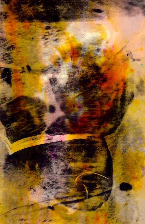
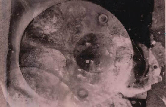
Picture of the First original
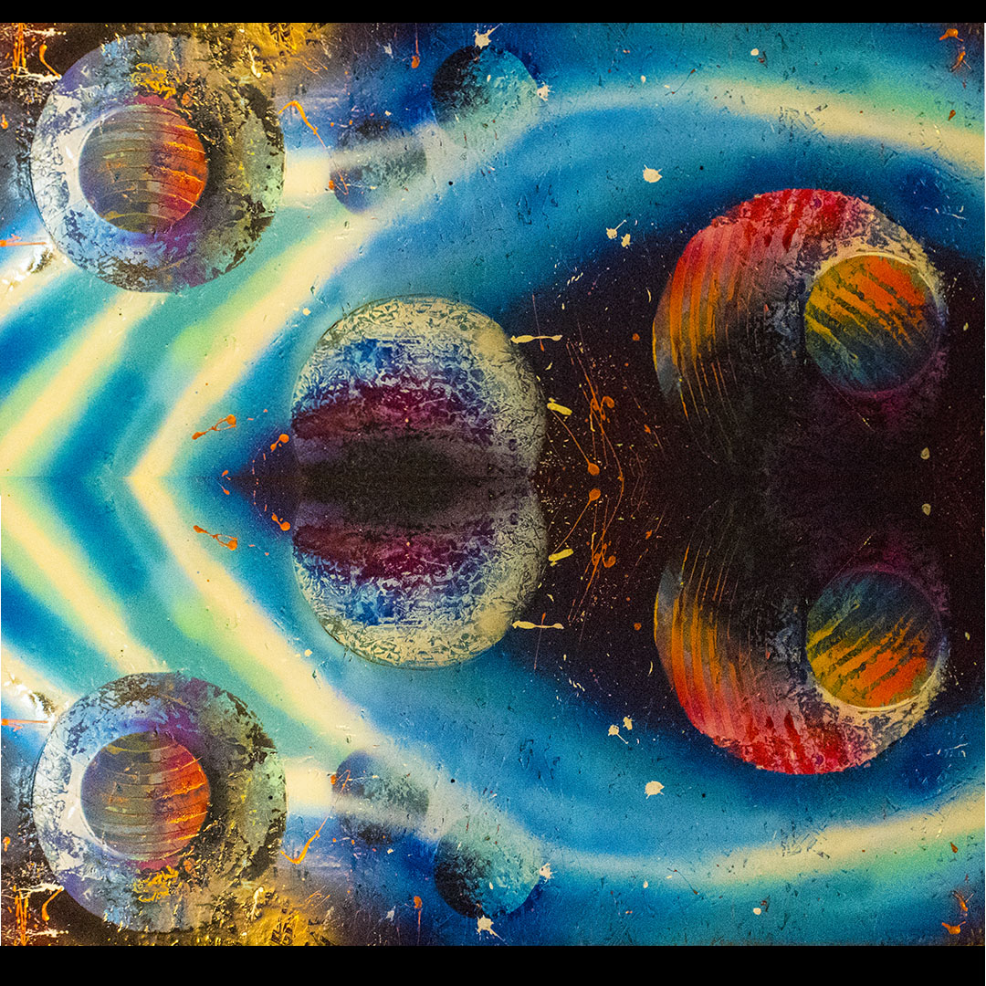
|
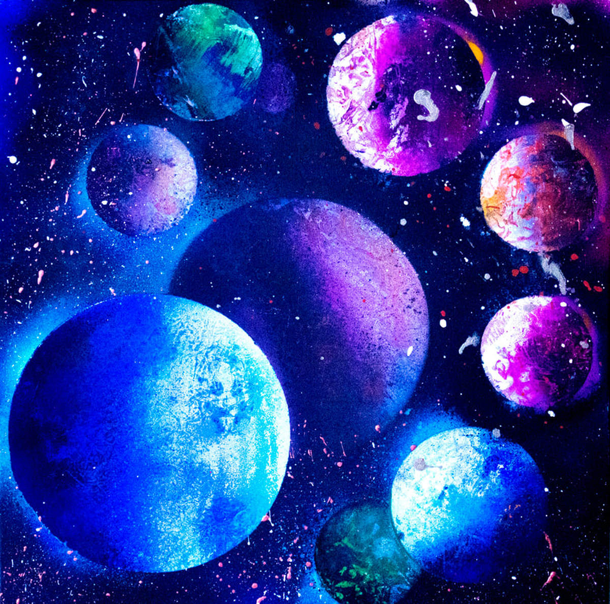
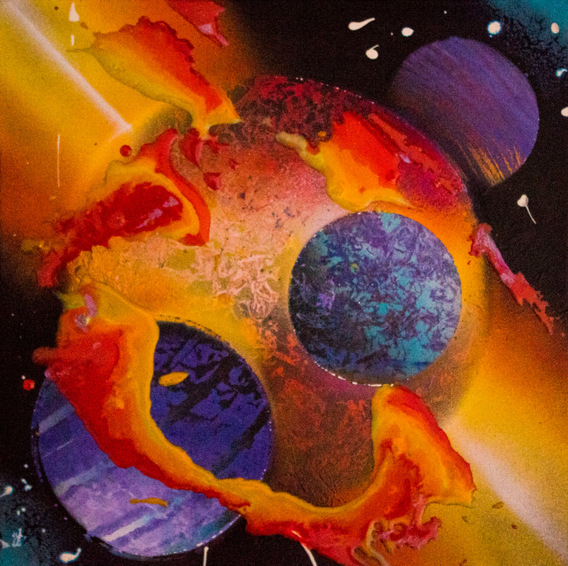
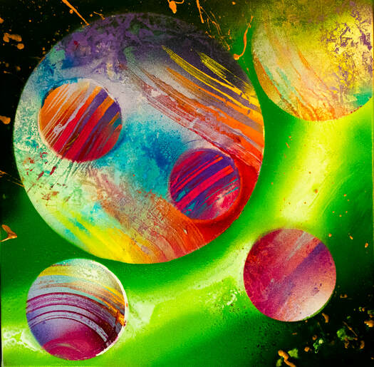
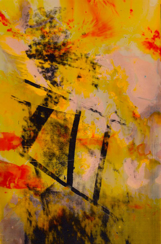
Using post production to enhance colours
Using post production on a scanned piece of spay paint really helped to pick out the details and create a ambient glow behind the planets, firstly I seperated the picture into 3 layers this allowed me to individually enhance the colours for each different colour. The next step was to flatten the image and then I used the filter "diffuse glow" this picked out a lot of the white details on the planets, it also brought back the star as the colour enhancement made it a shade of red, now its the brightest spot in the image. The last step was to netted the boarders between the different coloured sections.
WWW: I really like the effect of multiple colours being separated, especially since the colours are very fluesent it allows you to perceive the image without being overwhelmed.
EBI: I would like to find a way to focus on creating a way to enhance the shadows, highlights and mid-tones of the planets, this would add more to the 3d effect of the image. I want to create a similar image to this one however develop the idea of separated colours and tones.
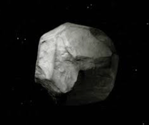
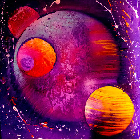
Adrien Missaika
|
Space Between 2007 – 2009
Photographic ensemble, lighjet prints mounted on aluminium frames Variable dimensions. I like this work because how it focuses on space (outer space) such as the planet on the right this relates to the work I am currently creating. However she also works with a different type of space, Negative space ; this is where there is few main focus points to the photo or more than half of the picture is simply empty sky or without a subject. This is something I can bring into my work by only the planets I create have texture or subject and techniques however the "background" will be empty space, negative or outer. I will use this work as inspiration when creating my pieces its helped me see how photographic art doesn't need to always have a main subject. Emptiness can be just as aesthetic |
|
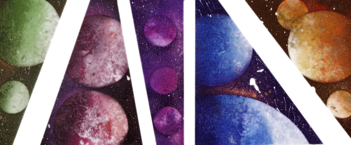
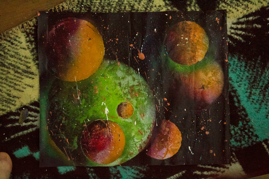
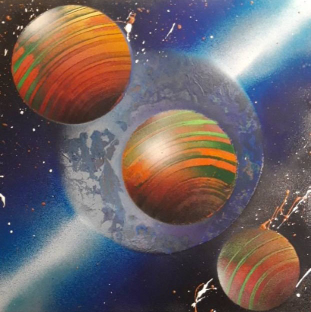
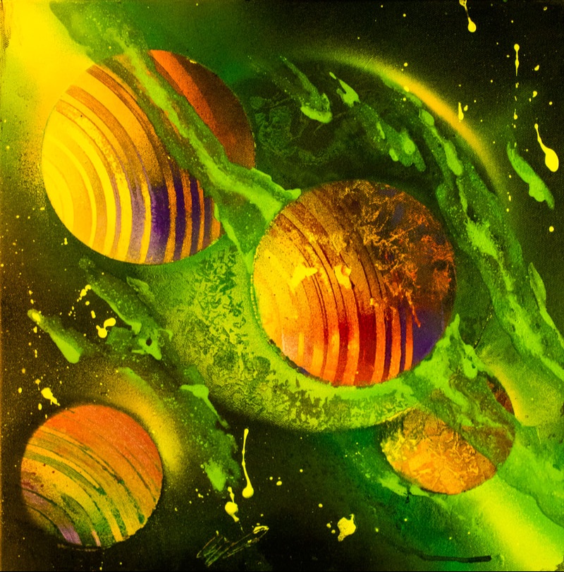
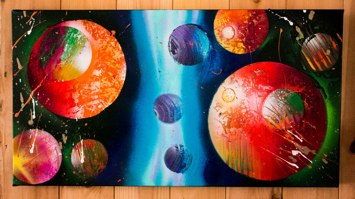
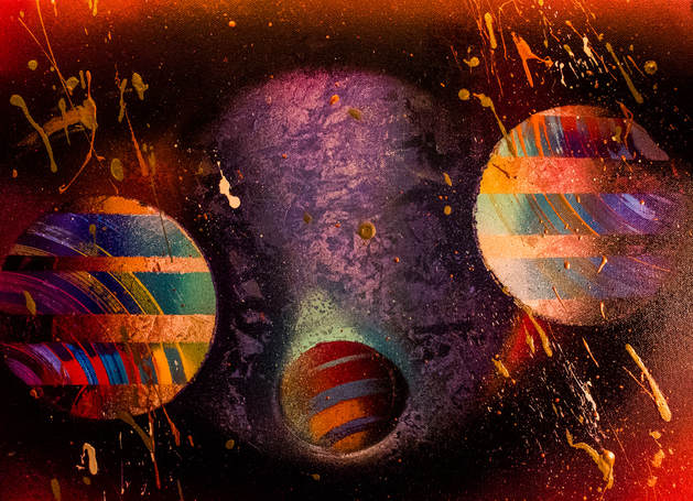
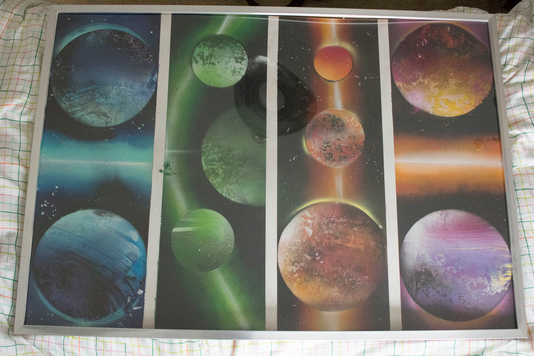
2nd development
|
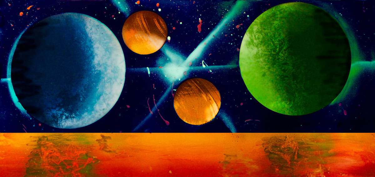
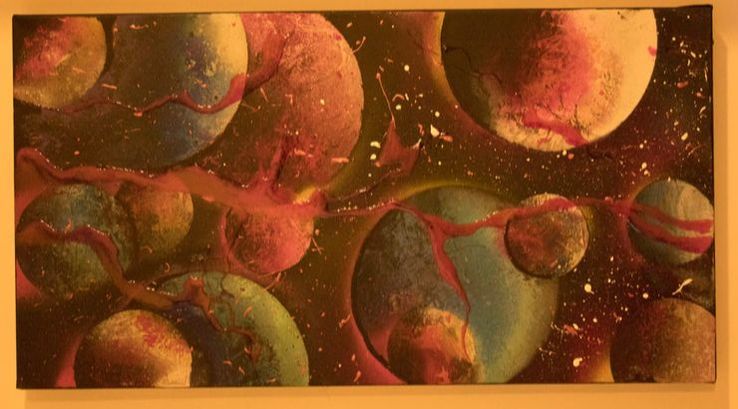
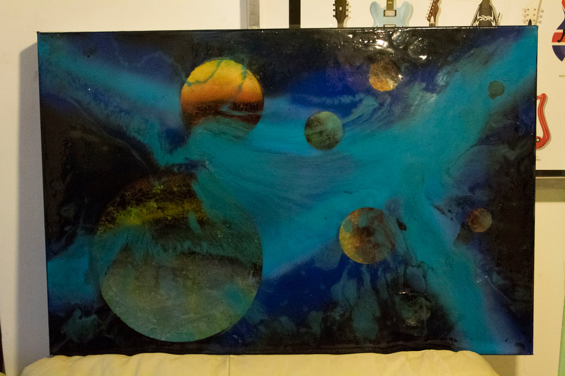
Creating an upgraded version of my first piece is a great idea to easily include things that I wanted to improve, it also allows me to experiment with a larger scale, this piece was double the size of the first one this allowed me to include a lot more detail, such as a 4th section and a more advanced version of the other colours, including a lot more planets and abstract elements.
The new section was very experimental however I like the effect of using a lot more paint that mixes with the background and that mixes with each other. I especially like the way the main circle is still visible behind the mixed paint fading into the background. |
Picture of the original, no post production added.
|
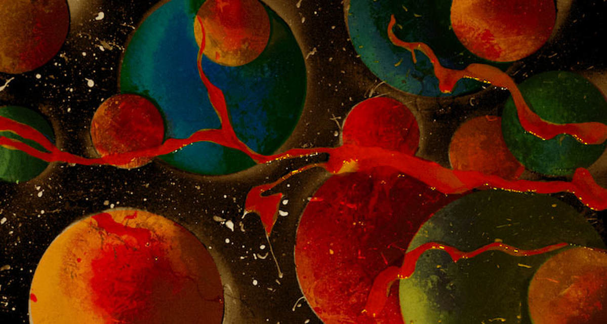
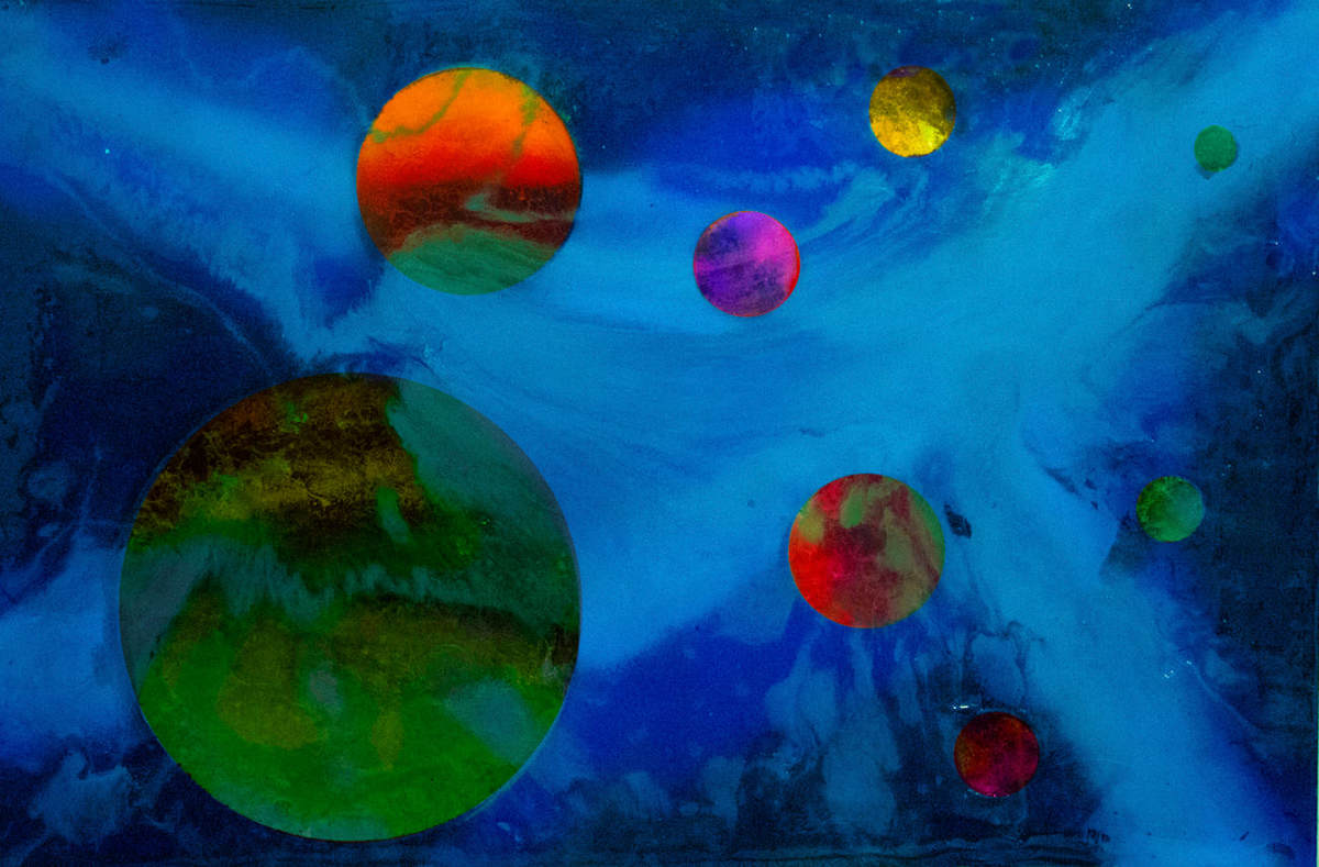
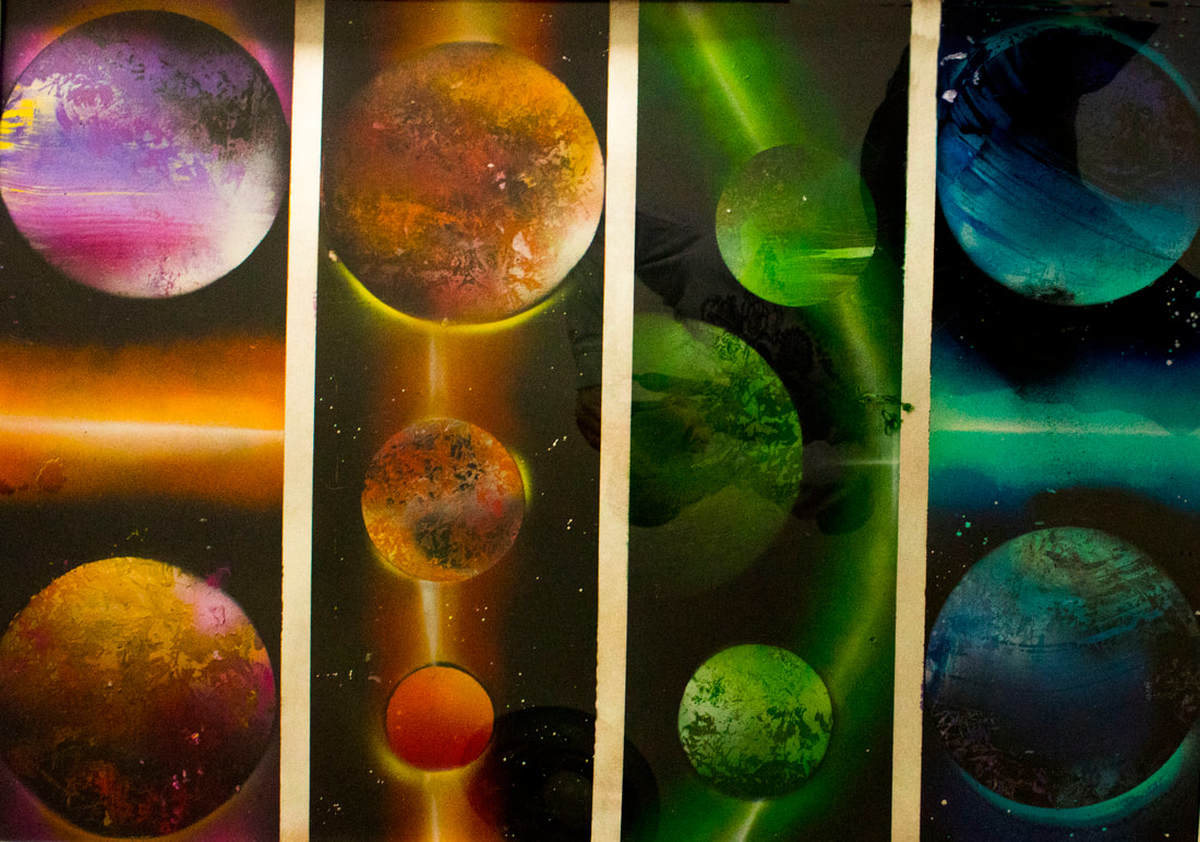
Developing post production skills
Using photoshop to not just enhance the colours and clean up the main seperation lines, but change the impact of the image to the viewer. I used all the steps from before however this time i included the burn and sharpening tools, this allowed me to focus on just the planets while i strengthened the highlights and darkened the shadowed side of the planet, at the end of this process i made a week "diffuse glow" that highlighted all the very white sections, this gives the illusion that light is hitting from one side of the planet.
Scott Campbell
Scott Campbell presents his new work They Say Miracles Are Past at OHWOW, London from October 4th through 13th. This exhibition reveals that Campbell’s appetite for patent imagery continues his repute, but it also signals a new direction.
His work focuses on bringing almost tattoo like photographic drawings and layering them on top of pictures of space or singular planets, I like the idea of layering different pictures and processes on top of each other it shows variety of techniques, themes and creation processes. I like how in this work the overlapping pictures don't take priority of the art instead they are simply another element to the existing picture behind, I really like the idea of just having 1 large planet taking up the whole page this is interesting because it allows for more overlapping techniques and processes that interact more with each other not like they are competing to be seen in the picture but like they are all incased in a singular planet structure that helps bring it all together as in 1 piece.
His work focuses on bringing almost tattoo like photographic drawings and layering them on top of pictures of space or singular planets, I like the idea of layering different pictures and processes on top of each other it shows variety of techniques, themes and creation processes. I like how in this work the overlapping pictures don't take priority of the art instead they are simply another element to the existing picture behind, I really like the idea of just having 1 large planet taking up the whole page this is interesting because it allows for more overlapping techniques and processes that interact more with each other not like they are competing to be seen in the picture but like they are all incased in a singular planet structure that helps bring it all together as in 1 piece.
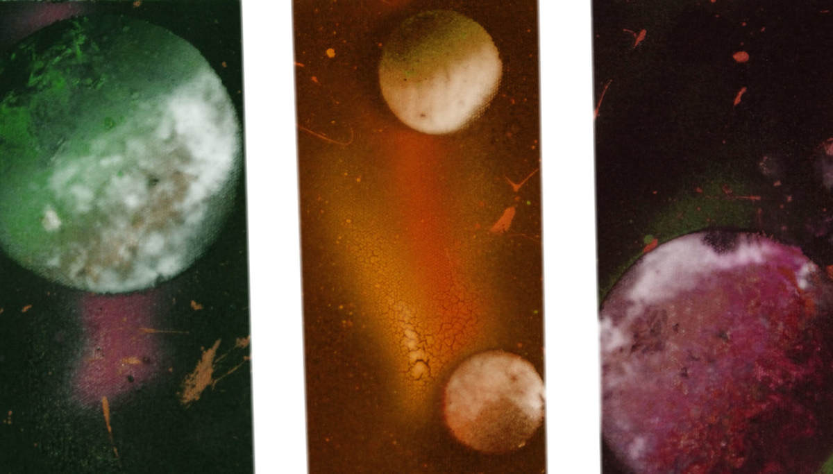
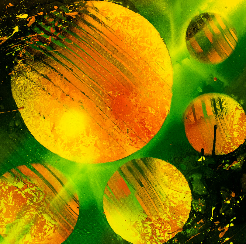
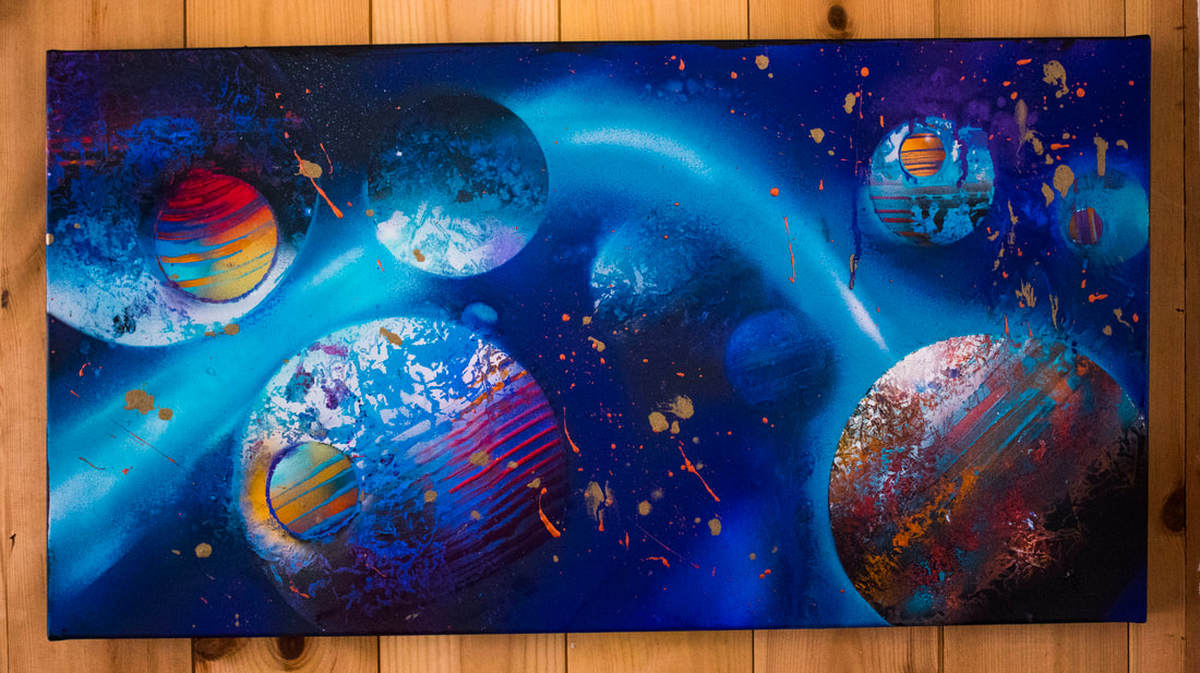
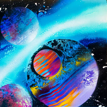
3rd development
Experimenting with OVERlapping planets
New colours that will suit the theam
I've gone and bought some new colours that will suit the theme, this includes 2 new shades of green a variety of tan colours, i also grabbed some light purples and pinks. I hope to use these colours to create more contrast of colours, before i was limited by the 4 colours i had now i have a variety of shades of individual colours. I want to create a piece where i have all the colours on show across a strip. However there's a new technical idea i have to create a planet in front or to the side of another.
|
|
|
|
I really like this outcome, using my knowledge from my last developments i took necessary steps to improve the outcome from the original. These techniques are mainly to do with the way i was spray painting instead of just post production skills being improved, i much prefer the development of spaying skills as the combination afterwards is really impressive. Here's a list of what i kept in mind when creating this piece ;
- An attention to contrast, the dark side of the biggest planet is enhanced by the lighter blues in the background this strengthens the shape of the planet. - Using a new flicking method with a toothbrush of bronze paint, this creates stars in the background however i prefer the bronze colour rather than an ordinary white. - To create the overlaid planets i created the front planets first and then covered them while i sprayed the back planet. While adding texture it was hard to keep the front planets from mixing with the blue behind. I really like the outcome of the photoshopped version, you can see how the burn tool is having an effect on the variety of shades on each planet, i had to make good use of the "clone" tool when editing this piece because the planets were overlapped i wanted the edges to be a lot shaper of each individual planet, this left empty blue space behind the overlaid planets and the clone tool fixed this by allowing me to keep those areas looking original and purposeful. Overall the extra hassle of overlaying paid off because i really like the effect of the whole piece, this also taught me a lot about how to manage the spray paint a lot more professionally. This work drew creatively directly from Scott Campbell's work I wanted to create a piece that was only a singular planet with overlapping of some sort involved in the piece this was fortunate as I discovered a new technique of overlapping planets. |
Picture of original
Enhanced by photoshop
|
Kander
|
I really like his work for specific reasons, for example the subject of the pictures art to relevant however the way he presets it is. The white lines that separated his work help the viewer understand the work more directly and visually it just suites the darker pictures contents as the contrast is something that adds to the complexity of the picture. This separation technique is something that I have interest already however I will take time to redevelop and enhance this idea.
|
|
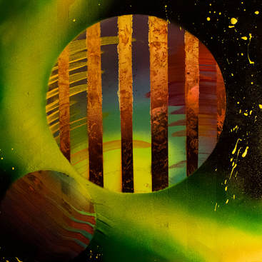
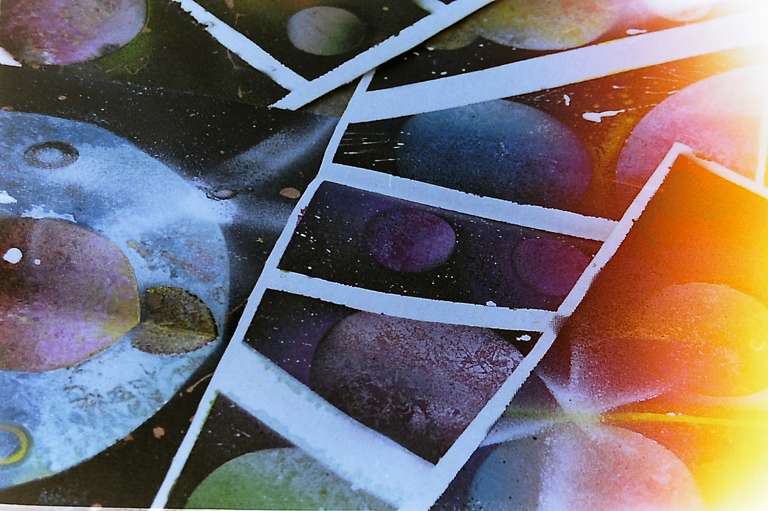
4th development
improving SEPARATION technique
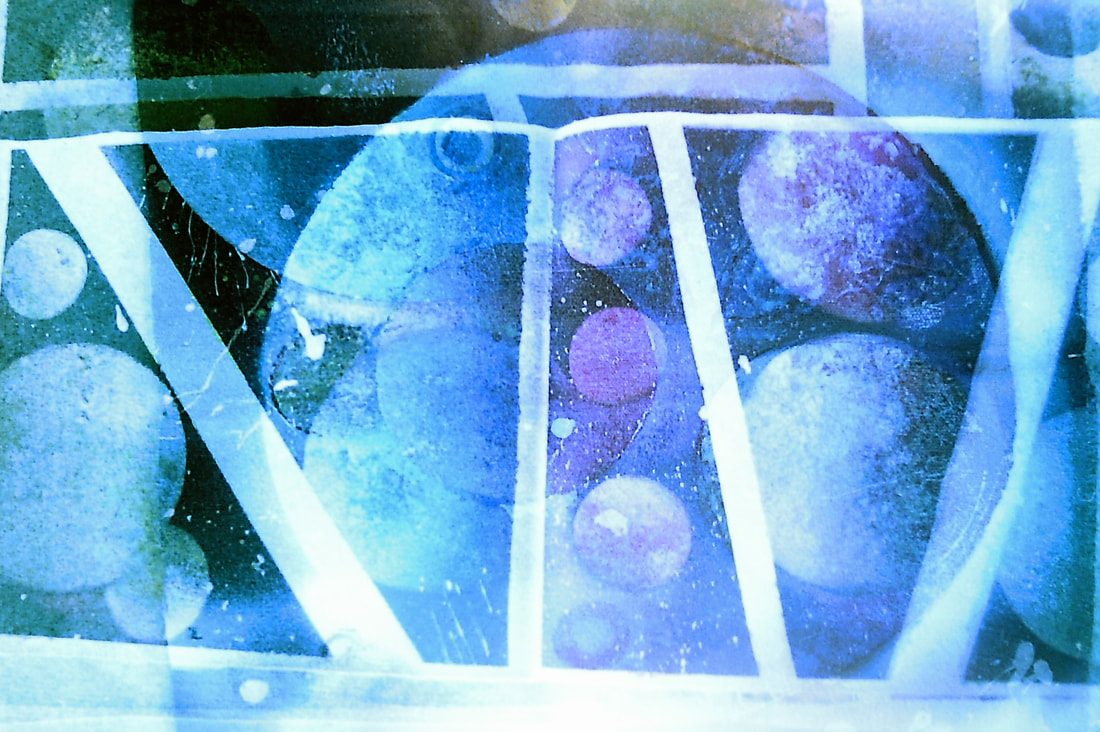
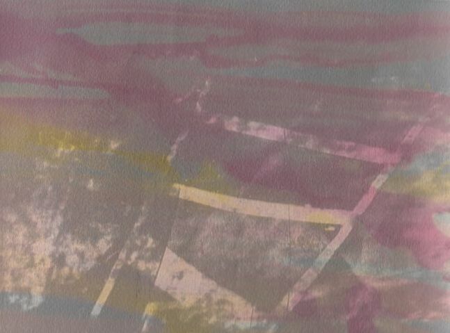
This technique of separating the different colours into different strips is made just by using masking tape to cover the strips, for this piece i wanted to find the best width of tape, there's 3 different widths i like the thinner ones in the middle because they don't take up to much space complimenting the smaller planets a lot more. This piece shows off my colour range, i wanted to fill as much of the area with planets as possible to show off the technique. An example of originality to this piece would be the use of white and bronze stars which i made with my "toothbrush flick" technique, and there is no main light source point this works because the separation lines keep each section local however without this the piece would look messy.
The reason for developing the separation technique was because of SCOTT Campbell's work showing me that not everything has to be part of the same section sometimes its much better to have the focus on its own in a way allowing the viewer to see more clearly what is trying to be shown, the separation of this particular picture also had another reason as I recently expanded the amount of colours I had available so this piece also allowed me to focus on developing singular colour planets and backgrounds without worrying about if the colours would match each other or not. And I was obviously inspired by Kander's work which includes these exact processes and themes.
Enhanced version in photoshop
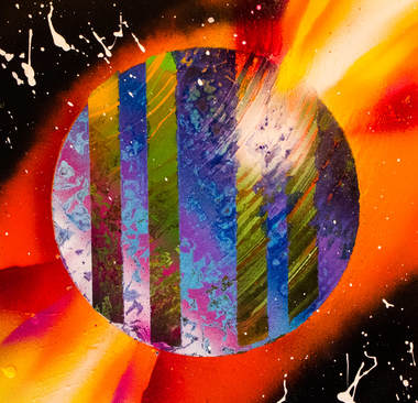
WWW: I really like the slanted angles of the separation lines, this is exaggerated by the width difference within the lines, the middle two are half the width of the outside ones. I think this helps give a centre point of focus for the eyes to focus onto. I also really like the larger variety of colours that art in any order adding to the abstractness of the piece.
EBI: To improve I could start adding a lot more variety of colour into the actual planets themselfs, this is harder to achieve when working with smaller planets however with larger circles I am able to include a larger colour range between light and dark shades of main hue, this effect will help with a 3D effect and give the illusion that they rant flat on the material.
Something that I could easily improve in post-production is the colour enhancements on some of the planets, I could create new method where I can enhance the colours separately on the same planet, this would allow me to experiment with multicoloured planets.
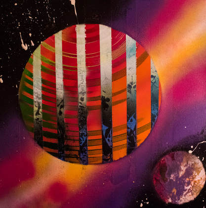
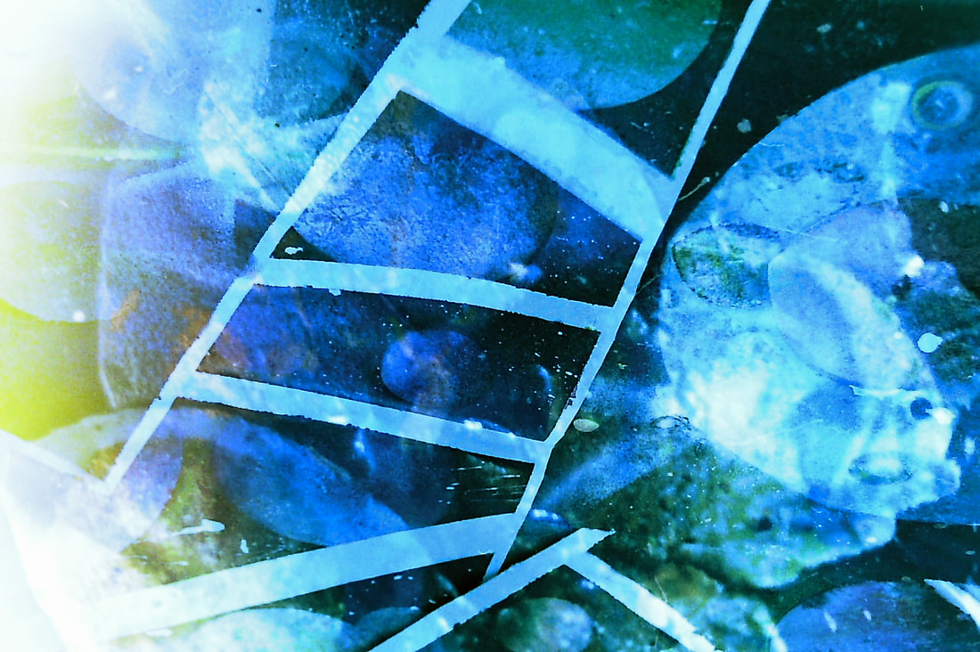
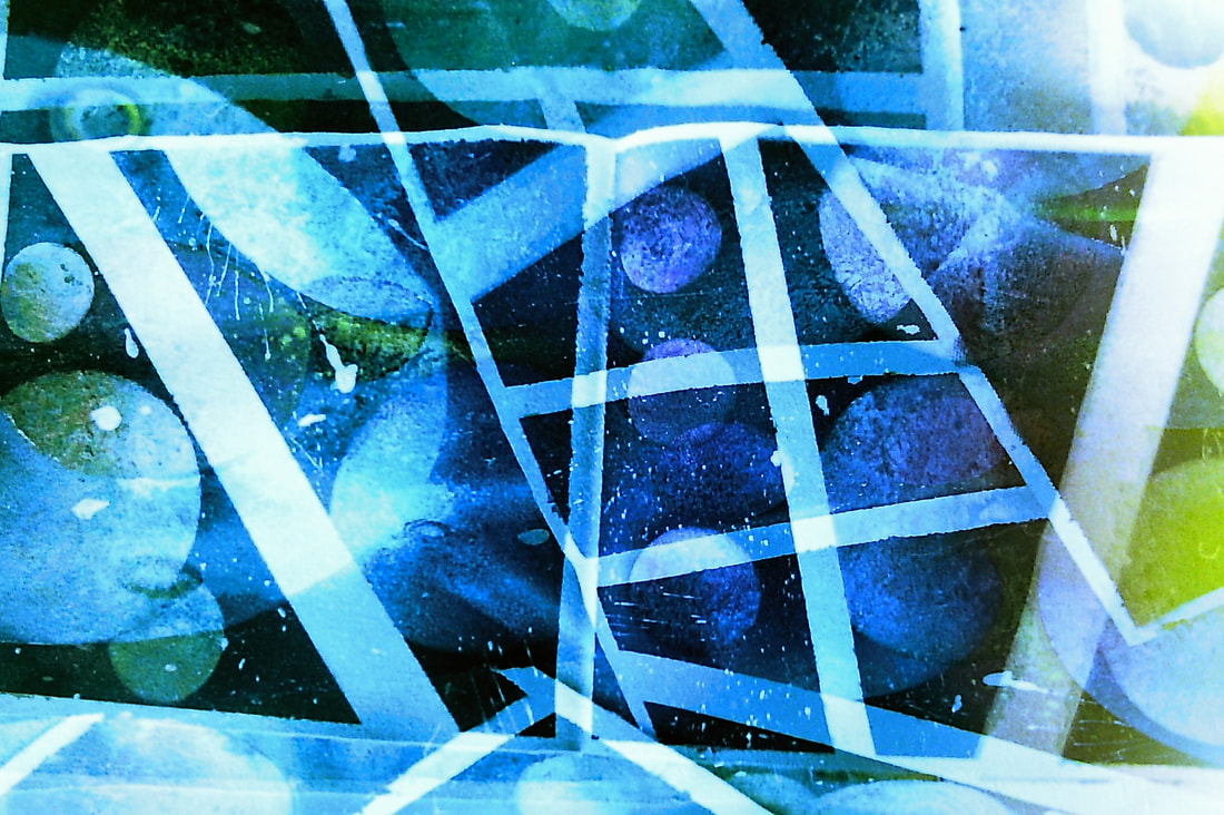
Working with SEPARATION and Cracking background
WWW: I've created a new way to create texture within the background, using a combination of water-bassed paint and solvent paints produced a cracking effect, this is useful as it is another way to produce variety. I like how the cracks expose the background colours underneath this could be another angle to look abstractly, if I spent longer developing a cracking method i could have cracks across a whole piece with a different landscape within the cracked sections.
EBI: The editing of this specific piece wasn't the best on the larger planets, I can improve on this by lowering the value of the diffuse glow that I apply at the end of the post-production process.
EBI: The editing of this specific piece wasn't the best on the larger planets, I can improve on this by lowering the value of the diffuse glow that I apply at the end of the post-production process.
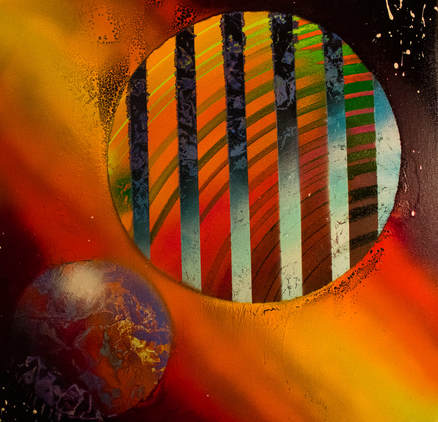
5th development
This development focuses on experimenting with new techniques and experimenting with painting techniques, such as a new method of painting where i spin my finger in circles over the paint creating a circular pattern representing clouds this process could work well as creating a bridge between the painted background and the real pictures that i will find a way to overlap over the top.
|
|
Maya Rochat
|
Her work is very revolutionary in my opinion, she creates her work by the use of photographic chemicals and a variety of pouring methods onto the photographic paper, the almost paints with chemicals this shows that she is thinking out of the box and always thinking of new ways to produce new and more interesting pieces of work by using new processes and techniques, something I would like to bring into my work is the use of a liquid or resin that can produce a similar effect to her work, having this on top of my previous work would also relate to previous ideas of overlapping techniques and processes.
|
She sprays broad, open swathes of coloured paints on top of photographs, douses them in bleach or chemicals and scratches into their surfaces before feeding them back into the printer, and onto paper, plastic and metal. |
6th development
Using larger CANVASES to achive more variety and more detail
|
I made this piece by developing on previous ideas and techniques. Examples of techniques I've developed are above however I will also pick them out on the main picture to show development. Techniques range from :
|
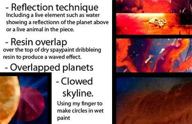
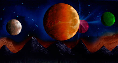
Once i had finished spray-painting the background i took a picture of it; this composed off the planets, silhouette background and the Cloudy skyline. Then i started on the reflection of the sky, I achieved this by spaying too much paint and using my finger to spread it back and forward. if i was to do this again i would also add a shadowed side and light side to the reflection of the individual planets. Using post production(photoshop) i enhanced colours and separate parts of the painting to create a refined product. Something I would change about the editing process was I took a picture half way though the piece this was without the resin and animals in the front, if I could have used a combination of both pictures to create an overall picture in photoshop this piece could have looked a lot better.
|
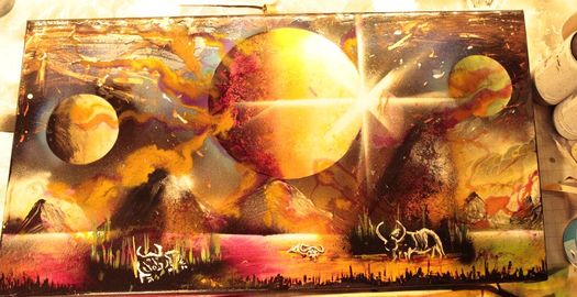
Picture of piece without enhancements in photoshop.
|
Picture of piece half way though production, edited in photoshop.
|
The next step was to pour resin in 3 different colours onto the canvas. I created a wave pattern with the resin and used the colours together to create a variety in the way it dried. Once this had dried i took its picture and enhanced it again in photoshop.
WWW. I really like the way the resin adds another dimension to the painting, it brings the background together with the foreground. I also like the newer way i make the smaller planets, instead of pulling layers away i've found a way to spread the paint in a circular motion while still keeping texture and a light and dark side of the planet.
EBI. I'm not overly confident with the animals in the scene, i much prefer the abstractness i can produce with these effects. I also think the change between the reds and the blues are too small, i could fix this by having more in between colours the separate the gap and increase the idea that there's a star nebular there.
EBI. I'm not overly confident with the animals in the scene, i much prefer the abstractness i can produce with these effects. I also think the change between the reds and the blues are too small, i could fix this by having more in between colours the separate the gap and increase the idea that there's a star nebular there.
7th development

|
WWW: The newer effect on the yellow planets turned out really well, i achieved this by spreading the paint not peeling layers away to create texture, this gives the illusion that the planets are spinning at great speeds. I also really like the contrast in the background against the planets, the dark side of the planet is emphasized by a light colour in the background, this is also true on the light side of the planet where the background is pitch black.
EBI: The reflection of the two smaller planets didn't pull though leaving the piece as quite confusing that they don't have a reflection, i could improve this by making a mark from where the planets are above the water making it easy to get a parallel reflection. |
|
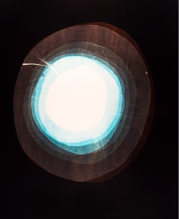
Rebecca Najdowski
|
Black Sun 2010 | c-print photograms, digital video, and acrylic mirror and electroluminescent wire sculpture.
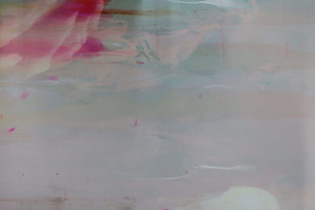
Combining stop-motion animation, time-lapse, and altered found footage the video Rebecca Najdowski uses a multiple range of materials and techniques to produce her work. I find this inspiring because it shows that theres a lot more thought put into the piece oaf art, by looking at her images you can conclude that there was a trial and error process to her work even though we can only see the final product theres is development and a lot of direct artistic choice put into the piece. The piece to the left is called Black Sun, productive uncertainty occurs in the darkroom as various enlarger filter combinations and unwieldy light sources create abstract forms. The result are metallic and glossy images that function as alternative moments that may have been in the video. |
|
|
|
Development 7.5

|
In this task I wanted to create a piece that included a lot of my favourite parts of my previous artwork, to create this I was very selective with what I spayed. For example the reflective water I decided to not include, but things like overlaying planets and focusing on the contrast between the dark side of the planet and the light side of the planet I worked on a lot more. This is shown by the background colour really popping out the dark side of the planet. Another thing I included was both processes of creating a planet one by removing layers of paint and 1 by spreading it across as seen as the top left green planet. I also include a lot of variety of colour in this picture. One thing that could make a large improvement on this piece would be to add a layer of resin onto of the spay-paint this I will expose in further developments.
|
Picture of original artwork, before post production
|
8th development

|
In this task i was required to combine everything i have learnt from previous developments and then add another level to the artwork, this was a resin layer. Originally i focused on just dripping a variety of shades into a random electrical shape. This worked really well on this piece i especially like how the resin adds another texture not just adding to the variety in colour and abstractness. I also focused a lot on overlaying planets and filling up the whole canvas as best as i could , i made the stars with copper and white paint.
|
|
WWW: I really like this piece, it successfully shows the development of my overlaying techniques while using a combination of resin techniques. Something that worked especially well on this piece was the contrast spaying, this requires to overspray onto the background on the darker side of the planet before taking off the stensil producing a dark to light contrast that helps the piece look 3 dimensional.
EBI: I Feel looking at the edited version compared to the real canvas there's too much of a dramatic change in colour, the method of isolating each planet to enhance the colours is effective however another way i could produce a much more accurate colour ratio by taking the picture in camera raw files these allow me to change the camera's exposure after taking the picture. If i could come back i would take a picture of this piece in camera raw file and edit that way.
EBI: I Feel looking at the edited version compared to the real canvas there's too much of a dramatic change in colour, the method of isolating each planet to enhance the colours is effective however another way i could produce a much more accurate colour ratio by taking the picture in camera raw files these allow me to change the camera's exposure after taking the picture. If i could come back i would take a picture of this piece in camera raw file and edit that way.
8.5th development
Combining resin METHOD, laser METHOD and OVERLAP method
|
In this task i was required to develop my resin methods more, i did this by using larger variety colour in the resin and to enhance the glow effect this gave off i put a strip line that mirrored the colours of the resin. I really like this effect and i will develop it more in further developments, an idea for developing this would be to use it in contrast with a past development that required me to put tape down so there would be an abstract looking white strip. The resin would appear see through and add contrast to the piece. Something that i carried over to these pieces was using a variety of media when peeling the paint away this gives more variety to the piece and allows me to explore more with a variety of undercoat methods. I think i could improve these pieces by experimenting with different colour paints for the stars.
|
I then took time to edit the art in post production, this enhanced the colours and enhance the contrast.
|
|
|
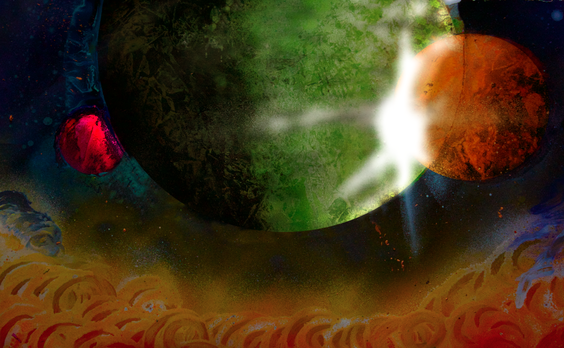
I liked the resin's effect so much that i wanted to create multiple pieces that shows of the addition to the piece. I made these two pieces very similarly because i really like the combination of effects in these pieces, there is a large red planet that symbolized the sun possibly turing into a red dwarf absorbing everything around it. This is where the resin and the laser spay behind the planet from one corner to another really help show this idea. I also focused on achieving a variety of planet structure, the purple planets were made by spreading paint opposed to peeling away layers of paint.
9th development
Coating the whole piece with reisin, combining with laser technique

|
In this piece I was required to take the resin technique to the next level I achieved this by coating the whole piece with resin, to help the whole piece come together I spayed the background the same colour as the resin I would put on top, this was where the laser technique development helped a lot. On this piece I coated the whole piece with clear resin and then was subjective with where the blue resin would sit mainly where the laser technique was. Something I really like about this piece is the way the planets look like there being transported to another world while showing a large variety in size and colour. Something I could improve on would be to experiment further with coating the whole piece with resin however this uses a significantly more about of resin than just the subjective range of colours method.
|
Picture of real piece, without any photoshop enhancements.
|
Method of post production
The method of Photoshop i use when enhancing my pictures starts by isolating the individual planets into their own layers this is so i can enhance the colours specifically to what colours the planets are, this is a better way of editing the planets because it gives each planet a colour personality different to the others. The next step is to increase contrast, vibrancy and saturation to make the colours pop a bit more and to help bring back more similarities in the very varied planets and their colours. The last step is to increase shadows in certain layers/planets and fine tune a few, another step i used to take was to use a filter that gave the whites an ambient glow however i found i actually lost a lot of detail in the planets and colours behind the whites when i used this effect so the way i found around this issue was to isolate the dark and light side of the planet and then enhance them differently to produce a higher even contrast between light and dark giving a higher illusion of 3d ness.
ACKNOWLEDGING mistakes made and TAKING steps to ensure they ARE NOT repeated
|
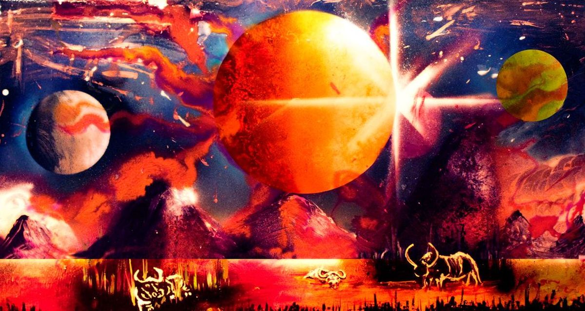
I made this piece as a follow up to the piece that involved some water buffalo however this one didn't go to planned as so. 1st the planet had no contrast spay and the skyline has no ambient glow. The sky is generally boring and i tried to include a reflection in the water of the planet in the sky this looked okay however the messy painting of the monoshade mountain range and tree takes away form the only few things i like about this piece. The resin technique also didn't go to plan for example my placing was bad and it first covered most of the sun meaning i had to scrape away for a more abstract look which ended up looking messy. Another big problem would be that i tried stretching the canvas after i applied the resin this popped the paint off in multiple locations as seen in white on this picture. Overall im happy with solving all these issues in this one piece it allows me to evaluate and be smarter with the combination of effects of my next pieces, for example the reflection technique seems to work a lot better when it's used abstractly rather than in combination with a tree line and resin overlapping the whole piece making it all look reflective.
|
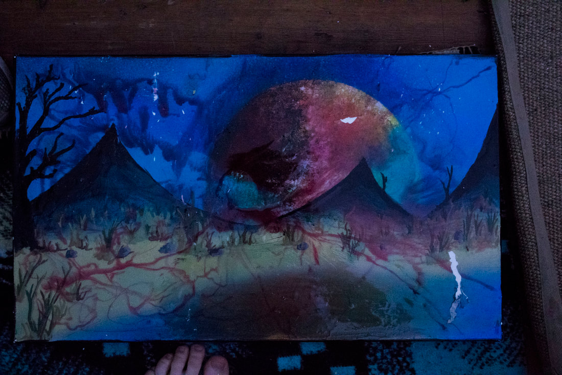
Close up picture of peeled away paint and strung back resin as a result of over stretching the canvas.
|
|
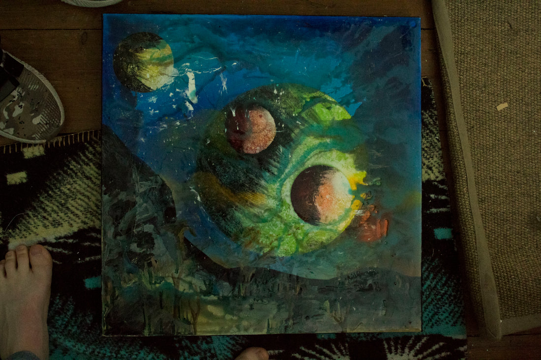
There are parts to this piece that i like and parts to this piece that i really don't like, for example the resin technique i used was really good using darker resins on the lighter side of the planet and using black resin to darken the outside of the canvas and i like the overlay structure however i really don't like the silhouette mountain covered by grass structures this took away from the plates resin that i think turned out good. Something that is different about this piece is i used black acrylic paint to achieve the dark side of the planet instead of using traditional black spray paint.
|
|
10th development
Going back to experimenting ideas on smaller pieces

|
In this task I was required to expand on my ideas about colour, for example I wanted to focus on 2 colours, I chose red and blue this requires light shades and dark shades of both colours. Overall I also wanted a variety in planet structure there is one planet in this piece that was made by speeding the paint rather that peeling away, to further distinguish this planet from the others I kept the stencil on while I flicked paint onto the rest on the piece and the other peeled away planets. I really like the approach of further separating singular parts on the piece, another thing that separates this planet would be the amount of contrast spay on the darker side of the planet this was exaggerated a lot in this piece and underused on some planets to give the illusion of depth in the piece, ones with more contrast reflect the idea that they are a lot closer that the others.
|
Picture of original artwork, before post production.
|
EBI: an improvement would be to closely look at a colour wheel to chose 2 colours that are opposite this would make the piece look a lot more dramatic and contextual.
10.5th development
Improving on previous ideas and solving mistakes
This piece I made works really well for a combination of effects, including simple feature such as the colour wheel really adds to the piece, I chose to focus on reds and greens while having the colours much closer to each other or even overlapping each other bringing the colour contrast to a higher level. Something that I include a lot more and am a lot more aware of would be taking off the stencils before making artificial stars with white and bronze paints this effect works well for creating depth in the piece.
|
Picture of original artwork, before post production.
|
|
EBI: Something I didn't plan in this piece is the two red planets to the furthest right of this piece, when planing where the planetswould be I wanted one of them to be green to show the dramatic colour contrast however when I put the stencils on one of the planets I forgot what colour it was after revealing it I relied my mistake and decied to add colour contrast by creating a highlight on the overlapping planet in green this would bring the piece together a bit more while also bringing back some more of the colours that I intended to have more of a role in this piece.
|
|
11th development
combining a lot of different effects
I made this piece quite overpowering and overcomplicated, I find it hard to find a centre point of focus in this piece or a point that I really like more than the entirety of the piece. This happenes when I include way too many effects into 1 piece, for example I feel the golly resin effect works sometimes on some pieces however only when it compliments a background colour an immediate improvement could have been to use green resin instead of blue this would complement the colour wheel adding more dramatic contrast to the piece while not having to include a different shade of planet. Something that I really like is how the resin looks when it sits on the spay paint and the white section as well, because its semi transparency you are able to see the instant contrast.
WWW: I really like this piece because it shows a combination of loads of different effects, from resin overlapping effect, to a larger effect of planet structure and planet colour. Something that worked well was
12th development
Further developing spreading the paint and finding an alternative to resin
original picture of spay-ain't without any post production.
This piece shows how techniques i've learnt in this development can be utilized abstractly.
|
This development was focused on spreading the paint across the canvas instead of peeling it away. I further developed this technique by cutting small indents into some balsa wood before I spend the paint in a circular motion, this left the under coat of paint below and scraped away where there wasn't an indent in the balsa wood. I really like this effect and now I've developed the effect and become a lot more proficient at creating this effect for example once I've made the technique you need to add shading to the piece and a highlight spot.
Once all of this had been achieved i took the green canvas and used a special canvas matt coat instead of the resin that i used in previous developments, i really like the effect it produced and it's a lot cheaper than using resin however it doesn't mix well with the solvents paint leaving bits in it so it's quite unpredictable. |
original picture of spay-ain't without any post production.
Resin effect achieved with a cheaper alternative
|
In the green piece I've included planets that used both techniques to produce spreading the paint and peeling away the paint, I really like this practice of using both texturing techniques because it adds another dimension to the piece for example you can see how I have used the peeling away technique to give more depth to the planet that is sitting behind the others. and half peeled away one planets paint to show that it is half way between the spread planet and the peeled away planets.
|
|
|
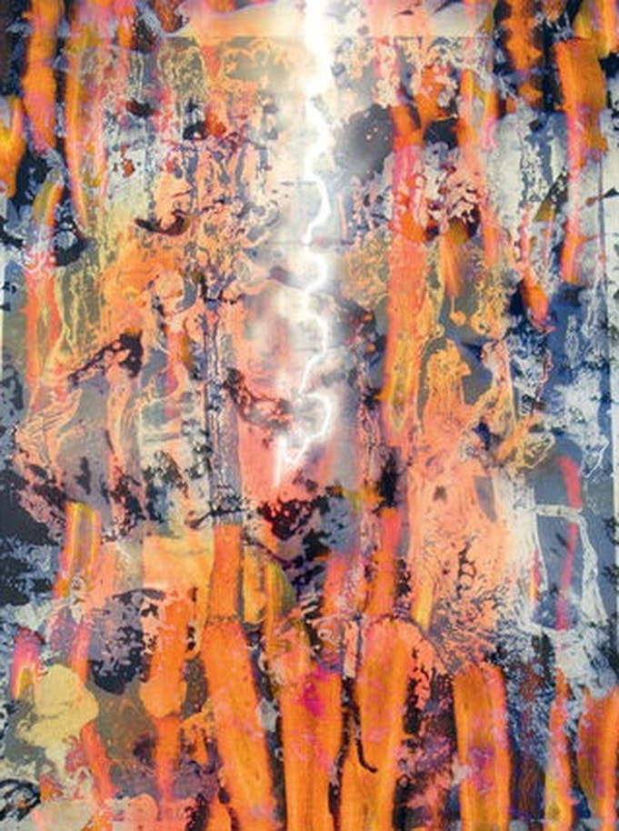
This development focuses on working on larger canvases while implementing all of my previous techniques and bringing them all together on this large piece, something that I think works well is the blue on blue contrast and the green and red complimenting colours, the lighter side of the planets are facing the blue laser this adds a point of focus to the blue details and the blue planets I think this is why this part of the piece stands out apart from there being the most white in that area.
Working from a more artistic angle on this piece and taking things that worked well from my last large piece such as the lighter side of the planets facing towards the laser light source works well. I really like the way the reds and oranges contrast against the deep blues dramatically , when picking what colours to make the stars I chose a copper and a Champaign gold to exaggerate the whites in the piece and not take away from the lightness of the laser behind the details.
13th development
Developing strip method onto the planets
|
|
|
Developing a specific method takes time and usually it takes a few mistakes before I find what colours and what contrast works best in the individual piece, the first thing to do to create these pieces was to first spay a background colour and then using car number shine I spayed one section and added paint to it this made a mixed liquid that takes a lot longer to dry and is a lot easier to spend across the canvas using a piece of balsa wood with indents in it, this process wold leave the background colour in the places where there was an indent. Once that layer had dried I then places tape across it in parallel and then spayed the next planet on top of the tape that would keep the paint under intact, the new planet on top would be the peeling away method this increases contest on the lines and allows me to include a larger variety of textures into the piece, something that I also wanted to include was the laser strips across the background.
|
Taking this process I've decided to make a larger canvas that includes my latest developments, this is the masking tape process where the strips are created and then the laser technique which leaves a multicolour background. Taking these processes I took it to a larger piece allowing me to include resin overlapped processes and a larger variety of lasers over the whole piece, I especially like the contrast between the peeled away paint and the scrapping method.
|
|
13.5 development
Working Abstractly with strip method
|
working abstractly with the strip method and learning more about a new method of creating ambient light around the corners of the piece with a red glow this is an alternative method to the laser background technique. In this piece I really like the large planet that is in contrast of texture and colour of the other planets that appear to be infant of the other large peeling paint planet. something different that I did on this piece was flick a range of colours not just white to make stars however is stayed metallic ranging from bronzes golds and silvers. in this piece I especially like the large contrast in the strips that separate the individual planets theres large contrast in colour texture and method of creating. This helps create depth to the piece and adds more meaning and variety.
|
14th development
Feeling a lot more confident with the techniques i have developed, the art work that continues is a mix of different developments however i have categorized them under 1 development because i feel that they fit into the same aesthetical level or show similar variety of techniques.
|
|
|
|
|
Picture of original piece.
|
Picture of original piece.
|
15th development
Creating the largests pieces in my collection
|
Working on a larger scale, on a large MDF sheet. this came with some complications such as the board had to be spayed with primer before I could start an art piece on it, this was so the colours that I was saying represented themselves accurately. Using canvas paper that is already white primed onto the paper results with a much more accurate colour range form what they look like on the can. Overall I really like the effect that I can achieve on a larger space it allows for more experimental techniques and allows me to include a lot more techniques that I have built up and developed
|
|
|
I wanted to create a piece that shows a large development step, while including multiple different colours and points of focus for example the lines that separate the colours are white this brings more attention to the colours used because there is a bigger contrast between the white separated by the black backgrounds, I was quite selective with where I flicked white paint to form distant stars this was because there was already a lot of white in this piece and I didn't want to take away from the lightest point on each strip that would be the laser effect. Theres many different textures included here on the same planet as well, for example on the red section theres a planet that I left without texture I did this by accident first however liked the look of it after wards adding more variety to the section.
|
|
EBI: I could improve this piece by putting it in a black frame to represent the black background and bring the centre of attention to the main art in the middle of the piece.
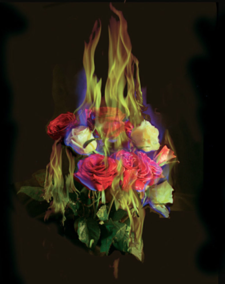
Matt Collishaw “Burning Flowers’
|
I really like this work, I think the intentions were to find a new media to create art onto, sometimes just creating art that is 2 dimensional can be tedious so I feel there is an element of expression though 3 dimensional artwork. Also I fell the use of plants is clever because it relates to a wider audience, everyone can relate to nature such as leaves and plants because we all see so much of it in our life its subconsciously natural when we see it, this is interesting because they are on fire showing how beauty can not be logical and showing that the leaves have become the subject of stress and destruction rather than peace and tranquility. I want to find a source of media that will show how the subject the art is on can be changed.
|
|
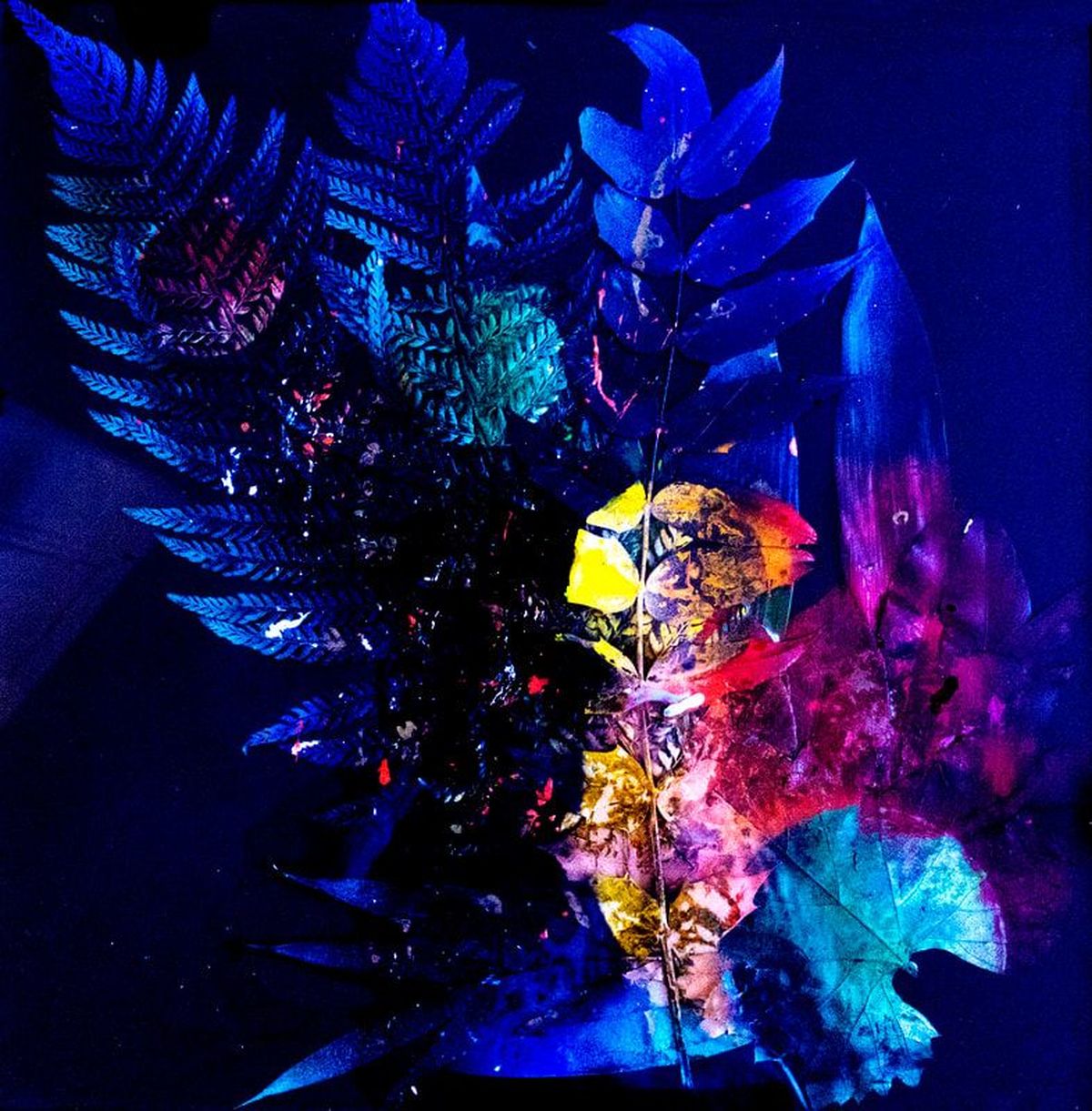
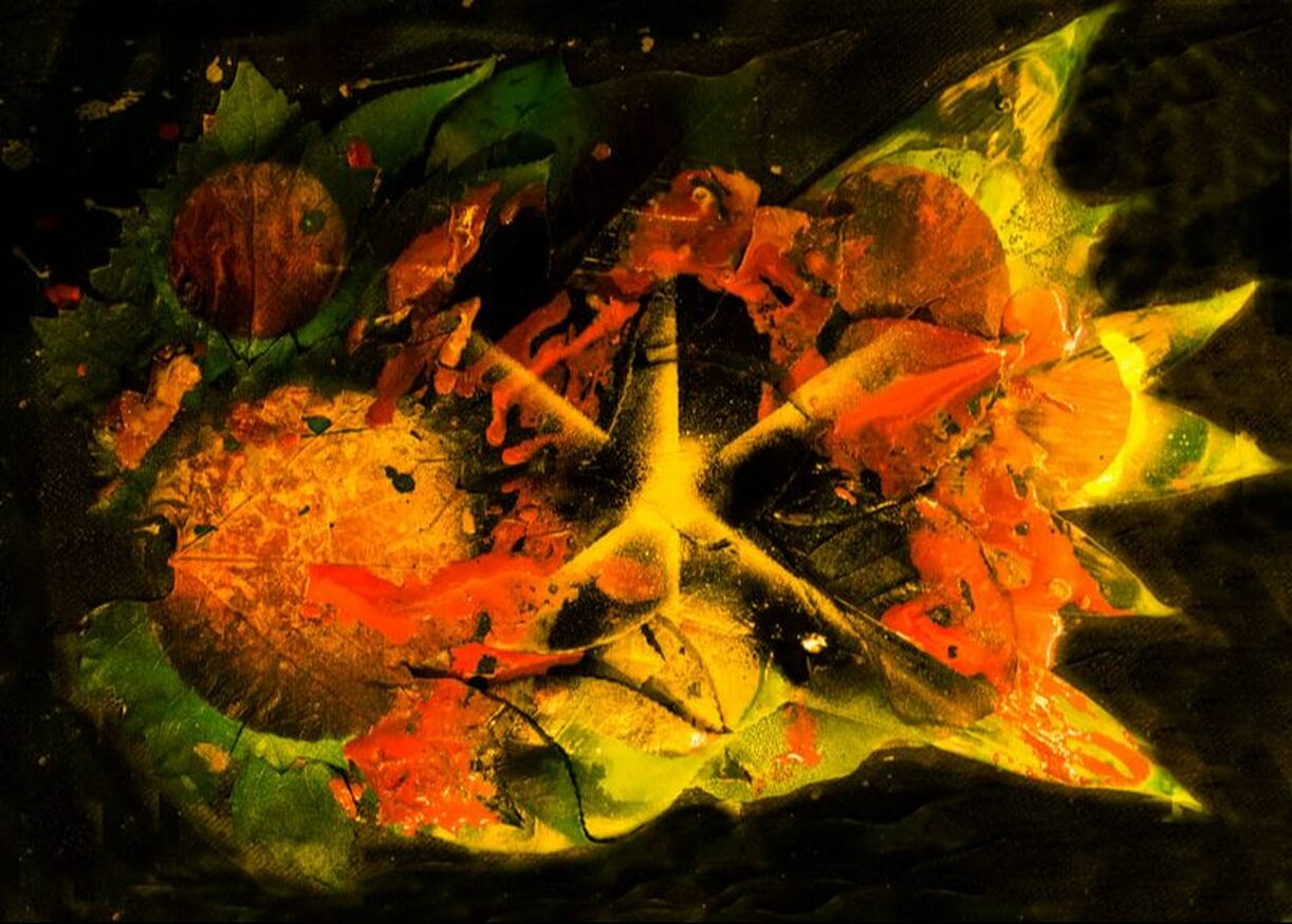
16th development

|
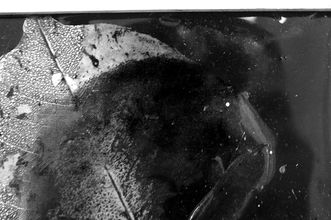
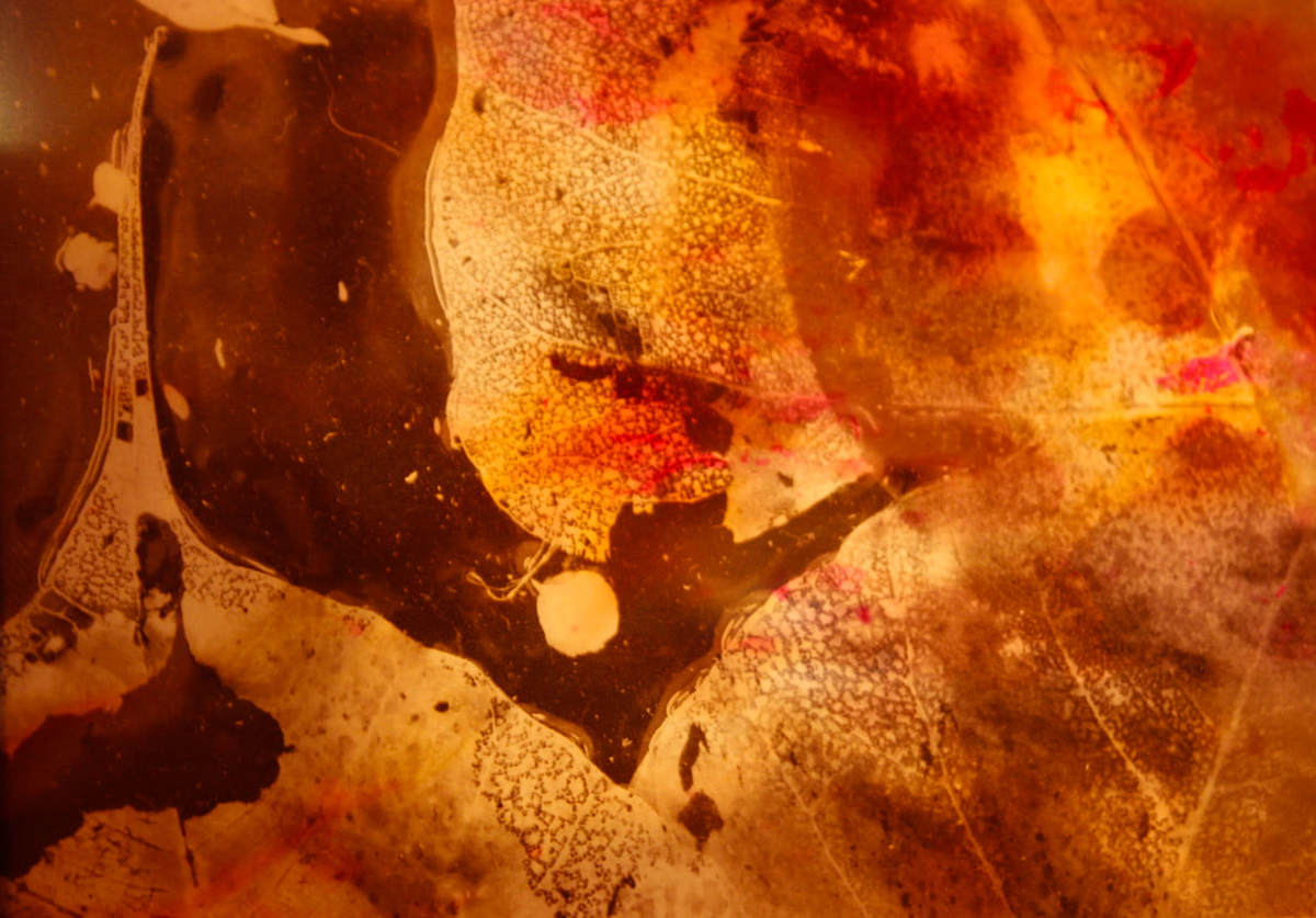
In this task I was required to further develop the spay paint however onto leaves, this time I wanted to include a variety of leaves structures so I included a variety of ferns, broad leaves and holly leaves, overall I achieved the best effect on deciduous leaves and ferns, I really like the way these type of leaves picked up the spay-paint, things I would improve would I need to be more subjective with the size of the planets, the largest planet size tends not to work as well when covering the variety of leaves this however does work well when overlapping the planets, another improvement I could make would be to include resin into the piece as well this would consume a lot of resin because the leaves often cover a large surface area however I will definitely explore this in further developments.
|
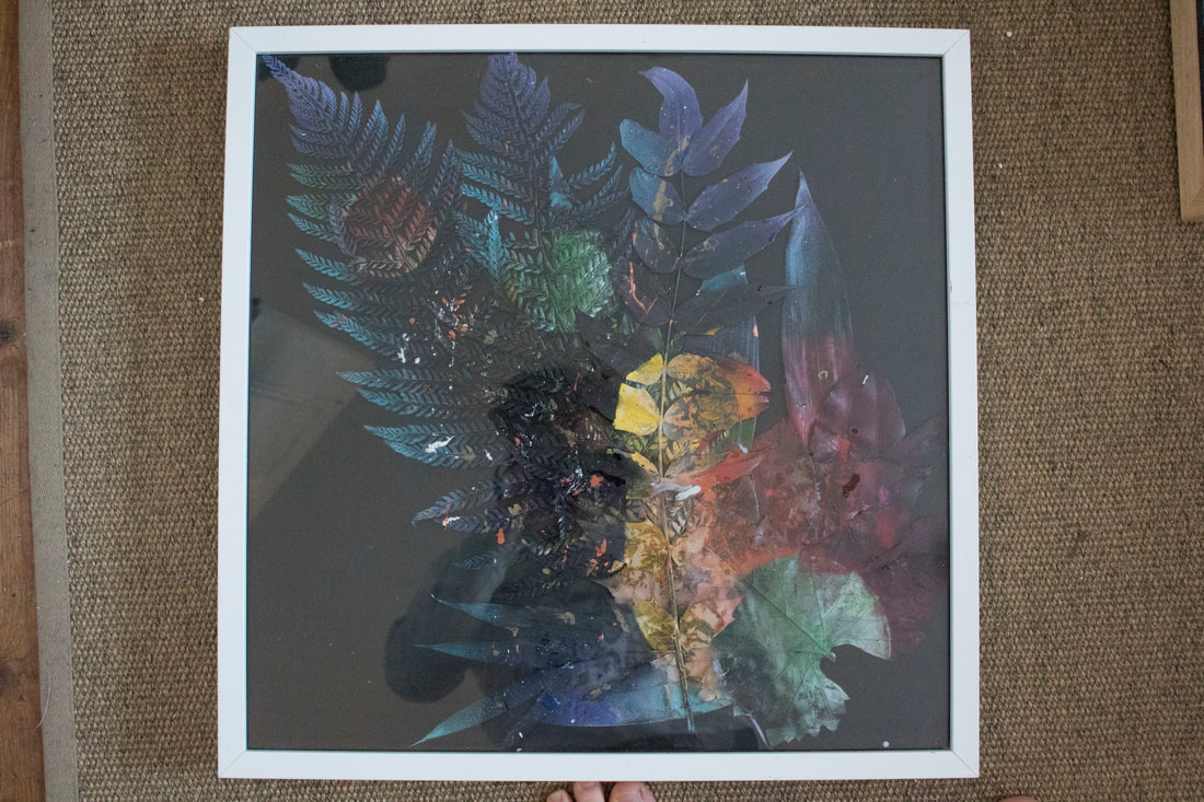
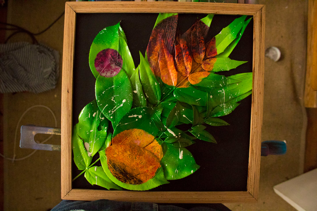
Photo of framed artwork, without photoshop enhancements, overlayed leaf structures in glass frame.
|
17th development

|
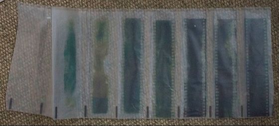
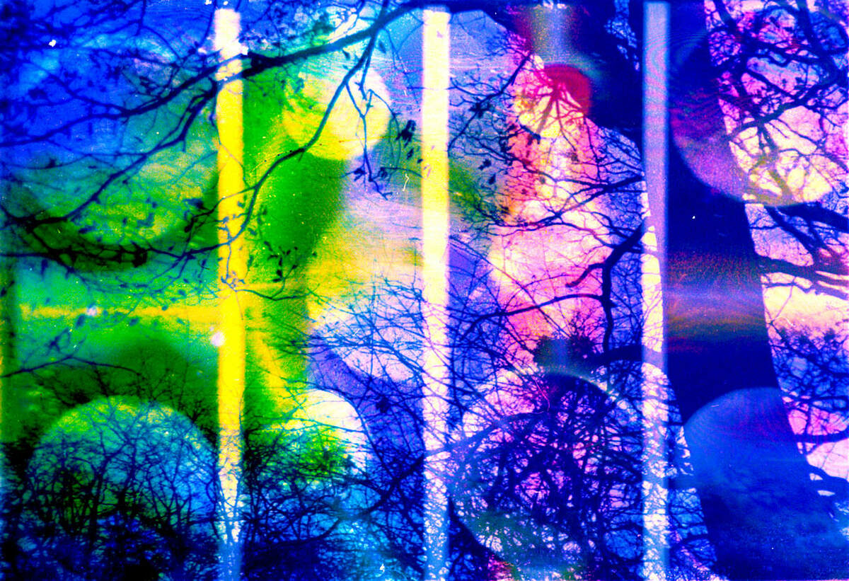
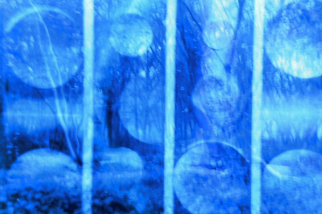
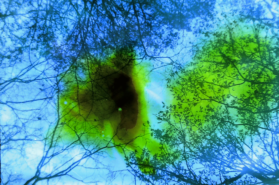
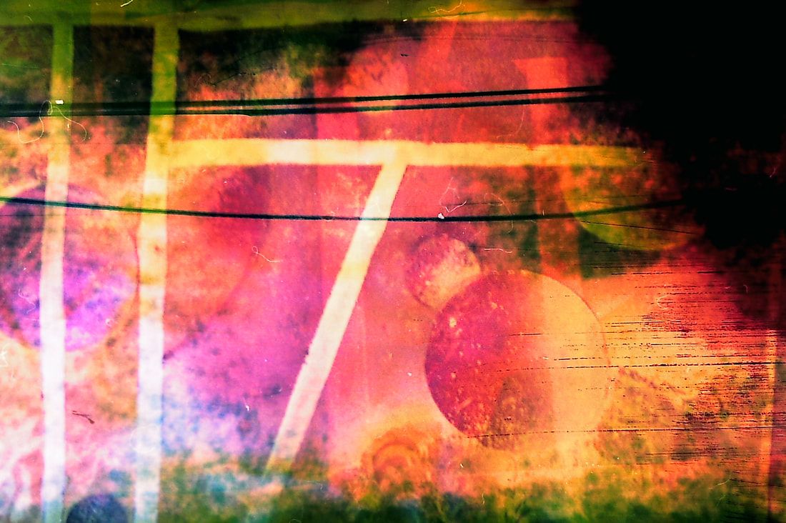
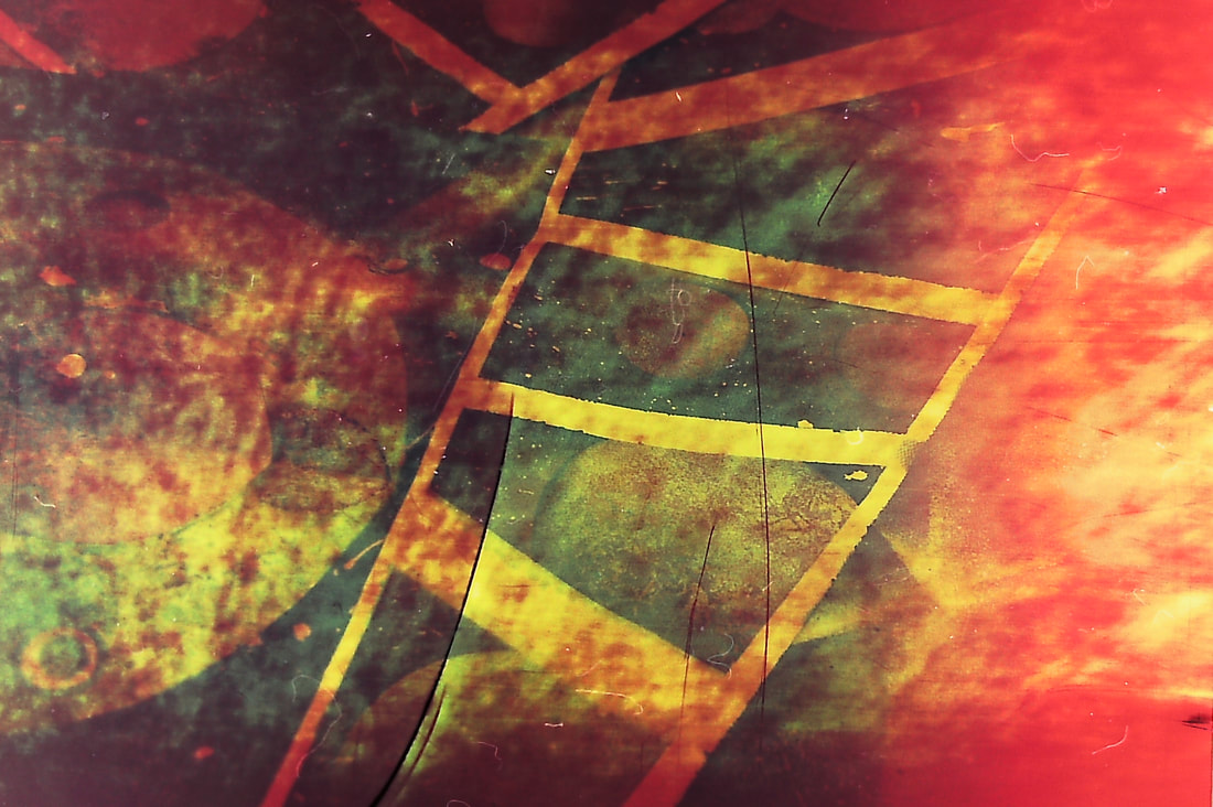
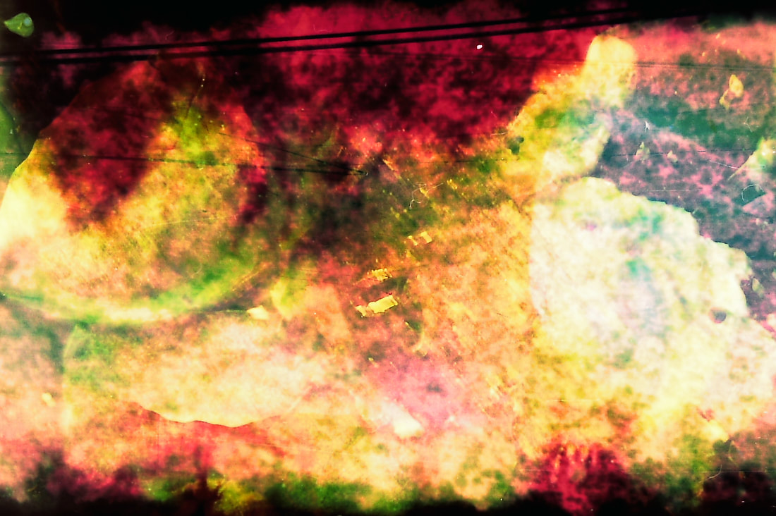
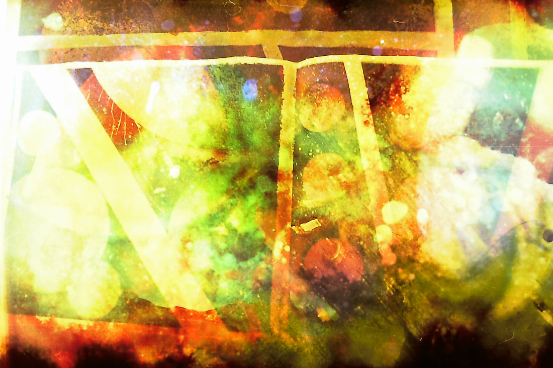
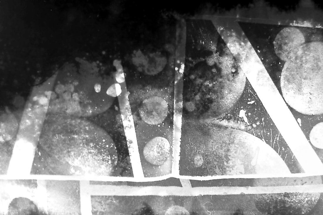
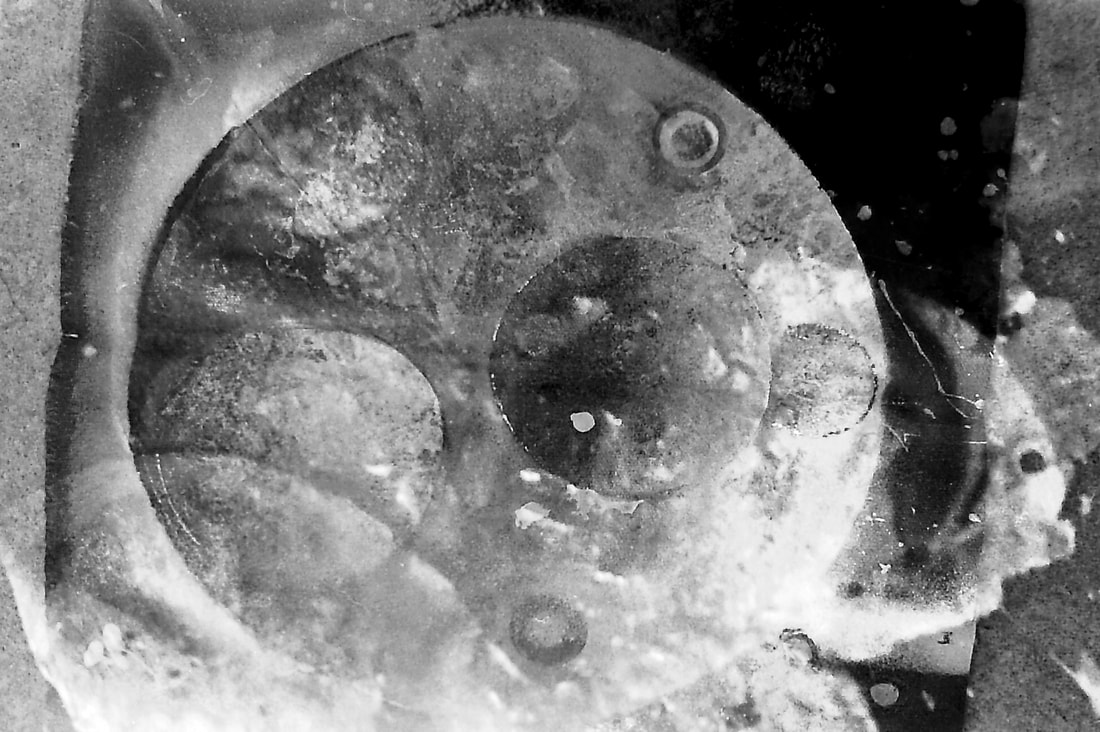
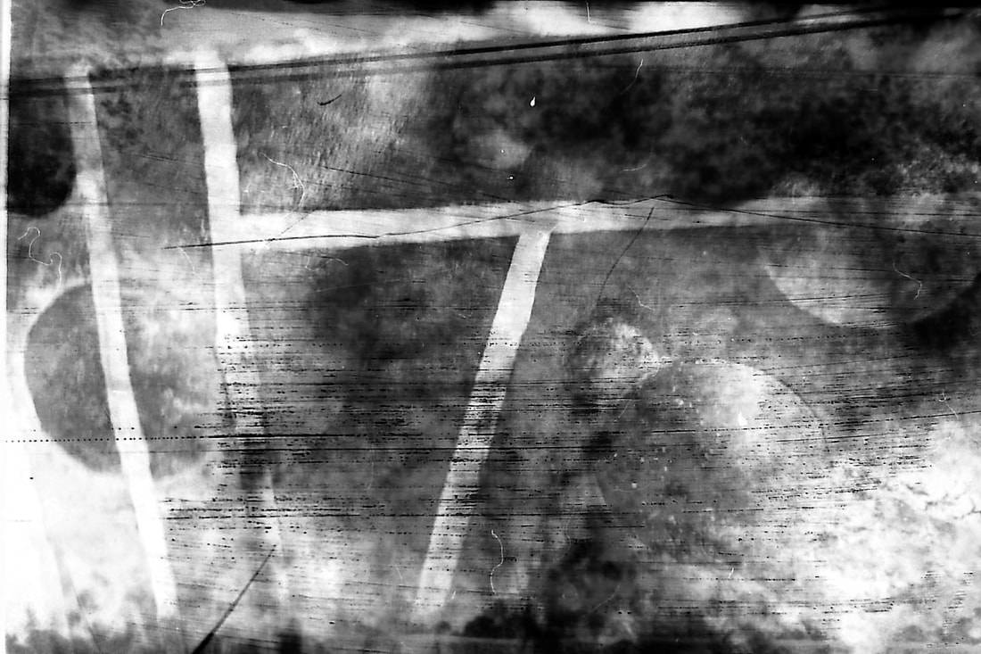
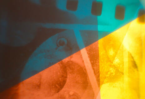
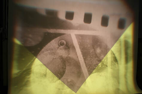
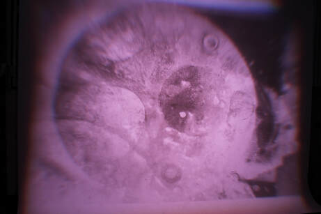
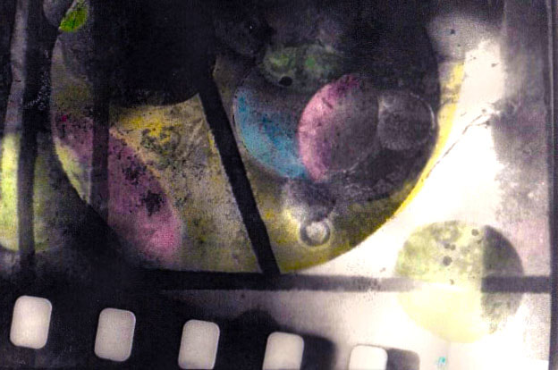
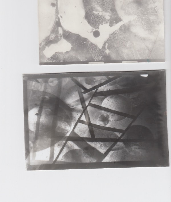
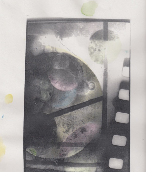
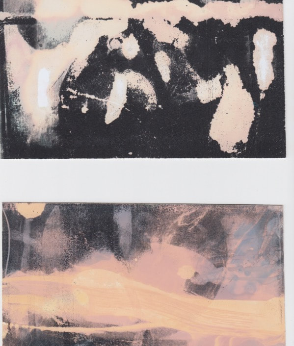
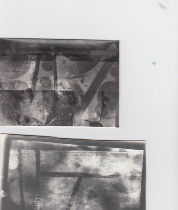
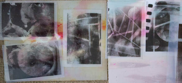
In this task I was required to take pictures of my existing spay-paint art using colour film, I developed this at sappy snaps. The plan was to disfigure the film by using processes like rubbing bleach onto the film, before this I scanned the film these are the pictures below. Another technique I developed from this development was double and triple exposing the film, I did this when I was scanning them in by simply putting 2 films onto of each other this produced a very blue overall effect while also being able to see both photos.
|
Picture of film after bleaching process.
|
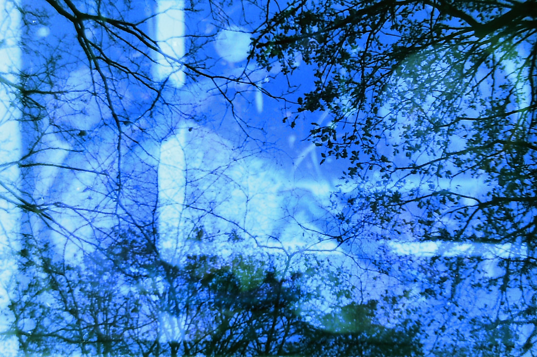
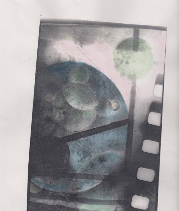
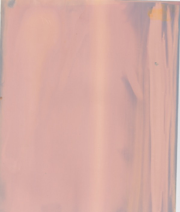
While taking this picture i acidently opened the back of the film camera, this ruined a few pictures however on a few I already took I produced this great yellow light from one side of the picture. Overall i really like this effect I made accidentally.
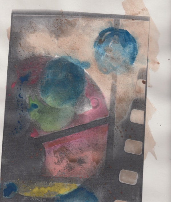
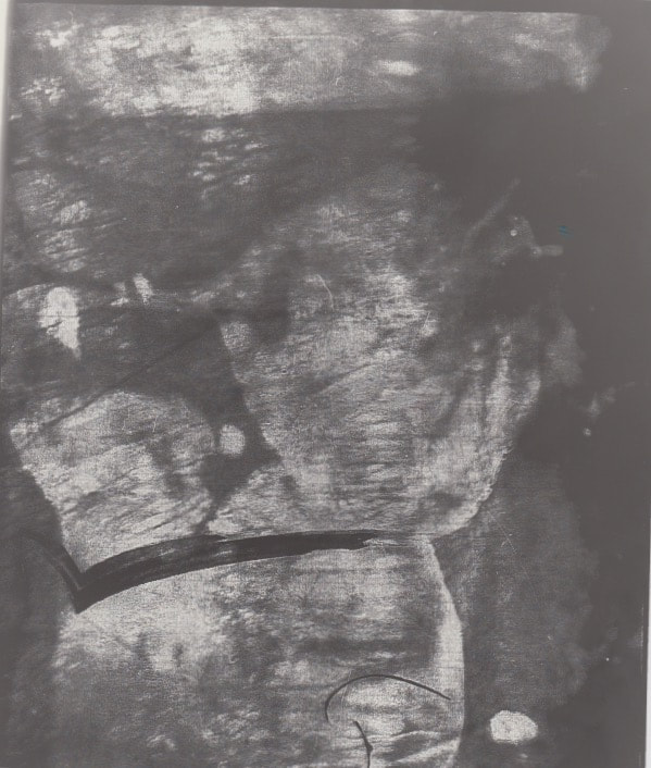
Another example of double exposure using layers of film.
examples of triple exposure picture.
|
This is a great example of a double exposure picture, there are 2 pictures layered onto of each other and then scanned in, I really like this technique because it shows a lot more art on one picture allowing me to be more selective with what is on the page.
Another example of double exposure using layers of film.
examples of triple exposure picture.
|
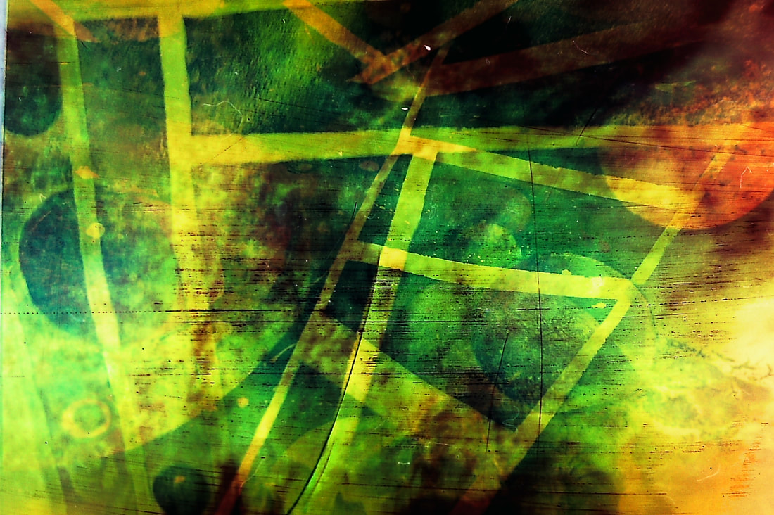
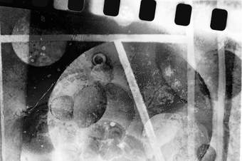
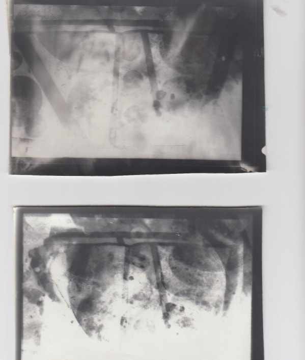
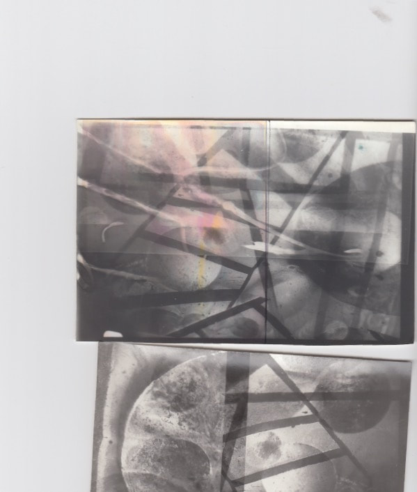
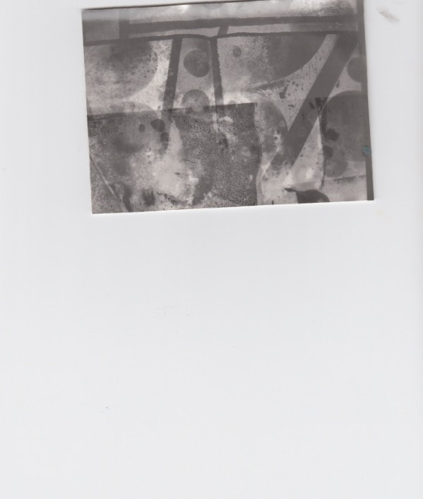
Contact sheet
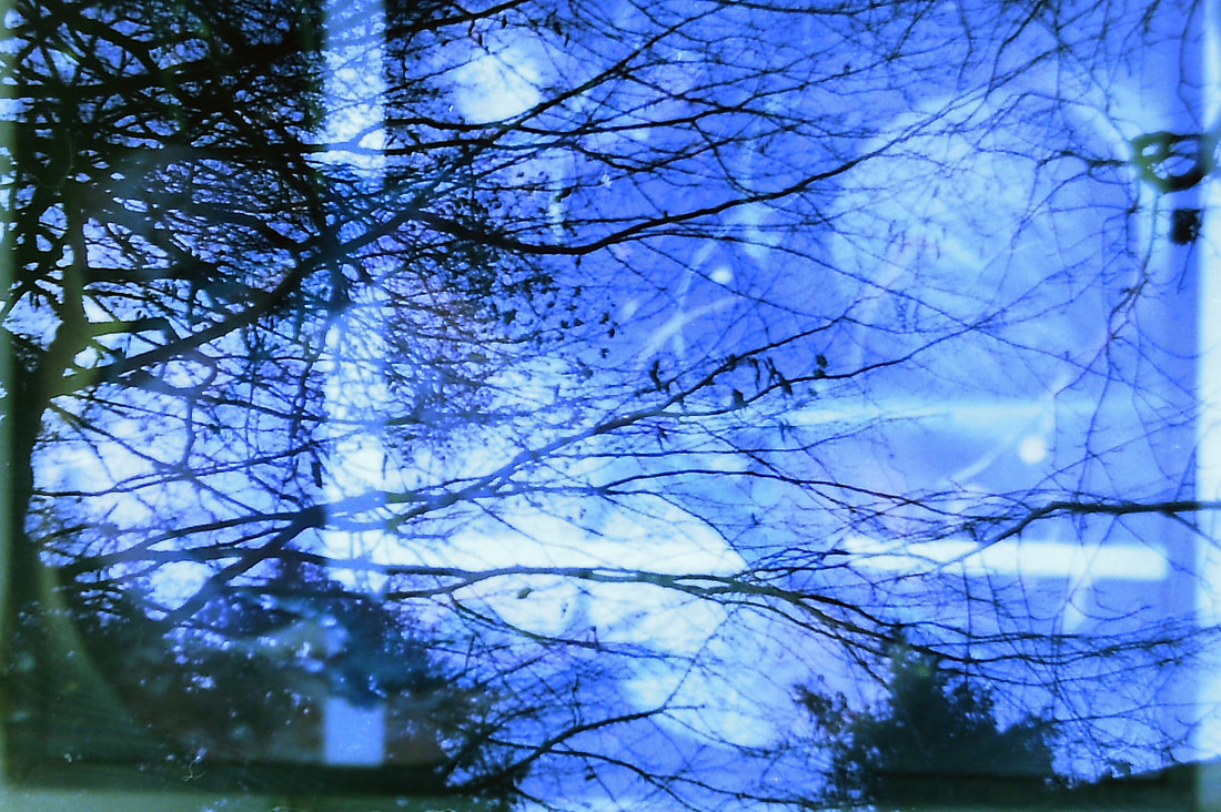
18th development
2nd response
Using a second role of colour film to develop double exposure shots
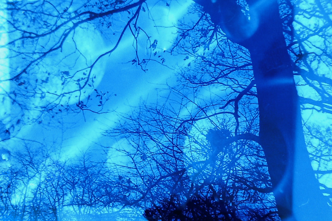
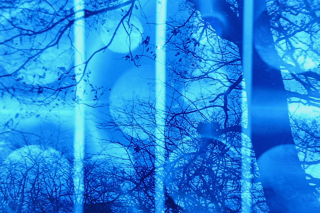
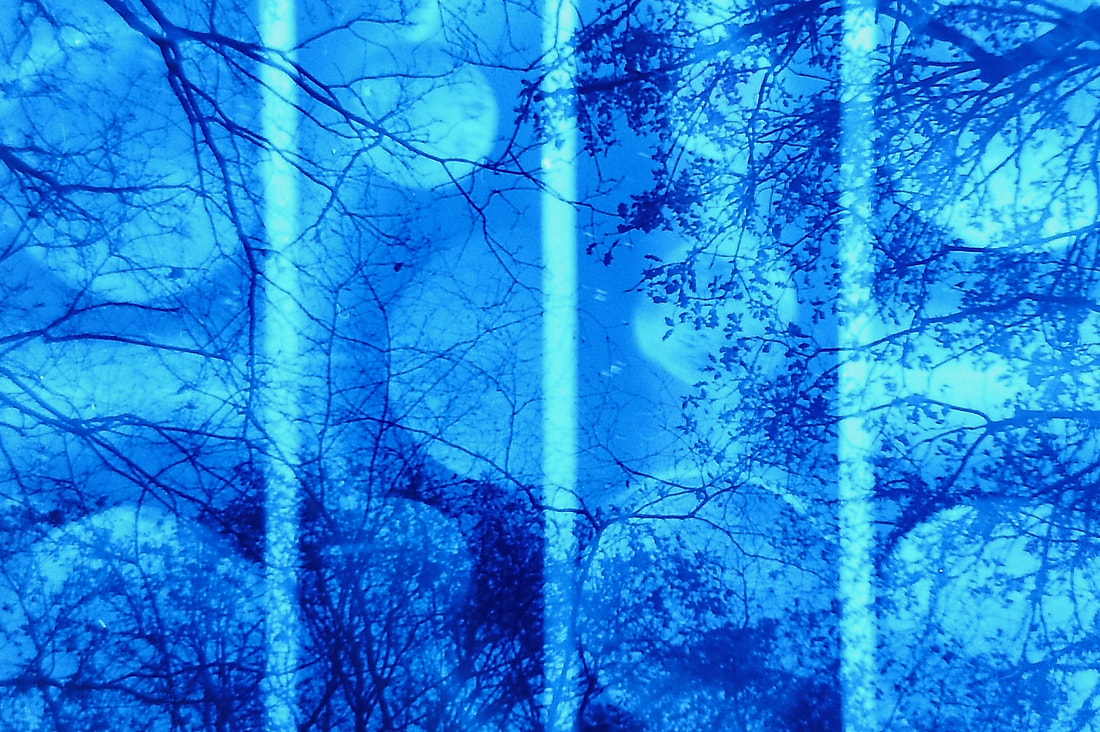
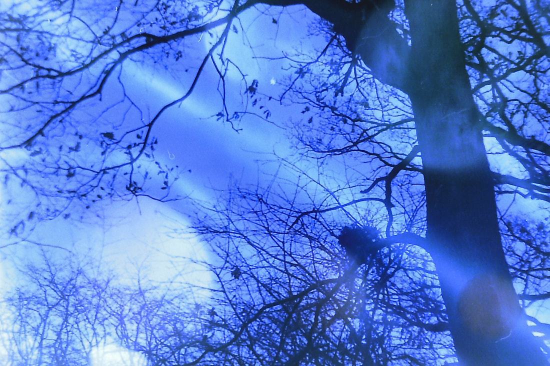
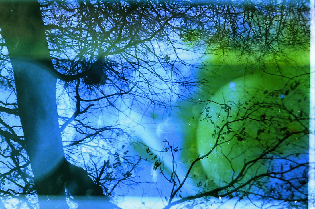
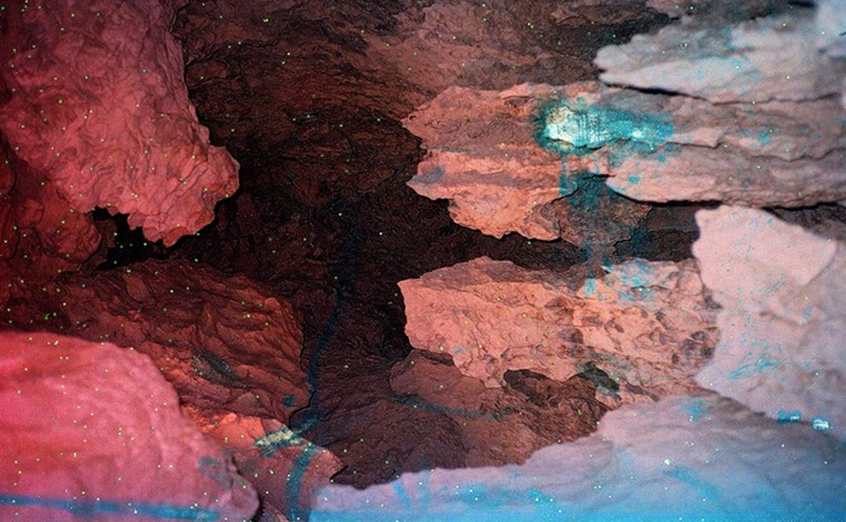
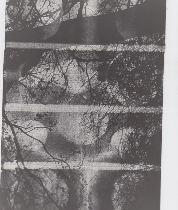
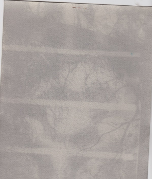
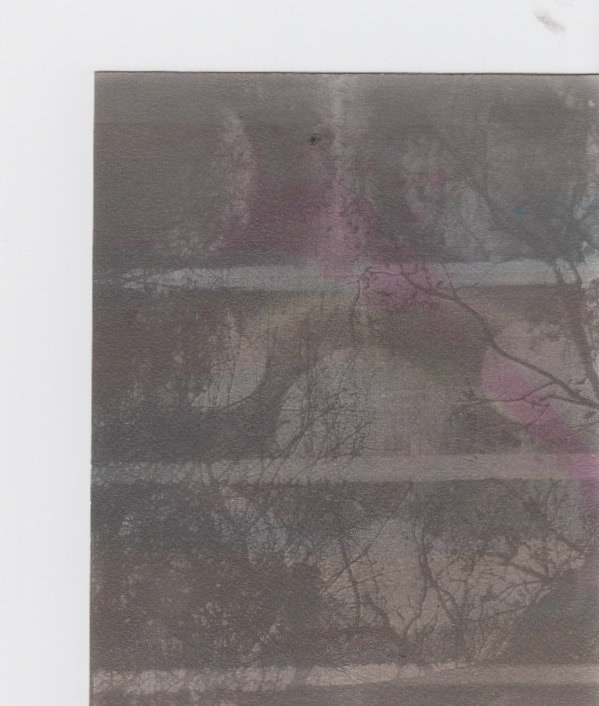
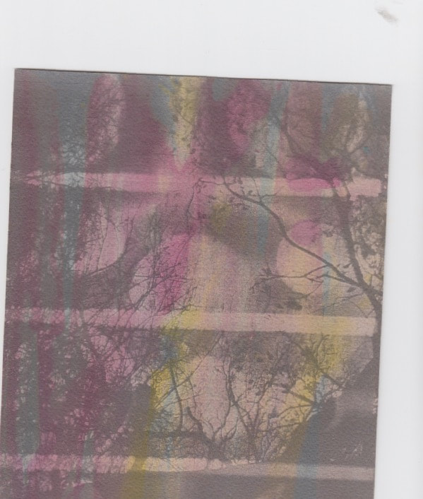
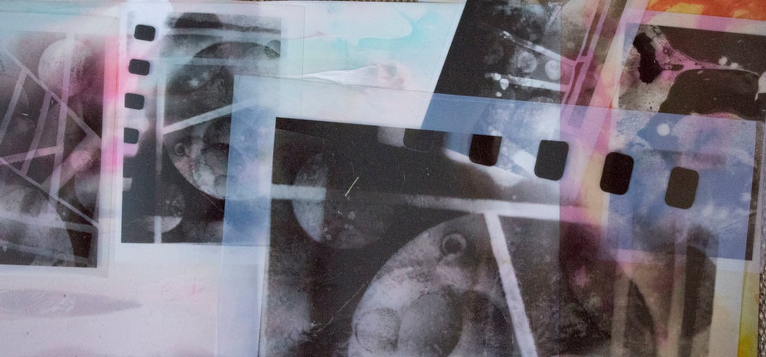
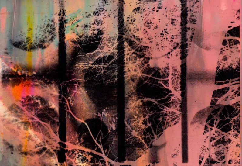
In this task I was required to find a way to bring more photography into my work, I wanted to do this without taking away from the main focus which would be the spay paint/planets therefor the technique I've developed of overlapping two layers of film and producing a singular image from both pictures. I chose trees because they are relateable to all people and because it links directly to the spay-paint onto leaves development this adds depth to the art and shows the development of ideas and how they all relate to each other. I really like the overlapping technique and I will defiantly take this process and develop the idea a lot more.
|
|
|
|
|
|
|
|
|

|
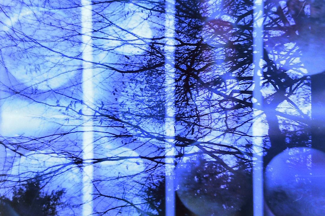
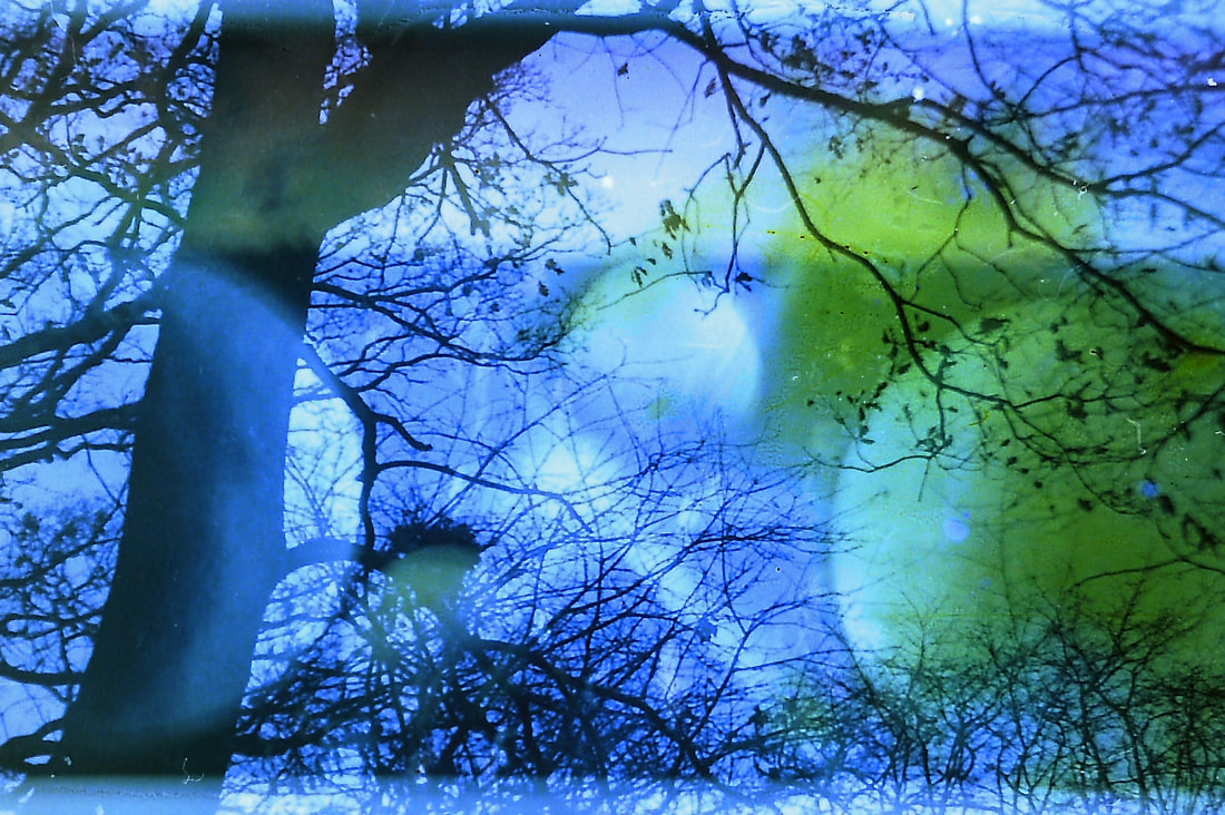
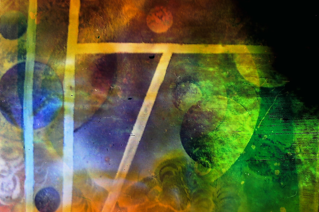
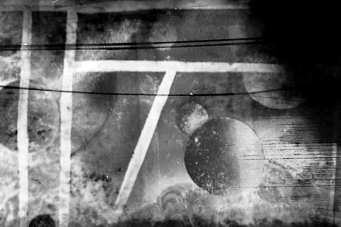
After successfully achieving a natural double exposure using colour film layered on top of eachother, i now wanted to experiment by manipulating one of the layers of film this would be the tree skyline pictures. I manipulated the film with bleach slightly peeling away small parts of the picture where i thought there would be an overlap of where the planets are. The bleach after been scanned in brought a new colour into the piece and added a more interesting effect in front of the planets, i could develop this more by dramatically removing material on the top piece of film using bleach allowing the bottom piece to be more visible with a lot of different effects on top of it.

|
|
|
|

|
|
|
SEUNG HWAN OH
|
I find this work relates to my theme and my work that i am currently making, the process he uses is to take an existing picture and then work into it with chemicals to produce bleach like effects where the colour and picture is half distorted so you can see half of the real picture and half is almost an abstract piece of art. His work however focuses a lot more on human subjects or portraits rather than leaves or trees. But the process of creation is very similar, things i have learnt from his work is the potential of the bleaching idea for example in my development above i used bleach on some film to create a contrast in colour and to peel away 1 of the layers of picture to reveal the one bellow. This wasn't too successful i would say however it did teach me a lot more about this process and liking the idea to his work has given me a clearer objective of what can be produced.
|
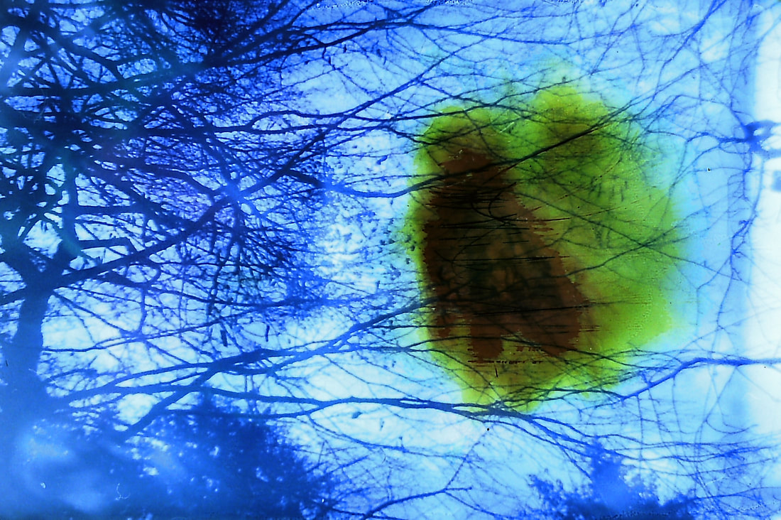
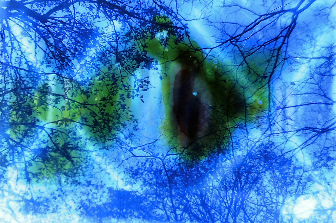
19th development

In this task i was required to develop further on my bleaching the double exposed film layers, this time i new what sort of effect would be produced so i was a lot more purpose full of where and what parts of the picture to remove, however still it is a trial and error process because not all the pictures were successful.
I really like this piece because it shows how the bleaching method can add depth and another physical looking effect to the artwork, i really like the bubbling look the bleach has left onto the film and the darkness in the top right.
|
I really like the way the bleach has left the piece in a different colour, there's also a scratching look that the bleach has left im not to sure how i produced this but i do like the contrast of circles and lines.
|
|
|
Converting Bleached developments to ASIATE
|
|
|
I've converted my previous development into black and white assetates to use in later developments, if i want to take them to the dark room it was necessary to invert them into negatives.
20th development
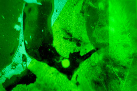
In this task i was required to use the assetates i had made and put them on an enlarger/ projector, this would project the image onto a wall that i could take a physical photograph of. I used sheets of coloured acetate on top of the image to produce the colours and bring back the colour to the piece this also produced a solid hard line between where the colours overlap. I like where the colours are similar to each other like the green piece, i also think green suits the leaves in this picture.
|
|
|
|
Maya Rochat (again)
Focusing on her variety of works
|
I find her work inspirational because the abstract theme is very similar to what my own work includes, because of this I relate to her work. As seen to the left there is a clear laser like technique produced onto of the abstractness part of the piece this is very similar to what I produce with my laser techniques however there is a lot more ridged lines in the form of the laser and a pure white ambient glow. The piece above shows themes of space and unknown landscapes, the white specs represent stars in the sky and is relatable to more people as everyone has seen the stars before, I also use this technique on top of my work as a final layer.
|
|
|
|
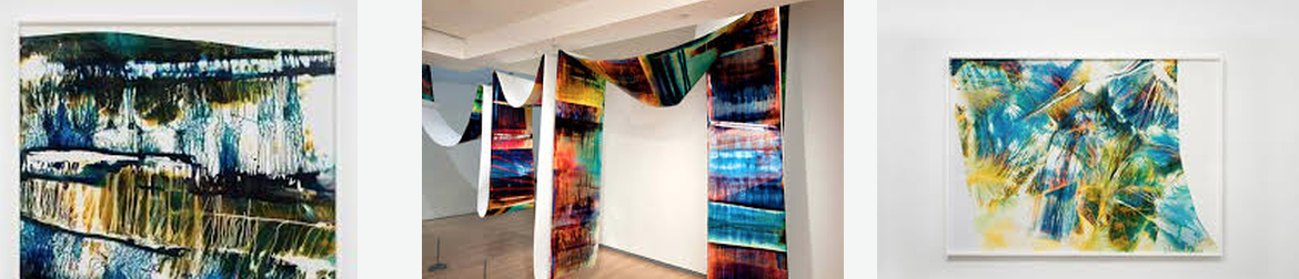
This is one of my favourite pieces that she has made, this is because of multiple reasons such as the amount of reworking she had to do to produce the background for example the first stage she took was to produce the red-strips and background this took multiple stages of reprinting and reworking into the prints using different techniques and processes. This is a working method that I want to include in my own work, finding a way to take my work and rework into it by using different techniques, processes or chemical ideas. This is something that i have already started to do with the bleaching of film which is a way of printing the work and reworking Into it this is something I would like to rework into with the bleached developments. I really like the lighting bolt dragged across the middle of the page and the ambient glow behind it I'm not to sure how she produced this effect onto of the artwork but it adds a central point of focus to the piece, this is also supported by the use of white which naturally draws our eyes to it as it is the brightest thing on the page. This is something that I can replicate easily as my separation development which uses a lot white stripes.
|
|
In her book productions as well as in her plastic work, Maya Rochat pursues her research on the image, which is situated between photography, the printed image, painting and digitisation. I like the idea of creating a book because your able to show a variety of work in a singular product this allows for more work to be shown to a wider audience. MAYA ROCHATs book only focuses on full page art showing off her reworked into abstract artwork without a distraction or an added meaning this shows that the artwork can speak for itself something very important for successful artwork. Although it is hard to show a direct theme or purpose of art though abstract work I this she is successful at provoking emotion and by emerging us in the artwork itself.
Chemical processes in combination with PHOTOGRAPHIC paper
1st RESPONSE to MAYA ROCHATs work
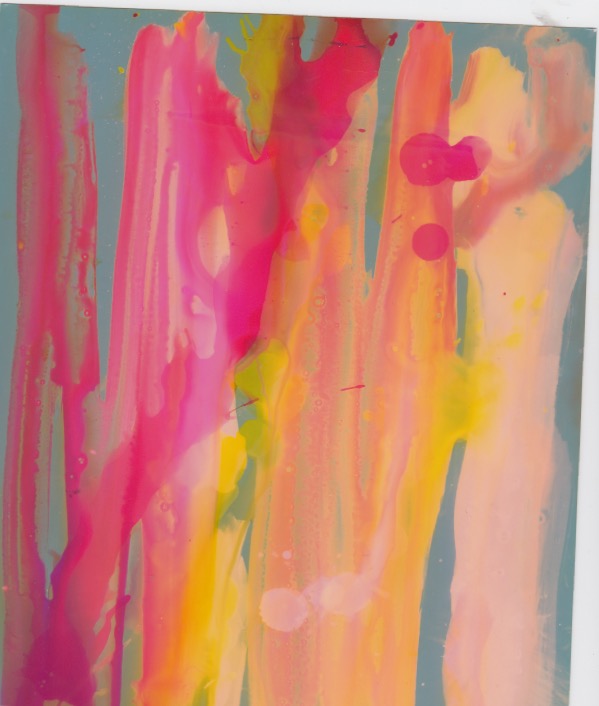
I made these pictures by using a combination of different chemical processes on photographic papers, such as inks washing up liquid and chemicals from the dark room something that I didn't expect to happen was the way the ink reacted with the stop chemical, the ink went clumpy and sat on the top of the paper instead of washing off the longer I left it on the paper the more vibrant the colour that was left behind, I used a combination of yellow and red inks in this piece, when the ink would mix with washing up liquids it would produce different colours such as purples and reds. Something I also did in this piece was I used bleach to peel away some of the areas related to where there was a higher concentration of inks.
|
|
|
This artwork was directly inspired by MAYA ROCHAT work although there is only 1 layer of woking into it aesthetically shows similar qualities to her work, I also made this work by the use of reactive colour paper and chemicals such as ; bleach, inks, washing liquid, Vinegar and lemon juice.
Experimenting using the scanner
2nd RESPONSE TO MAYA ROCHATS WORK
Using a large A3 scanner I managed to produce these pieces of art by simply taking unordinary shapes and pieces of acrylic and mdf and then moved them slowly as the scanner passed by them, this produced strange irregular pattens I really like a few of the pictures it made however its a bit of a hit or miss. Its also harder to produce the original colour of the scanned objects as the lid has to be open of the scanner while I'm moving the parts about. Using this technique I would like to use my previous developments (spay-paint) on the scanner and move it in a variety of motions much like what I've produced here.
|
|
|
The abstract pictures above shows a development of a singular technique but they don't show a development of an overall theme or idea so I kept the technique of using the scanner and I used some of my previous development to produce the same technique it with different focuses, it turns out that I didn't like the effect it gave as I didn't like the way it manipulated the artwork too much this was a learning curve as i learnt not all experimental ideas can look good however its always good to keep experiment and coming up with new ideas and ways of creating artwork or manipulating old works.
|
|
|
|
|
|
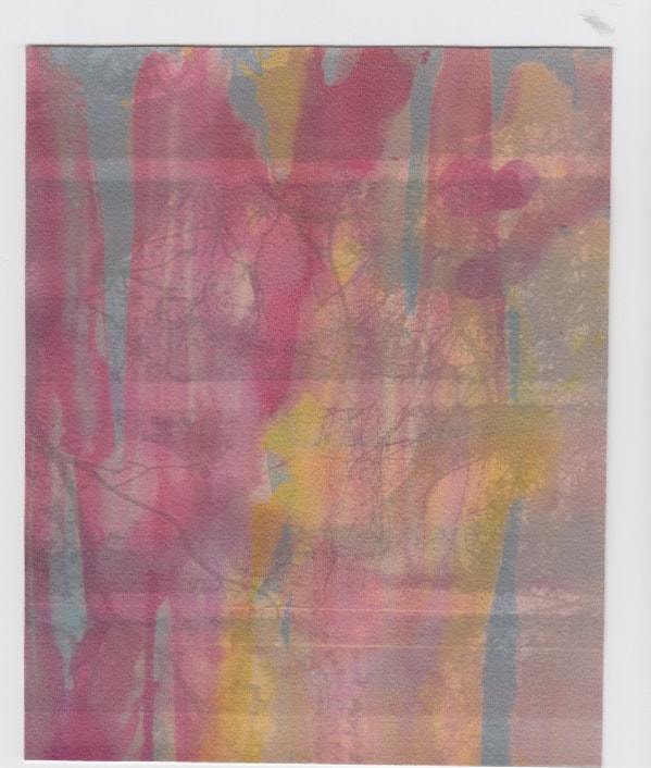
I made these images by printing them out on paper in black and white and then using water colours to suttlely bring the colours back into the piece, however in post production I increased the vibrancy a bit to much causing an effect I didn't aim to achieve in the first place however the originals are a lot more successful as they show a lot more texture behind a lot more suttle picture.
|
|
|
|
|
|
|
|
|
Last development
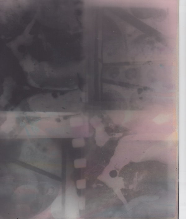
In this task i was required to use all my previous developments to my advantage and include as many themes and techniques into the same piece for example in this final development i have included : My original spay-paint pieces, then manipulating the colour film in the darkroom, then converting the picture digitally into acetates. Once i had these's acetates made there was multiple angles that i could approach to bring colour back colour into the artwork.
chemical processes on reactive paper, used underneath see though acetates.
|
This piece uses the acetates layered on top of my chemical processes development to bring back the colour to the artwork this is deliberate because it relates to Maya Rochat who is always reworking into her pictures to produce new effects or add different elements to her work, using this as inspiration i developed these pieces keeping this in mind.
I also wanted to include specific things like my leaves development and my bleached film development because they themselves represent the development from singular ideas for example i didn't start spaying onto leaves so theres a higher level of development there. |
These pictures show how I've layered the acetate pictures over the chemical processes development.
|
|
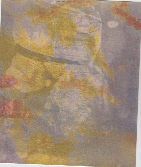
The second process was to turn the acetates into inverted pictures and then take them to the darkroom to be developed, this was harder than expected. Developing the picture wasn't the hard part the harder part was to find the right thickness and texture of paper that would subsequently fit though the printer. Once i had developed the black and white photos in the dark room i then dried them and printed my chemical process development onto the fibre paper and multigrade paper with the image on it.
Scan of original
|
original edited in post production
|
|
|
Annotation Help
Introducing a task:
Subject matter
ebi:
Subject matter
What’s next
Analysis Help
What do you think the photographer’s intentions are? There may be more than one. ‘PEC’ each intention.
P (Photographer’s name) creates (what type of images? Fantastical, surreal, objective)
E He / she does this by… (describe something in the image)
C He/she wanted us to consider ….
What wider issues is the photographer addressing?
P (Photographer’s name) is considering (is the photographer talking about a bigger issue in photography, society, politics?)
E This is shown by … (describe something in the image)
C The (Photographer’s name) was interested in this issue because (they felt it was relevant to us now…)
How do the materials and techniques used support your photographer’s intentions?
P (Photographer’s name) has used (the darkroom / multiple exposure / film / digital manipulation techniques) in creating this work.
E This creates a ______ effect. (describe something in the image)
C This helps to support (Photographer’s name) point about (showing an identity / hiding a person’s identity / the media / anonymity)
Introducing a task:
- In this task I was required to…..
- This task links to the theme, landscape as it shows....
Subject matter
- The subject I chose to photograph suited the theme as it……
- My composition helped to support my response to the theme by….
- I managed the exposure very well. My ISO / shutter speed / aperture settings were…..
- I prioritised my shutter speed to… (capture movement / blur/ frozen moment)
- I prioritised aperture to manipulate depth of field.
- I used a tripod to avoid camera shake.
- My images express my intentions which were…
ebi:
Subject matter
- The subject I chose to photograph did not necessarily fit the brief as it was not interesting enough / appropriate / adequately lit…..
- Next time I should go to (a different location), photograph at a different time of day, organise people in advance, think more about my composition so that….. ect
- I did not create enough depth of field / sense of movement.
- The image is over exposed / underexposed / too blurred.
- Next time I should use a tripod / use a different type of lens (be specific) / experiment with film…
- My images do not show my intentions which were…
- The concept wasn’t clear in my images, I need to make it more explicit by…
What’s next
- Next time I will consider the work of (a photographer) to inspire a more accurate depiction of what I want to achieve.
- I will experiment further with… (blur / shutter speed / composition)
Analysis Help
What do you think the photographer’s intentions are? There may be more than one. ‘PEC’ each intention.
P (Photographer’s name) creates (what type of images? Fantastical, surreal, objective)
E He / she does this by… (describe something in the image)
C He/she wanted us to consider ….
What wider issues is the photographer addressing?
P (Photographer’s name) is considering (is the photographer talking about a bigger issue in photography, society, politics?)
E This is shown by … (describe something in the image)
C The (Photographer’s name) was interested in this issue because (they felt it was relevant to us now…)
How do the materials and techniques used support your photographer’s intentions?
P (Photographer’s name) has used (the darkroom / multiple exposure / film / digital manipulation techniques) in creating this work.
E This creates a ______ effect. (describe something in the image)
C This helps to support (Photographer’s name) point about (showing an identity / hiding a person’s identity / the media / anonymity)
